10 Ways To Make Windows XP Look And Feel Better
Chances are you’re probably going to stick around with XP until Windows 7 comes along. And even then you may wait. If that’s what you plan to do, no problem. You can do a few things to get XP to look and feel better.
1. Use the Zune theme
The Zune theme is available here:
http://go.microsoft.com/fwlink/?LinkID=75078
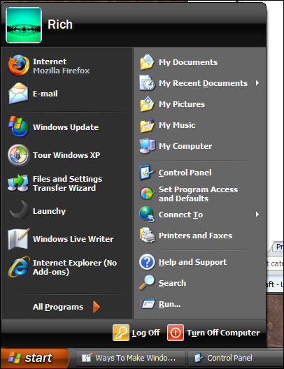
This gives XP a black and orange look. Additionally it’s a complete theme (unlike “Royale” which isn’t and has rough edges here and there).
Here’s an example of what it looks like:
Trust me when I say you will like this.
If you don’t feel like using this theme, the next best thing is “Silver”. This is built-in to your XP already and is accessible from the Display icon in the Control Panel from the Appearance tab.
Looks like this:
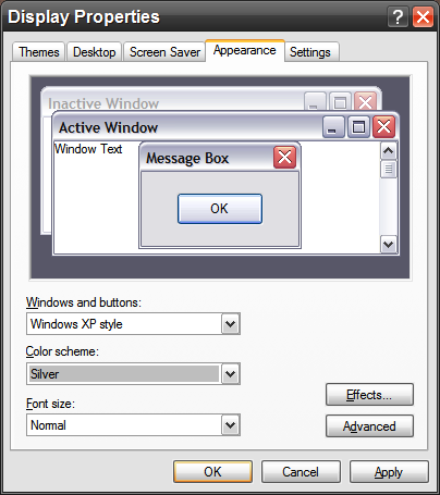
Silver is arguably the best built-in theme in XP. The standard blue gives XP too much of a toy-like appearance, and the “Olive Green” just doesn’t cut it.
Zune and Silver work well.
Small end note: Using the Zune theme doesn’t mean you have to actually own a Microsoft Zune music player, nor do you have to do any sign-up stuff or any of that crapola. It’s just a theme, plain and simple.
2. Use no wallpaper or tiled wallpaper.
Full-screen wallpaper can actually slow your system down – especially if you’re using dual (or more) screens. The reason for the slowdown is because XP has to keep redrawing the screen with a high-res graphic behind it.
If you use no wallpaper, XP won’t have to redraw as much. And in fact this is true for any OS and not just Windows. Even on Mac OS X and Linux, having no wallpaper speeds up window/screen redraws quite a bit.
Tiled wallpaper (ex: “Coffee Bean” in Windows XP) draws much faster compared to full-screen wallpaper.
TIP: Do a Google Image Search for wallpaper pattern. You’ll see lots of cool-looking stuff there you can try out for wallpaper use.
3. Use the ClearType Tuner Powertoy.
It makes all your fonts look better and easier to read. This is a no-brainer. I use it; it works; it’s free; it’s awesome.
Get it here:
http://www.microsoft.com/typography/ClearTypePowerToy.mspx
To note: Only people with LCD monitors should use this. If you’re using CRT (i.e. “tubed” monitor), stick with what you have.
4. Adjust Active Title Bar to use a larger font.
When you use a larger font in the title bar area it makes all apps look better and easier to locate.
It’s done like this:
First, go to Display Properties (“Display” icon from Control Panel), click the Appearance tab and then the Advanced button.
Looks like this:
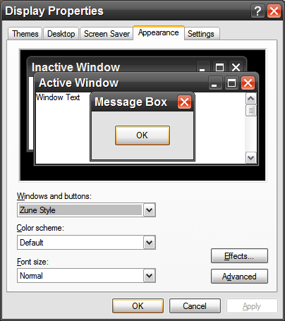
Note the “Advanced” button at the bottom right. Click that.
Where it states “Message Box”, click that. The Item listed will be Active Title Bar.
Set the font to Arial and its size to 12 and bold it (the little “B” button). Then next to Active Title Bar, set to 25. THIS SHOULD ALWAYS BE 25. If it’s not it will make icons in the taskbar look “scrunched” and pixelated.
Confused? Match what you see below:
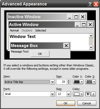
To note, you don’t have to use Arial. Other good fonts are Verdana, Trebuchet MS, Lucida Sans Unicode or whatever is loaded on your system.
Just remember to keep the “size” setting next to “Active Title Bar” to 25 to avoid the scrunch/pixelation of taskbar icons.
5. Adjust “Message Text” and “Menu” to Tahoma.
Tahoma is a built-in font with XP and said honestly is the best menu font it has.
Follow the same instructions above – but click on “Message Text”, set to Tahoma, size 8 and for “Selected” use the same settings.
It looks like this:
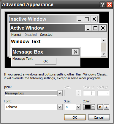
(Note under Item: that “Message Box” is selected – you want to do the same for “Selected Items” as well from that same drop-down menu.)
For those who have not-so perfect vision, try bolding the menu and dialog fonts. It makes the menus in XP a whole lot easier to see and use.
6. Set the Icon item to bold.
This is in the same section as the others mentioned above.
Looks like this:
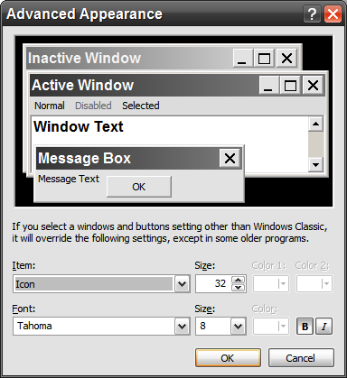
The Item is “Icon”, the font is “Tahoma”, size 32, the font size is 8 and lastly, the “B” is impressed (by clicking on it) to indicate it’s set to bold.
This carries over to the Windows Explorer and makes stuff easier to read, like this:
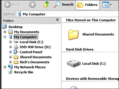
The icons on your desktop will also have bolded fonts, and will also bold a few things in Internet Explorer (which is not a bad thing at all).
7. Use a useful screen saver.
Fancy screen savers eat CPU cycles and slow down your computer. I stopped using those years ago and instead use the JKDefrag screen saver instead.
Whenever my computer goes into a screen saver mode it automatcally starts defragging the hard drive. That’s useful.
How to do it:
Step 1. Get JKDefrag (free).
Step 2. From the ZIP file, extract two of the files, that being JKDefragScreenSaver.exe and JKDefragScreenSaver.scr, into the main Windows folder (usually C:WINDOWS).
Step 3. Go to Display Properties from the Control Panel, click the Screen Saver tab and select JKDefragScreenSaver.
Looks like this:
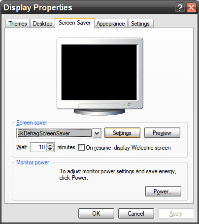
Step 4. Click Settings.
Set your screen saver to “Blank”, last defrag to 4 hours and status bar to Full status bar.
Looks like this:
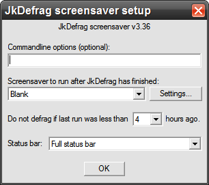
Note that you don’t have to use “Blank”, however it is better overall that you use a screen saver that doesn’t eat CPU cycles at all – and “Blank” is it.
When using this particular screen saver, JKDefrag will auto-defrag whenever your computer’s screen saver comes on – unless it was done fairly recently (less than 4 hours ago).
Basically put, you’ll never have to remember to defrag your drive because it will be done automatically. A defragged drive is a happy drive. :-)
Additional tip:
From the Screen Saver tab click the button labeled Power. From that screen set your monitor(s) to turn OFF after a set amount of time (I suggest somewhere between 10 to 30 minutes). This will increase the life of your LCD monitor. There’s no excuse to have it on when not at your computer.
8. Use a bigger mouse cursor.
On every XP computer I’ve ever used I always set the mouse cursor to “Magnified” and enable the pointer shadow.
Looks like this:
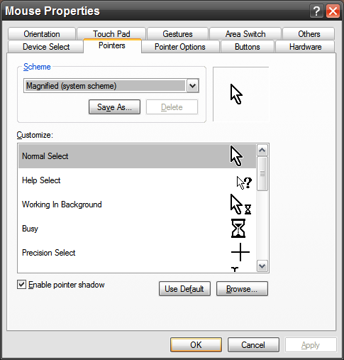
This is available from the “Mouse” icon in the Control Panel and via the “Pointers” tab.
The default mouse pointer in XP is too small and you can lose it easily. With “Magnified” it’s easily located. While it’s true this is a non-animated cursor set, believe me when I say you won’t miss it – because seeing the pointer is more important than it doing some frilly animation.
Also be sure to check off “Enable pointer shadow” at the bottom. This does help with visibility.
Alternatives:
Other mouse sets with XP that work well are black and inverted.
9. Enable “Show location” for mouse pointer.
Even with single-screen setups it’s easy to lose where the mouse pointer is. You can take care of this in short order by going to Pointer Options from Mouse properties and checking off “Show location of pointer when I press the CTRL key”.
Looks like this:
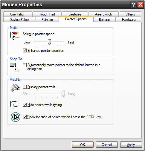
Check off the box at the bottom, click Apply, then tap your CTRL key once. You’ll see an animated circle appear around the pointer once.
This is very handy to have enabled – especially if you run a multi-monitor setup where you can lose the mouse a little too easily.
10. Make the taskbar “taller” so day and date is shown.
“One tier” high taskbar:

“Two tier” high taskbar:

As you can see, the date and day of week is shown when it’s “two tiers” high. This is good info to have at a glance.
How do to it:
1. Right click an empty area of the taskbar. A small menu will appear. One of the entries will be “Lock the taskbar”. If there is a check next to it, click it to uncheck. If there is no check, leave it be and click outside the menu to close it.
2. Move your mouse to the top of the taskbar so your mouse cursor changes to an up/down double-arrow.
3. Left click, hold, and drag the taskbar up one tier.
That’s it. You should see the day and date at that point.
If you don’t like it you can drag it back down to where it was.







10 thoughts on “10 Ways To Make Windows XP Look And Feel Better”
I just applied the Zune theme and made the adjustments you suggested(except the defrag screensaver). This old box feels like a new computer! You guys have done it again. I’ll be able to hold out till I save enough dough for my multi-core build. I’m almost there.
Thanks again
Ronnie