How to embed a responsive Google Map into a website

Maps are an essential aspect of any business website. Even if you’re completely internet-based, customers still like to know who you are and where you live. Google Maps is now the default for many websites as it is the easiest to use, seemingly the most accurate and is free. By the end of this tutorial, you will know exactly how to embed a responsive Google Map into your website.
Default Google Maps are not always responsive so may not scale to different screen sizes. Depending on whether you’re using a WordPress plugin or embedding it yourself using code, may need to add a couple of lines of CSS in order to make the map responsive.
Responsive web design
Responsive is a key term here. It describes web design that takes into account the user experience and device to ensure it is the same regardless of what device you use to access the website. For example, a responsive website should provide the same quality of experience whether you visit it on a desktop, tablet or smartphone.
To do this, the website has to adapt to different resolutions, screen sizes and to touch.
Embedding a responsive Google Map into a website
There are three ways I know of to embed Google Maps into a website. If you use a WordPress theme, it may have the feature built in. You can also use a plugin or you can embed code directly from Google into any website. The first and second options are great for WordPress users, other CMS use plugins too so you’re covered there. The final option, using code should work on most websites regardless of how they are built.

Use a WordPress theme to embed a responsive Google Map
Some WordPress themes will have a feature specifically for Google Maps. As maps are such a fundamental to modern websites, some theme designers have implemented them directly into their designs. If your theme has a map feature, you will likely need a Google Maps API to get it working. You add the API into the theme options and it will talk directly to Google to build the map at every visit.
- Visit this page on the Google website to begin the API process.
- Select the blue Get Started button.
- Select the three line menu icon in the top left of the new screen.
- Select APIs & Services and then Credentials.
- Select Create Credentials and then API Key.
- Select Restrict Key and select HTTP Referrers.
- Select Save.
- Copy the API Key and paste it into the design options page that requires it.
Once you have the API Key you can implement the Google Map into your website using the theme design tools. As long as the theme is responsive, the map should be too.

Use a plugin to embed a responsive Google Map
WordPress uses plugins, Joomla uses Extensions, Drupal uses modules or plugins and other CMS use similar naming conventions. Either way, plugins refer to modular elements you can bolt onto your core CMS to add features. One useful feature is a Google Map. If your website theme doesn’t include a maps element and you don’t want to do the code yourself, a plugin is the next best thing.
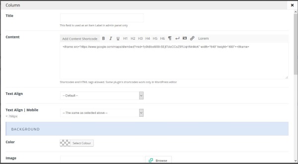
- In WordPress, navigate to Plugins and Add New.
- Search for Google Maps and select a plugin you like the look of.
- Enable it within Plugins and go to its Settings.
- Add the Google Maps API you created above where indicated and Save.
- Implement the plugin wherever you want the map to appear.
Other CMS differ slightly in their naming and menu positions but the principle is much the same. Most, if not all, map plugins will require the Google Maps API to work.
Use code to embed a responsive Google Map
If you don’t use WordPress or other CMS, you can still embed a responsive Google Map. You just need to use code instead of a module. It takes a little more work but will deliver the same responsive maps.
- Visit Google Maps and navigate until the map you want to display fills the screen.
- Select the blue Share link and copy the code from Embed Map.
- Add your specific embed code to the code below between and .
- Add the code within the HTML of your web page where you want to see the map.
- Save your changes.
The code:
<style>

.google-maps {

position: relative;

padding-bottom: 50%; // This is the aspect ratio

height: 0;

overflow: hidden;

}

.google-maps iframe {

position: absolute;

top: 0;

left: 0;

width: 100% !important;

height: 100% !important;

}

</style>


[googlemaps https://www.google.com/maps/d/embed?mid=1y9k8boM09-SEjf7zIoCCsZ9YUqHNnMoK&w=640&h=480]
This isn’t my code, I found it online but tested it out on my website. It works like a charm and should work whether you use a CMS, HTML, Hugo or one of the many other website languages or page tools.


