TechJunkie is a BOX20 Media Company

Home PC Windows PSA: OS X Yosemite Changes the Functionality of the Window Zoom Button

PSA: OS X Yosemite Changes the Functionality of the Window Zoom Button

PSA: OS X Yosemite Changes the Functionality of the Window Zoom Button

There are big changes coming in OS X Yosemite, and some will take quite a while for longtime Mac users to get used to. One such change is the way that the green zoom button now functions in the developer builds of Apple’s latest operating system.

The functionality of the zoom button has never been completely consistent through OS X’s history — in older versions of iTunes it launched the mini player, while in some early apps it expanded width of the window to cover the entire display — but most apps treated the zoom button the same, and users could usually expect it to resize the window to fit the content. No larger, no smaller.

This was particularly handy in Safari, as many websites don’t share a common width, and a quick press of the zoom button would fit Safari’s window perfectly to the currently displayed content.

In OS X Yosemite, however, the zoom button has now become the full screen button, likely a result of Apple’s work to minimize the title and toolbars of its apps. Pressing it mimics the functionality of the separate full screen button that lives in the upper-right corner of the window in OS X Mavericks and earlier.

OS X Yosemite Zoom Button Full Screen

Users can still access the traditional zoom button functionality by holding the Alt/Option key on their keyboards. In doing so, you’ll see the “full screen” arrows inside the button change to the old fashioned “plus” icon.
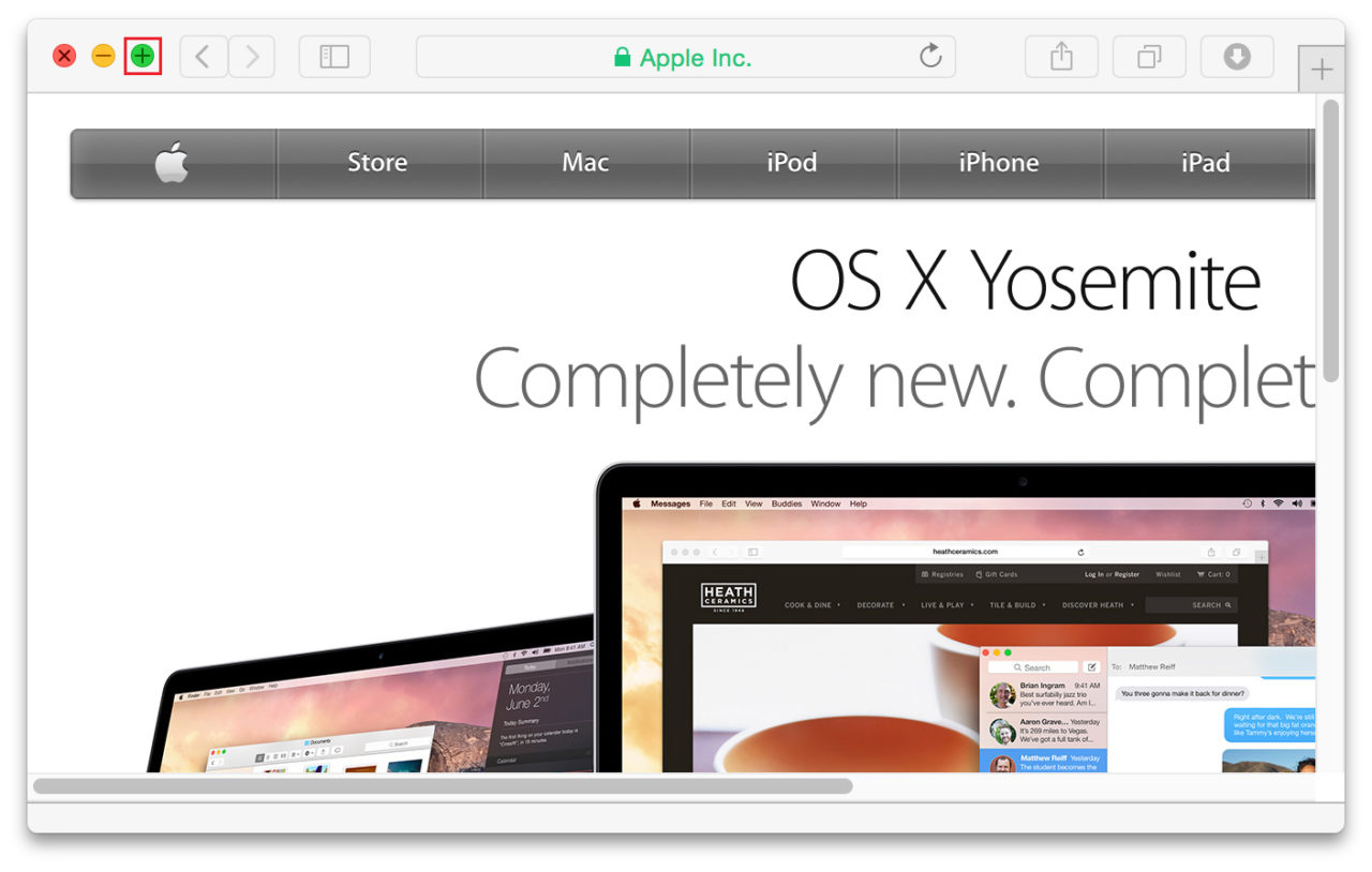
OS X Yosemite Zoom Button Option

We’re sure that Mac users will get used to holding Alt/Option over time, but it’s a jarring change that will make you think you’re going nuts the first few times it happens. Ironically, this new change in many ways reconciles years of inconsistencies and brings OS X window management a step closer to Microsoft Windows. In Windows, the “maximize” button has always made the active window as large as possible to fill the screen. It’s not “full screen” in the strictest sense, but it’s a close equivalent. In helping many users transition from Windows to OS X over the years, we’ve found that it’s also one of the areas that new Mac users find most confusing, as they expect the zoom button to function similarly to the maximize button.

OS X Yosemite won’t be ready for public consumption until the fall, so just about everything in the current preview build is still eligible to change. But it’s not likely that Apple will reconsider this change (there’s simply no other place to put a full screen button in the current design). At best, users who prefer the old functionality can hope that Apple adds an option in System Preferences. It’s also possible, if not likely, that a hidden Terminal command might be the solution. We’ll let you know if one is found.

Until then, just keep one finger hovering over Alt/Option and you should be just fine.

What is a Blacklisted Phone: Verizon iPhone is Blacklisted

Read Next 

20 thoughts on “PSA: OS X Yosemite Changes the Functionality of the Window Zoom Button”

DS says:
Yes, thanks for the alt-key option info
disqus_QzIURhC3et says:
such a stupid feature
Bryce Anderson says:
Seven months on, I’m still frequently going into FullScreen on accident. Never intentionally. I’ve gotten in the habit of just dragging corners. Yay, Apple! You took something that worked and broke it!
Dr. Strangelover says:
Dude, I hear you. I HATE the new functionality. I do not want to go into Full Screen mode, as it inhibits the Cmd-Tab capability; I run dual-screen so the screen supporting full screen is virtually useless if you quickly need to check out another app.

I still need the ability to quickly have a Safari window fill up the entire screen estate without the headache of being in full-screen mode, especially when I am constantly dragging windows back and forth between screens.

Joe Anthenat says:
Just go to Keyboard in System Preferences and add a keyboard shortcut for “All Applications”using the menu item name “Zoom”. I set it for f13 (unused for anything else in my world), now I have a one-tap zoom function that works in any application that supports zooming the window.
p̶e̶e̶e̶l̶a̶ says:
Use OPTION + Click = fill height
Use SHIFT + OPTION + Click = fill height and width
Jordan says:
This is awful. I hate Apple for doing this.
Matt Fletcher says:
I like the idea of fullscreen applications but it’s just too buggy for me. I like to command+tab between windows- I know people who do everything in fullscreen and then do the three finger ‘swipe’ to jump between spaces, but doing that makes me feel a bit nauseous, especially as I’m a web developer and therefore am tabbing between windows at a frequent rate.

This reminds me a bit of “reverse-scroll-gate”. I don’t care what people say, moving your fingers down on a trackpad should relate to dragging the scrollbar not the screen. Who’s with me? Yeah? FIGHT THE POWER, etc, etc.

Baskaran says:
Alt + Green Button = Maximizes Length
Shift+Alt + GreenButton = Maximizes Length+Width
NotReallyHere says:
“Until then, just keep one finger hovering over Alt/Option and you should be just fine.” – sorry there is nothing “just” about this, it’s bloody annoying.
Fiyero109 says:
this is so annoying…..you’d think that the people who designed the iPhone could design a great operating system. Who the fudge wants to fullscreen their windows? add a damn fourth button for that if you want to add it as a shortcut….
windows is so much better at user interaction and ease of use….like having a quick show desktop shortcut (haven’t used my mac desktop for anything really)…..like having damn delete and backspace functionality…..being able to snap the current window to half a screen and better drag and drop and file management (why can’t you cut files?)
disqus_4XEHh5FuN1 says:
Totally agree. Windows does the window management a lot better and more consistent. I’m using RightZoom for years now and it fixes a lot of the, in my opinion, design flaws of Apple. Unfortunately RightZoom no longer works with Yosemite. It looks like Apple prefers worse functionality over copying the behaviour of Windows.
Dave Pearson says:
I use (used to use) BetterTouchTool for window snapping and it’s free. I also use HyperDock (paid) for window previews which now supports window snapping so no need for BTT anymore, however I do recommend it.
veritas007 says:
Half the stuff you mentioned already exists. The other half isn’t quite necessary in a Unix environment. You can cut files, just not quite the same way. The option exists as “Move” instead and can be used in a drag-and-drop environment. To move the file instead of copying it, hold down the command key (⌘) while dragging and dropping a file. The reason it COPIES the file instead of moving it now is for ease of use if you have a Time Machine backup drive. There is a terminal command you can use to change it to move the file by default. Google it. The delete key and backspace key work synonymously, however an option to go to the front of text and use the delete key to erase that way seems to be lacking (or at least I haven’t found it). The snap window function is called Aero Snap and is trademarked by Microsoft, so Apple isn’t able to add in that kind of function without getting a lawsuit. That said, there are third-party apps you can use to add a function like that in. HyperDock is a great example. As for the file management system, I find it superior to Windows file management system. I do use both systems (as well as several other Unix OS’s) on a daily basis and I find the file management system (especially if you use terminal) in OS X is waaay better. I can expound on this if you’d like. Too lazy to type it all out now.
Ben Stones says:
You can also cut and paste a file into a new location by copying it first (CMD + C) and then pasting it using CMD + ALT + V.
Jesse Riggins says:
I really thought that I might be the only person that felt this way.
Kevin Robert Broten says:
having multi monitors this full screen button is useless. it makes the app take over all screens, blanking out the rest.
TekRevue says:
Kevin, go to System Preferences > Mission Control and check the box Displays have separate spaces. I agree that Apple needs to further improve the full screen functionality with multi-monitor setups, but this should let you use other apps while one monitor has a full screen app.
Fabio says:
Actually, double clicking on the window title will maximize the old way (not every app responds to that, such as Chrome). Finder, mail, and I guess the new redesigned apps respond to double clicking the title bar. I would have done the other way around, and maximize should work the way Windows and Linux do.. just resize the windows to fill the screen in BOTH directions… that’s my 2 cents…

Edit… whoops..it’s been said already…

Guest says:
Apologies if this has already been said, but you can also double click the top of the window to access zoom / maximize.
Michael Masek says:
THANK YOU! I was going crazy with out this, trying to resize all of my windows :)
Tanner Caputo says:
You can double-click on the status bar to fit to content & Shrink down to the original size.
Turbojacket says:
It would be nice for some apps. I wish Photoshop or Illustrator would natively support OSX Full Screen. But not Safari. No way. Most websites are designed at 900px to 1000px in width. On my 27″ iMac that’s a ton of wasted pixels when it blows up to massive size. When I came over from Windows in 2005, I’ll admit, it was a bit to get used to, but once you get over the fear of empty space, it’s quite nice the way OSX handles windowing. Now I can’t stand “maximize” in Windows in browsers. Everything just balloons up an hijacks your screen space!
Turbojacket says:
Annoying. Fit to content always made the most sense to me. Why fill valuable screen space with white? I’d rather have my Finder window in the unused space, or a chat window, or an iTunes window. Anything really, but what does white give me? Nada.

Did not know about the option click though. At least it’s still kinda there. Just another whacky thing to get used to with Apple. Still better than Windows I suppose. I just find the “Full Screen” of OS X slow, cumbersome, and very in your face. Never cared for it.

xypaul says:
They should have left the full screen button and turned the + button into maximise, just like windows. That’s the easiest to use, as it’s very predictable.
Nick Athawes says:
I think this will be a welcome change for me, since i never click the ‘plus’ button anyway.

….now that i think about it, i don’t use applications in full screen mode either…

ilikepear says:
Nice find! Thanks for this!

Leave a Reply

Your email address will not be published. Required fields are marked *


Jim Tanous

Jun 5, 2014

676 Articles Published

More