ES File Explorer PRO Review: Is The Paid Version Worth It?
One of the great things about Android is that you can take complete control of your files and how your device handles them. I’ve been using ES File Explorer for a number of years now for just that reason, and I’ve really liked it. But since the PRO version of the app is out now, I thought I had better take a look at it.
Both the ES File Explorer and the PRO version of the app offer a range of great features, such as a web browser, a “junk cleaner” notification, recommended apps, and so on. Users can see all their files in the way that they want, with icons, details, and so on.
Despite the fact that both apps are great, ES File Explorer, or the standard version of the app, has taken a hit of late. It seems as though ES Global has taken a pretty frustrating and debatably unethical approach in order to promote the ES File Explorer PRO – that is, rather than make a new app that’s a lot better than the last, it has made ES File Explorer worse, making the PRO, paid version, seem better. I myself am not opposed to unconventional methods of monetizing apps – money is what keeps developers going – but ES Global’s way of doing this isn’t something I would consider to be ethical.
In defense of ES Global, both apps still work great, In fact, you would be forgiven for thinking there’s no difference between them. ES File Explorer PRO essentially offers users a chance to remove some of the more annoying parts of the standard version of the app, as well as adds a number of customization options. For example, users can set their start page and their default windows in the PRO version, something that used to be available in the free version, but was removed and replaced with a simple “homepage.” While the standard version opens up to this home page, the PRO version tellingly opens up to the folder view, which is where most other file managers begin.
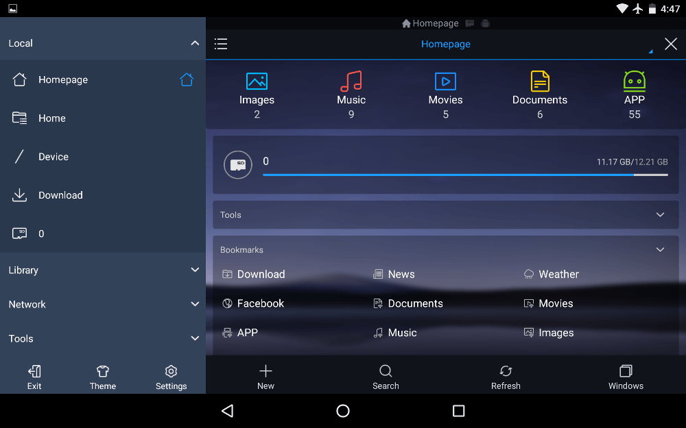
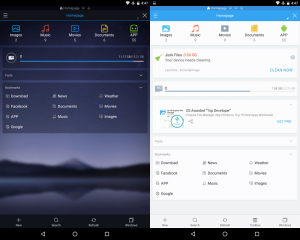
ES File Explorer PRO also has a different starting interface, which is a little darker and shows off the options to change backgrounds and themes. Users also have the ability to download other themes from the Google Play Store, and most of those are only available for PRO users.
Apart from those customization options, it almost seems as if the PRO version of the app is a little stripped down – like ES Global realized that the free version was getting a little bloated and decided to offer a potentially easy to use version, which is the PRO version. This is shown off by the fact that on the bottom right of the PRO UI can be found a “windows” button, which enables users to see the different windows that they have had open within the app. On the free version, however, that button is replaced by a “more” option, which, upon being pressed, allows users to either go to the “windows” view, or to use the app cleaner, which is aimed at removing files that aren’t needed on the user’s system.
Last but not least, PRO removes the ad, that will occasionally pop up in the standard version, but is rarely present and always out of the way.
Conclusions
ES File Explorer PRO costs $3, which is $3 I recommend you save. The new version of the app is great, but it’s not that great compared to the free version, and while it’s nice to be able to get to your windows view from the home screen, it’s also nice to get to the cleaner view. All this talk about views, however, is pretty insignificant. I don’t like the fact that ES Global is pushing PRO by making the standard version a little worse, and I don’t think removing the occasional ad is worth $3. The only draw I can see is that the Google Play page says that the “team will keep improving the app and strive to keep it the #1 most powerful file manager for android” in a section called “what to explect.” Until then, however, you have $3 you can spend somewhere else.


2 thoughts on “ES File Explorer PRO Review: Is The Paid Version Worth It?”