
TechJunkie Expert Recommendations

It’s no secret: technology has completely revolutionized how we go about our daily lives. Over the past ten years—basically since the release of the first iPhone—everyone from students to business owners to content creators have turned to smartphones to keep track of our lives. Nowadays, it’s commonplace to rely on our Android phones and tablets for all sorts of tasks and information. There are plenty of applications out there promising to boost your productivity or focus, but with so much choice in our applications, what’s really the best of the bunch?
Testing a hundred productivity apps isn’t going to do much but erase your own productivity—so luckily for you, we’ve tested them ourselves. From word processors and spreadsheet creators to apps designed to keep your focus and attention on the work at hand, our list has something for everyone. No matter what you’re looking for in a new productivity app, our top ten selections should be downloaded on every new Android device in your selection. So, without further ado, here’s our top-ten productivity apps for Android. Just make sure you read our list off the clock.
Compatible With

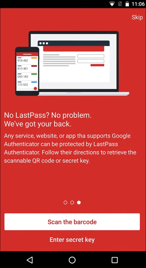
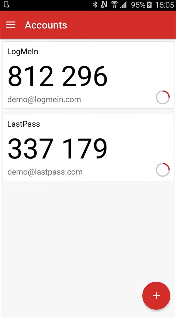
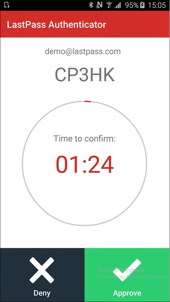
We’ve all heard the news reports, or read the articles online. Left and right, companies seem to leak and lose customer information, including names, addresses, credit card info, and passwords to hackers online. It happens everywhere: Verizon. Walmart. Twitch. Yahoo. Yahoo again. Huge companies that you supply with your personal information, data, and passwords simply appearing in public discourse one morning, for anyone with enough time and effort to search through and find.
You can’t stop companies from getting hacked and taking your information—unless you’re willing to live off the grid, giving up technology, banking, and all other sorts of modern-day conveniences for the small peace of mind that your information won’t be stolen. But that’s a pretty big life decision—and for most of us, impossible, unless we choose to make some major life decisions and changes—so instead, we can get proactive about our data. Stop using the same, simple password for your accounts over and over. Instead, make the change to a password manager, a decision millions all over the world have made, and make sure the companies trusted with your password and private information aren’t the only ones capable of protecting your information.
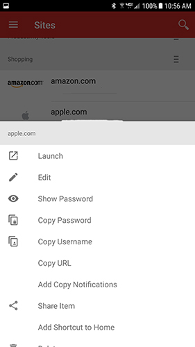
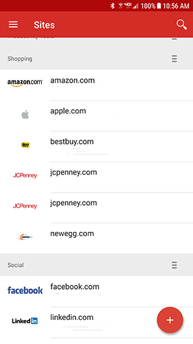
Lastpass is our favorite password management app on Android, for a few different reasons. First, the app has a fully-featured free tier that gives you nearly every option you could ask for out of Lastpass, making it easy to log into your accounts on your phone, tablet, and PC. With plugins available for most major browsers—including some selections on mobile, like Dolphin Browser—you’ll have no problem logging into any of the accounts on your device. The app features fingerprint support, so you won’t have to type in your (preferably long and complicated) master password into your fingerprint-enabled devices.
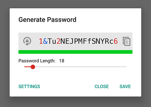
The syncing in Lastpass works well, quickly and effortlessly loading in new accounts whether we add them from our laptop, desktop, or anything else. You can jot down notes and labels for each of your accounts, and even sort by category when looking for specific web pages or logins. The app can automatically create a unique password for your applications, generating passwords with uppercase and lowercase letters, numbers, and special characters—so no matter what your new app login requires, Lastpass can fill in the blank for you. Even better, when you’re generating an app, Lastpass gives you an option to keep your password pronounceable, making it easier to remember the spelling and pattern for when you aren’t logged into Lastpass on a new device. And if you prefer to keep your browsing just as secure as your accounts and passwords, Lastpass includes a built-in browser within their application, making it easier to keep all your logins in one place.
We mentioned Lastpass is a free application, but as you’ll find with most productivity applications, there’s a paid tier here as well. While the free version of Lastpass will provide most users with everything they need out of a password manager—and more—Lastpass Premium offers a few additional features at ust a $12/year subscription (breaking down to $1 a month). Included with Premium: family password sharing with a built-in shared family folder, 1GB of encrypted file cloud storage, ad removal, desktop fingerprint authentication (if your computer supports it), and additional priority support features.
Overall, though, we think you’ll find the standard free version of Lastpass to be more than you need in a password manager. Gone are the days where one master password for every account and device will keep you secure. Instead, each service you use should have its own unique password, preferably long and with assorted characters, numbers, and letters. It’s a real pain to try to manage all your passwords on your own—so don’t. Lastpass is a great free solution to a long-troubling problem. The next attack on a major service or application will no doubt happen sooner than you think. While we can’t reliably stop these data breaches from happening, apps like Lastpass can at least offer us some additional security. And if Lastpass isn’t for you, check out 1Password or Avast Passwords, two more great choices for password management.
Compatible With
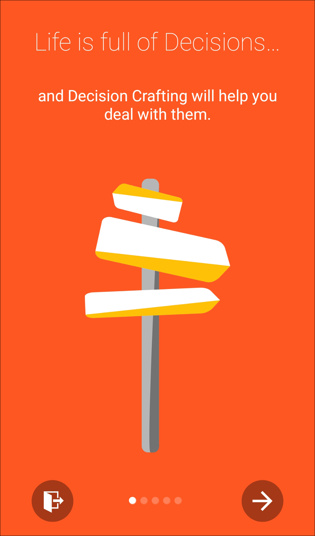
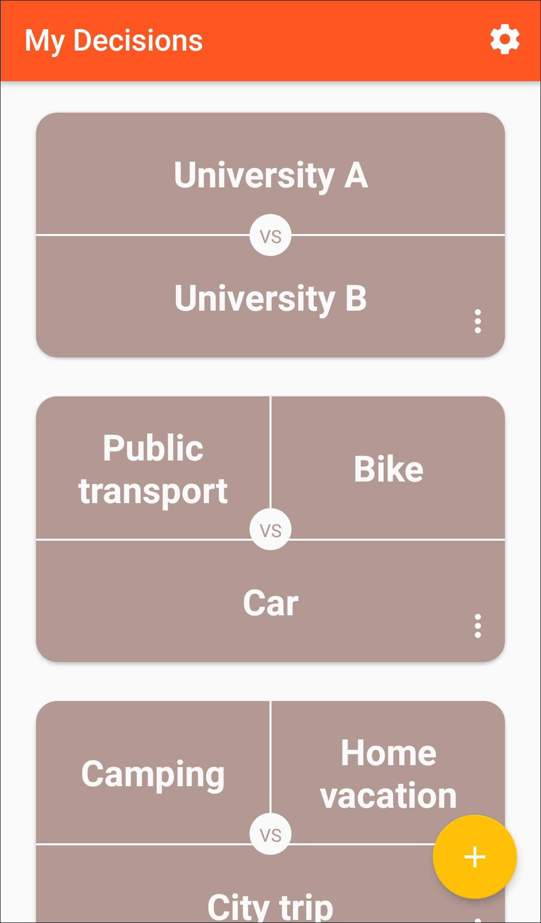
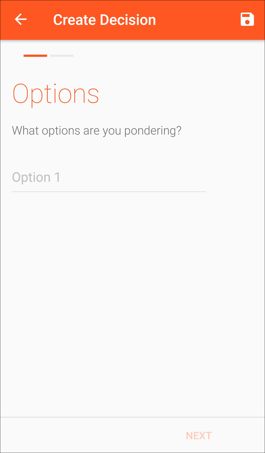
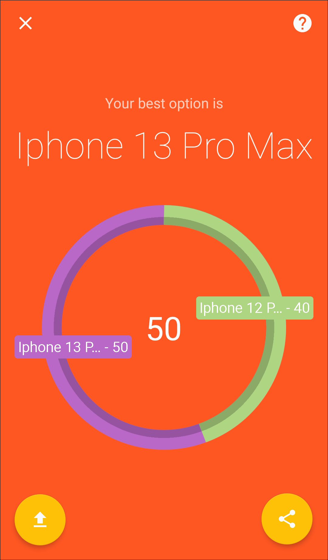
Decision Crafting is a fairly new application on the Play Store, but we found it to be such an interesting concept—something we hadn’t seen done before on Android—we had to list it among our favorite productivity apps on the Play Store. Productivity might seem like an odd categorical sort for Decision Crafting, but in our experiences, procrastination and a lack of productivity can often lead from indecision and a lack of certainty. This might seem like a strange offering, but once you start using the app properly, you’ll be shocked at just how handy this app can be.
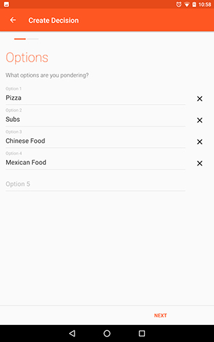
The first display of the app is rather blank, a clean-looking design laid out following material design guidelines to a T. There’s no sliding menu here to speak of, but the app does include an action button in the lower-right hand corner, and a triple-dotted menu button in the upper-right, giving you access to backups, restoring options, tips, a donate button, and a slider control menu (more on that in a moment). Tapping on the action button in the lower-right will open up a new “decision” creation menu, beginning with your options. Decision Crafting can be used for decisions of any size and variety, from where to eat dinner or what movie to watch, all the way to where to go to college or which job offer to accept, and the easiest way to demo just how handy this app is by walking through how setup works one step at a time.
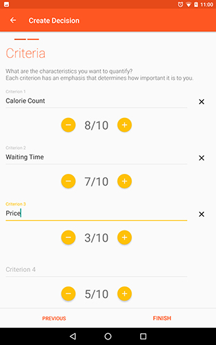
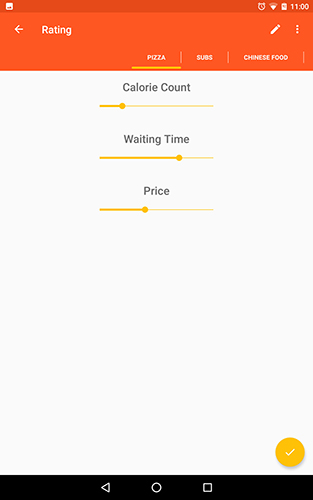
You begin by inputting the options you have to pick from (names of restaurants, schools, movies, etc). From there, you input the criteria for each selection—think about what you want out of a movie, restaurant, or school selection. You can input as much criteria as you want, and assign each one an importance rating out of 10 (or, if you prefer, you can change to the slider control menu we mentioned above). After you’ve typed in your various criteria, hit “Finish,” and you’ll load an entire new display. This is where you “rate” each individual selection; for example, if you’re trying to decide where to eat for dinner, you can rank the restaurant by how packed the place typically is, how fast or slow the food is prepared, the price of food on the menu, and whether vegetarian or vegan options are available for selection. At any time, you can change the criteria and selections for decisions you made above as you rate your choices. Once you’ve rated every selection based on your chosen criteria, select the yellow checkmark in the lower corner to return to the main display—and for the real magic of Decision Crafting to begin.
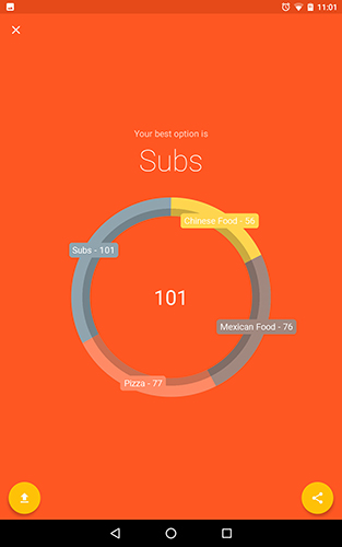
Decision Crafting will, using the metrics you laid out for both how important each criteria ranks and how each choice ranks at every criteria, put your decisions through a formula and determine the decision that’s right for you, along with a helpful circular bar graph that displays how each restaurant ranked in the competition. You can share and export the data, though without the formula used to calculate the decision, it might not do you a ton of good beyond displaying the data for everyone around you to see and comment on. Every decision you create through the app is saved on the main display page inside the app, and can be accessed and modified at any time. The winner of each decision will also be shown from this page, highlighted in a darker gray than the other choices on your decision graph.
The app isn’t perfect. As it stands right now, the app is only at version 1.0.10, and it shows—currently, it’s a bit bare-bones beyond the central premise. We’d love to see modifications that allow you to see the formula used to calculate your choices, as well as a night mode or variations on the general theme. Still, it’s a great start for an application, one that we actually think will come in handy in a multitude of situations. From date-night or movie-night decisions to purchasing options to major life events like where to move or what to study in school, we could see Decision Crafting becoming a serious gamechanger when it comes to helping those of us who happen to be (or happen to live with) the decision-anxious. We’re excited to see the next few versions of this app, but even in its early mode, it’s definitely worth checking out.
Compatible With
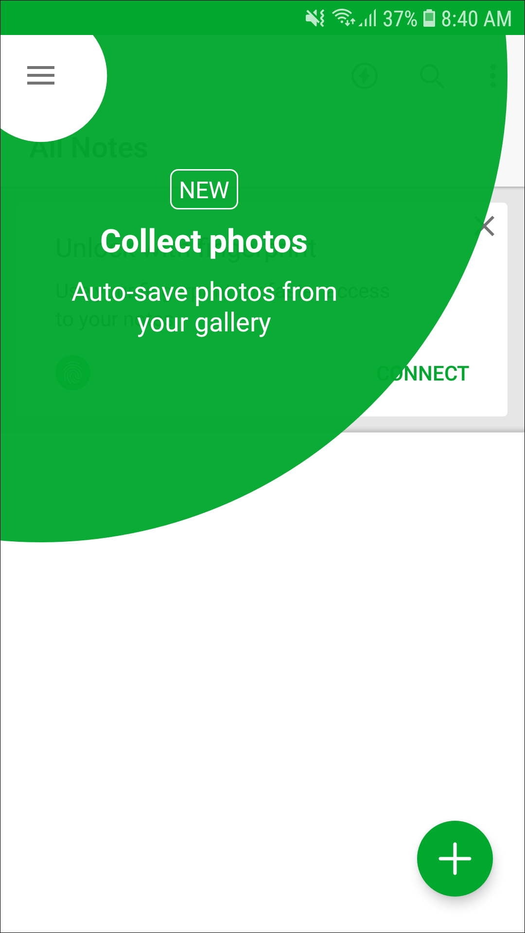
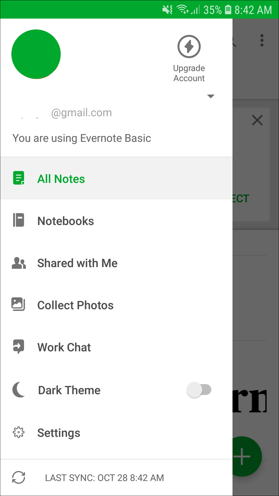
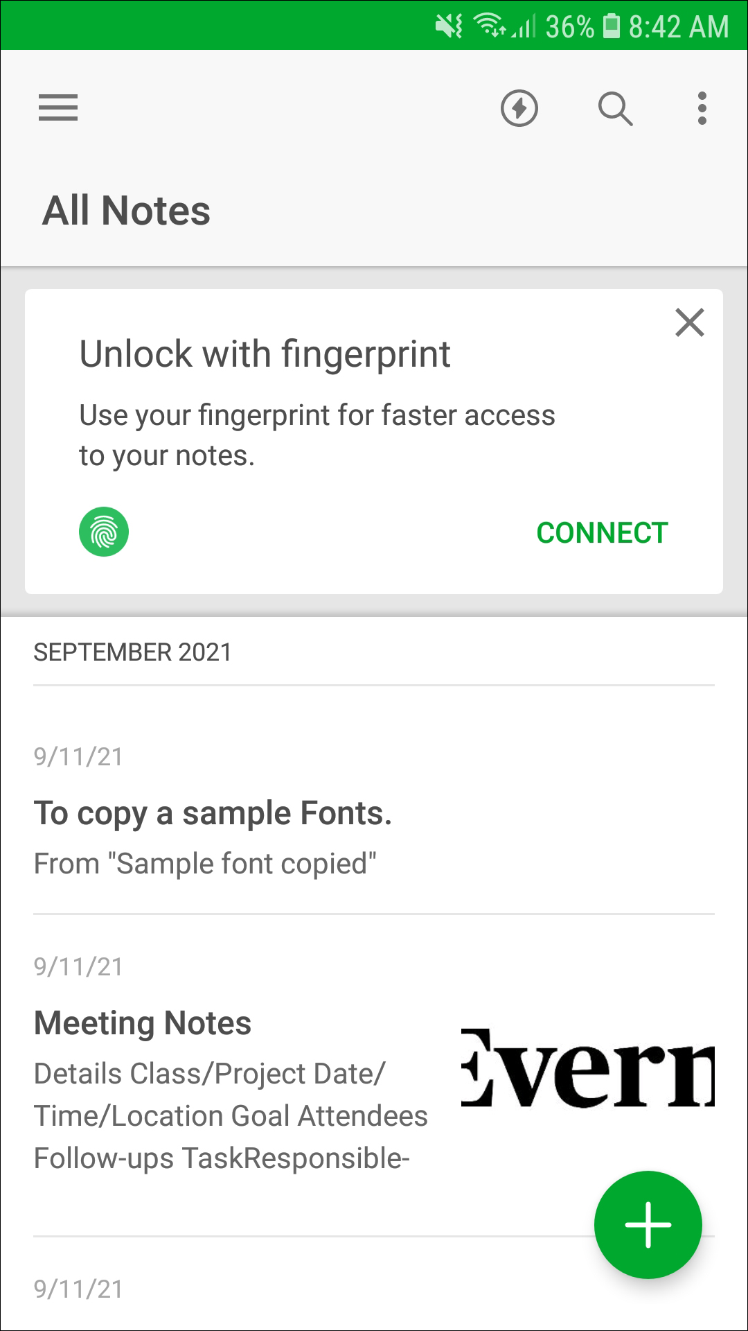
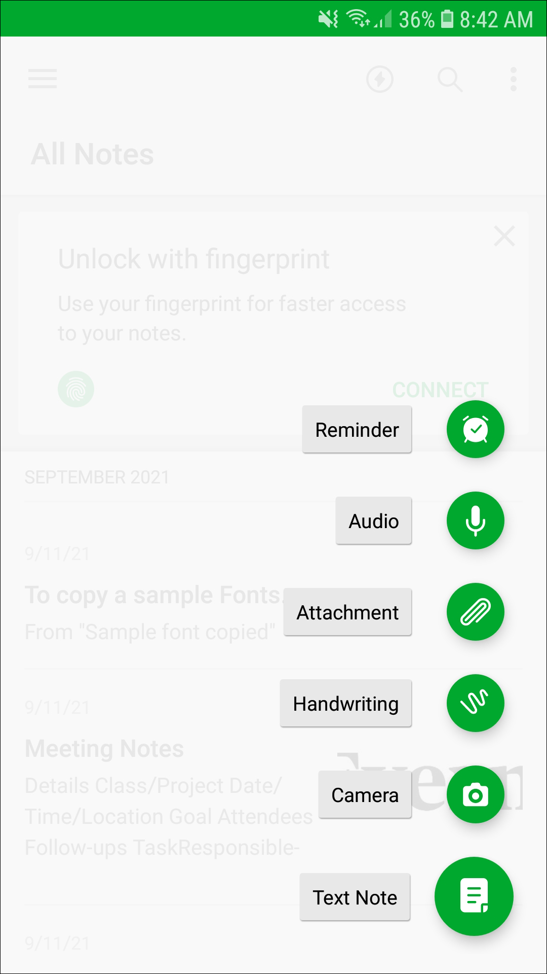
When it comes to productivity apps on Android, Evernote is probably the first application on your mind—it’s that good. The classic note-taking app has evolved a lot over the last half-decade, and even as other up-and-coming note apps have challenged the throng, Evernote has stayed strong, with reliable sync between devices and browsers, a wide variety of methods for taking notes and lists, and some of the best organization options in the game. If you’re looking for the best productivity apps on Android, you’re probably already a tried-and-true Evernote user—but if not, you’re in for a great experience.
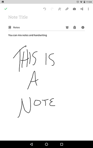
Let’s start with the most important aspect of any note-taking app: the actual experience of taking notes. Evernote is packed with features for writing down your thoughts, classroom notes, to-do lists, D&D campaigns, sketches, plans for the weekend—anything you can think of, Evernote has a tool to host it. Every note is held in specific notebooks, so your plans for your family reunion don’t mix in with last week’s shopping list. The app has support for checklists and to-do lists, making it easy to save anything you might need in an easy-to-read format, and every note is searchable, so notes never get lost in the shuffle. Every note can hold multiple formats of information, including text, sketches and handwritten notes, photos and video (either from your camera or pre-saved on your device), audio (again, recorded from your microphone or from existing sounds on your phone or tablet), PDFs, information saved from your browser, and more. You can even use your camera to scan and comment on paper documents, allowing you to keep every piece of info in your life saved to both your device and the cloud.
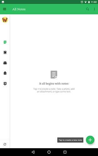
Evernote doesn’t just stop at allowing you to take your own notes, though. The app also has a robust collaboration tool built-in, and while it doesn’t quite meet the heights of Google Drive’s sharing integration, it’s still an excellent tool that makes Evernote a proper tool for your business or enterprise. Not only can individual notes and notebooks be shared and worked in at once, but you can comment on documents, search photos and images with annotation support to provide feedback to your teammates, and highlight work you think is complete or needs additional changes.
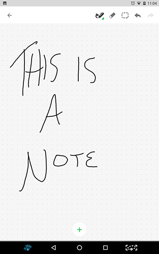
But, of course, everything we’ve mentioned up to here can be done and done well by a thousand various apps on the PlayStore. Two features make Evernote special: first, the ability to sync your notes is not to be underplayed. Everything you write, input, draw, photograph, record, or capture on Evernote is automatically saved in the cloud, able to be accessed from any device you’re signed into, including phones, tablets, and PCs. In our testing, Evernote’s testing is flawless, syncing your work from one device to another without any delay. It’s really impressive for a company not named Google, and it shouldn’t be underplayed—and neither should Evernote’s other marquee feature, search. Search in Evernote is unlike any other search function in other note apps we tested—Evernote can not only search your own text and handwriting, but search literally included inside of photos. Using search to find information in photos of documents or written notes from others is nothing short of futuristic. It feels magical every time we use it.
The biggest flaw in Evernote’s note-taking suite is the pricing. Evernote has a free tier, but it’s incredibly limited when compared to some of the other note-taking products out there. Here’s what you’re getting for free: an incredibly-limited amount of storage for your docs and photos (60mb of new storage per month), sync limited to two devices, text search within images, passcode locks, and of course, all the standard note features we highlighted above. And here’s what you aren’t getting on the free tier: offline notebooks, PDF text search, business card scan, customer support of any kind (seriously, we checked), Office doc search, note history, and PDF annotation—among other things. To gain access to some of those features, you’ll have to pony up $34.99 a year, and you still won’t be able to use over half of the features we mentioned above. The $34.99 tier also limits you to 1GB of storage per month, but it does allow you to sync as many devices as you’d like. If you want every feature Evernote offers, you’ll have to jump to the Premium plan, at a pricey $69.99 per year. In addition to unlocking every feature with Evernote, you’ll also gain 10GB of new storage per month—but at nearly $6.00 a month, you’ll have to pay for the privilege.
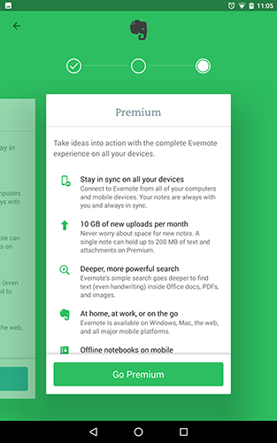
And that’s really the biggest problem with Evernote—for most users looking to jump into the best in class note-taking suite, you’ll have to pay quite a bit to unlock every feature included in the app. We aren’t against paying for services, but Evernote’s free tier is so anemic when it comes to features—seriously, there’s no support for free users—that we can’t help but feel like their platform has gone a bit too-far in trying to organize their pricing plans. Still, if you’re interested in some of the features of Evernote we outlined above, you’ll want to check out their app anyway. When used as a trial, the free tier is respectable, and can get you a good feel for how the app works, syncs, and functions. But overall, if you’re at all interested in truly utilizing the power of Evernote, you’ll have to upgrade to at least the mid tier, if not the full-fledged $69/year plan. And for a lot of users, that might be just a bit too steep.
Compatible With
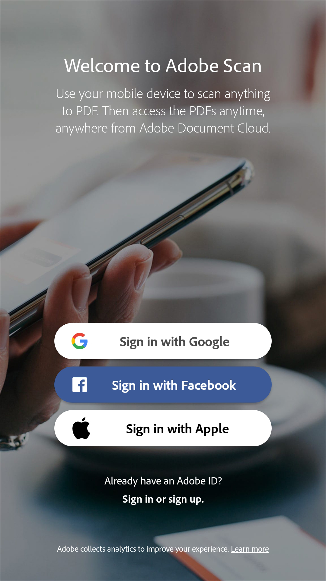
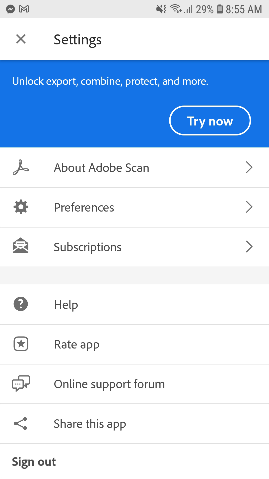
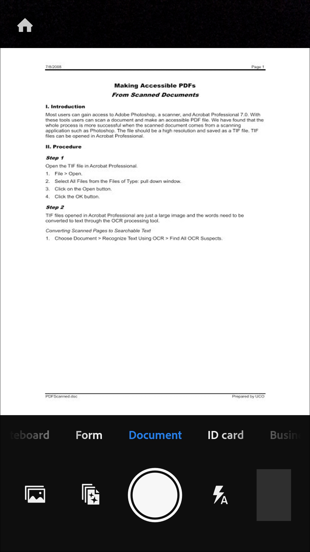
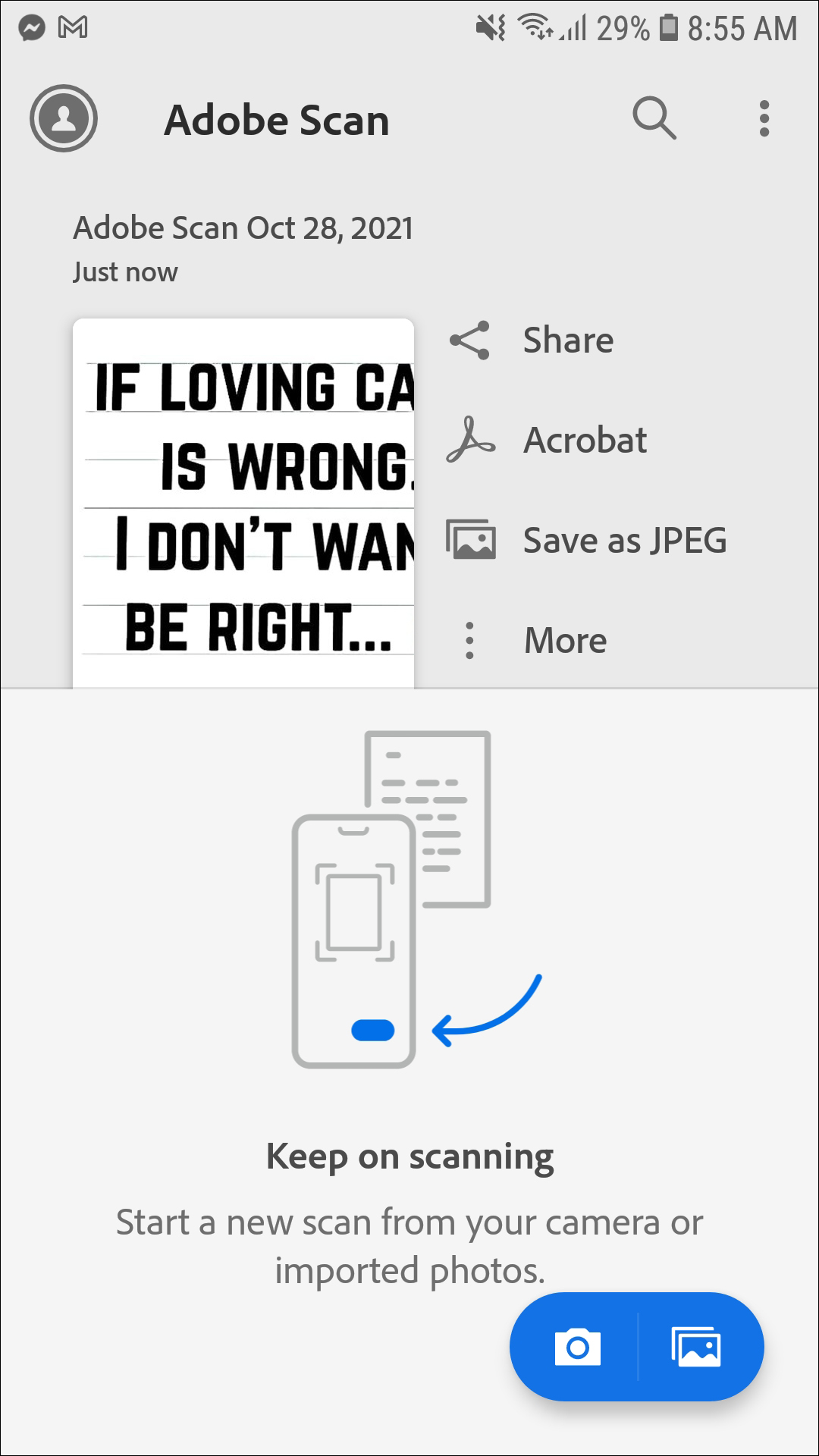
Adobe Scan isn’t quite as robust an application as some of the other apps featured in this list, but that doesn’t mean you should ignore it. As a utility, we found Adobe Scan to be super reliable for what it’s meant to do: scan paper documents into a tablet or phone for conversion into a PDF file. It can automatically recognize text and turn, according to Adobe, anything into text, including paper notes, documents, pictures, business cards, whiteboards, and more, into a searchable document. This is a great tool for anyone looking to scan documents on the go—but it isn’t perfect, and some of the limitations might be a bit too much for some users.
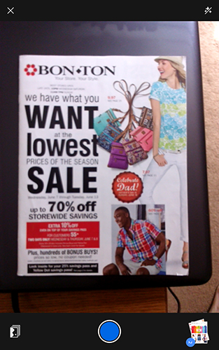
First and foremost, this is an Adobe app through and through. While the app is free, and doesn’t require an Adobe Creative Cloud purchase to use, you will have to either make or sign in with your Adobe ID from the get-go. From there, the app will immediately load into a camera capture mode, allowing you to capture any paper document—whether it be handwritten or typed, and no matter the size. Obviously, the quality of the scan depends on a few different factors: the quality of your device’s camera, the amount and quality of lighting in the area where you’re capturing your document, and how still you can hold your hands for the amount of time it takes to scan your document. This isn’t an incredibly-fast process, taking about 10 seconds or so to grab an image. If you happen to suffer from shaky hands, you may find your scans will have to be redone.
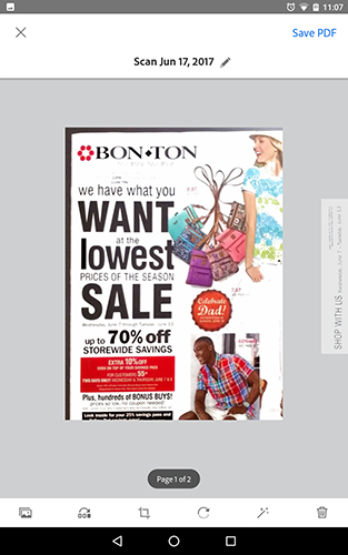
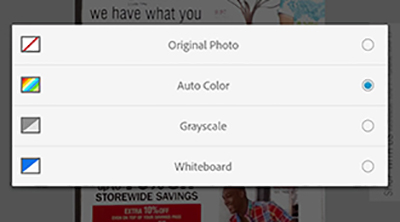
Once the scan is complete, you can view your scan in the lower-right hand corner of the application. There are a few different options for editing your scan. First, you can change your settings for the color of your scan. By default, Adobe Scan will try to optimize the color, brightness, and contrast of your photo, but the text can often come out looking washed out. Using the color tool, you can change your scan from the “Auto Color” setting to display the original photo, a grayscale version, or a “whiteboard” setting, which essentially ramps the brightness and contrast in your image up to, frankly, unusable levels for a photograph—though, if you’re using this app to take photos of whiteboards, this might be perfect for you. Other tools include rotate and crop, essentially must-have tools for any PDF-scanning app, and they work exactly as you’d expect. You can reorder your scans before saving them together as a PDF, and you can delete scans right from their display page. Finally, adding another photo is easy—just tap the icon in the lower-left corner and select “Take another Photo.”
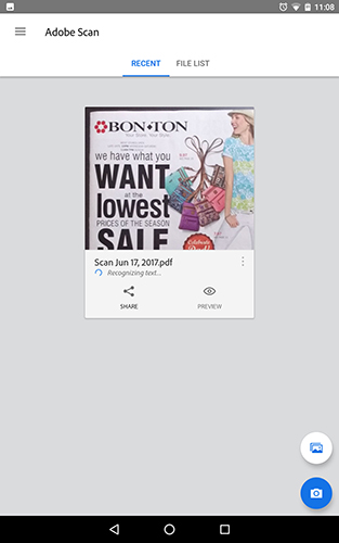
Beyond these editing tools, there isn’t much else to Adobe Scan. You can, of course, save and export your PDF, which will be saved on both your device and in your Adobe Cloud documents folder, where it will work to recognize the text in your document. You can share and open the document in Acrobat right from the app. Unfortunately, if you were looking to open the document in a different PDF reader, you’re out of luck—tapping “Open in Acrobat” without Acrobat Reader installed on your device will simply provide you with a link to download the app from Google Play. There are a few other features and sync solutions included hidden away in the app, including the ability to convert PDFs to Office-compatible documents, and inclusion of Adobe Fill and Sign, another useful Adobe plugin for your phone or tablet.
And that’s more or less it. Adobe Scan is a one-purpose application, and while there’s nothing wrong with that in theory, we’d love to see this functionality built right inside of Acrobat to prevent clutter in our app drawers. The only major flaw in Adobe Scan’s service relates to their auto-capture feature, which can be easily disabled from the camera viewfinder, making it a non-issue. Adobe Scan might seem like an odd conclusion since this app won’t be worth a download for some people. If you take a lot of handwritten notes, or you deal in documents regularly, you’ll want to grab this one right away—if you haven’t already. For everyone else though, while it might be a handy utility to keep on your phone, it’s by no means a necessary addition to your device.
Compatible With
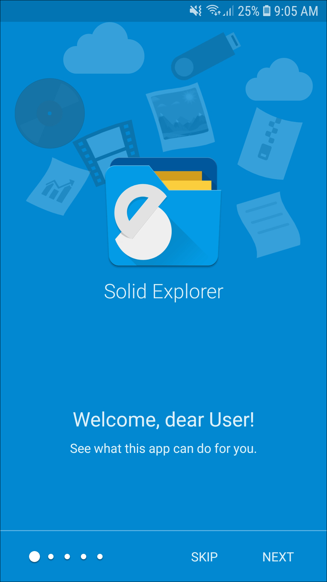
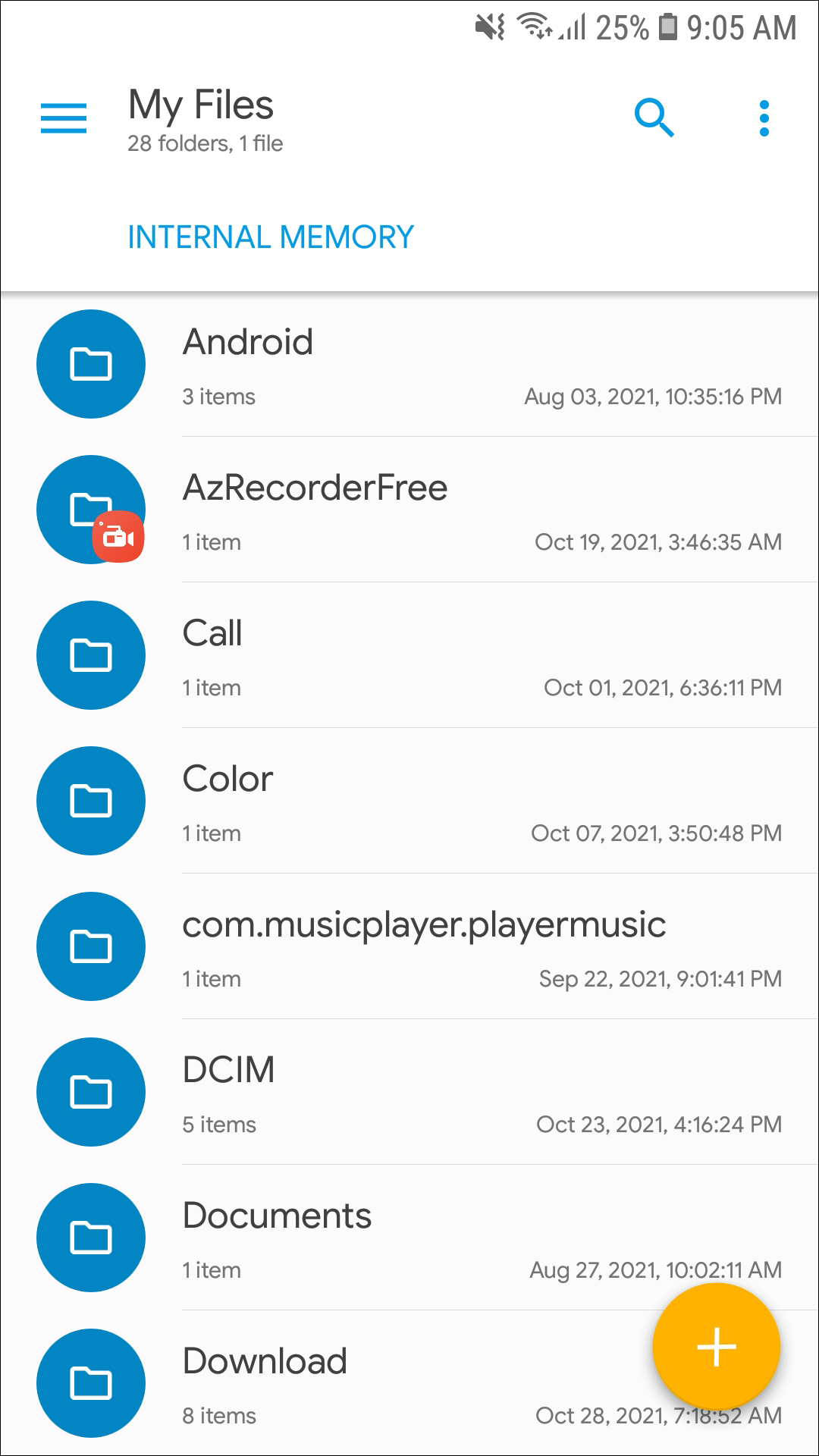
We’ve all been there: you’re working on an assignment or a project on your phone or tablet, and you realize the file you need to view is buried somewhere on your device. One of the benefits to Android for years has been the ability to access your phone or tablet’s file system without modifying or hacking the ability into Android. Whether you’re trying to move files around, access your downloads and documents folder, or view files and folders on external media like an SD card, a good file explorer app is essential to any work-focused Android user. And since Android 5.0, our favorite file browser has been Solid Explorer, an app good enough to be considered a must-download on any device.
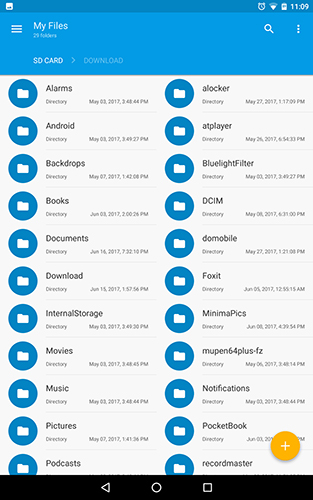
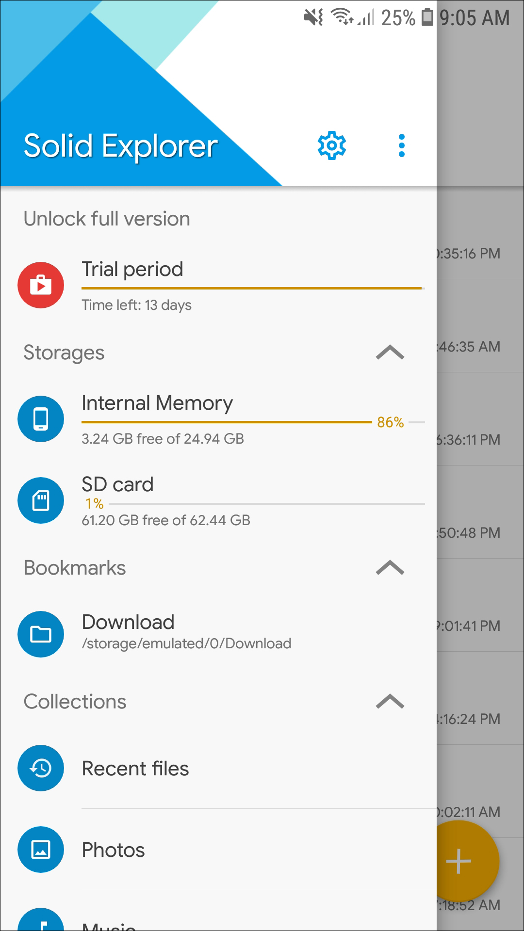
Solid Explorer is a file browser focused on simplicity, design, and features. Upon opening the app, the first thing you’ll notice: Solid is doused in material design—and the app looks amazing. Solid can be themed and customized to your liking, with light, dark, black, and auto themes available inside settings. We’re big fans of when apps support auto-dark modes—Textra, one of our favorite SMS apps for Android, does the same thing, and it looks and feels incredible. Solid doesn’t stop there: you can change the primary and accent colors (by default, these are set to blue and yellow), the color scheme, and even the icon set inside Solid (set to circles by default, a good match for Android 7.0 Nougat).
But no matter how customizable an app is in appearance, a file browser is only as good as its ability to move and access files. Luckily, Solid excels in spades. By default, the app is easy to browse and use through your files, opening on the standard file view, and allowing you to access folders quickly. Once you find the file you need, opening it is as easy as tapping on the file name. Most apps have an app assigned to open those file type already, but if not, Android will ask you to choose an app to access that file. For example, tapping on a downloaded PDF gave me the option to open the file in Google Drive, Google’s PDF Viewer, Microsoft Word, or Xodo, as well as the option to set that app to open those files once or always.
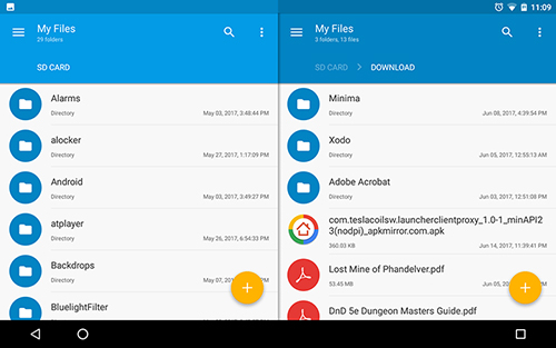
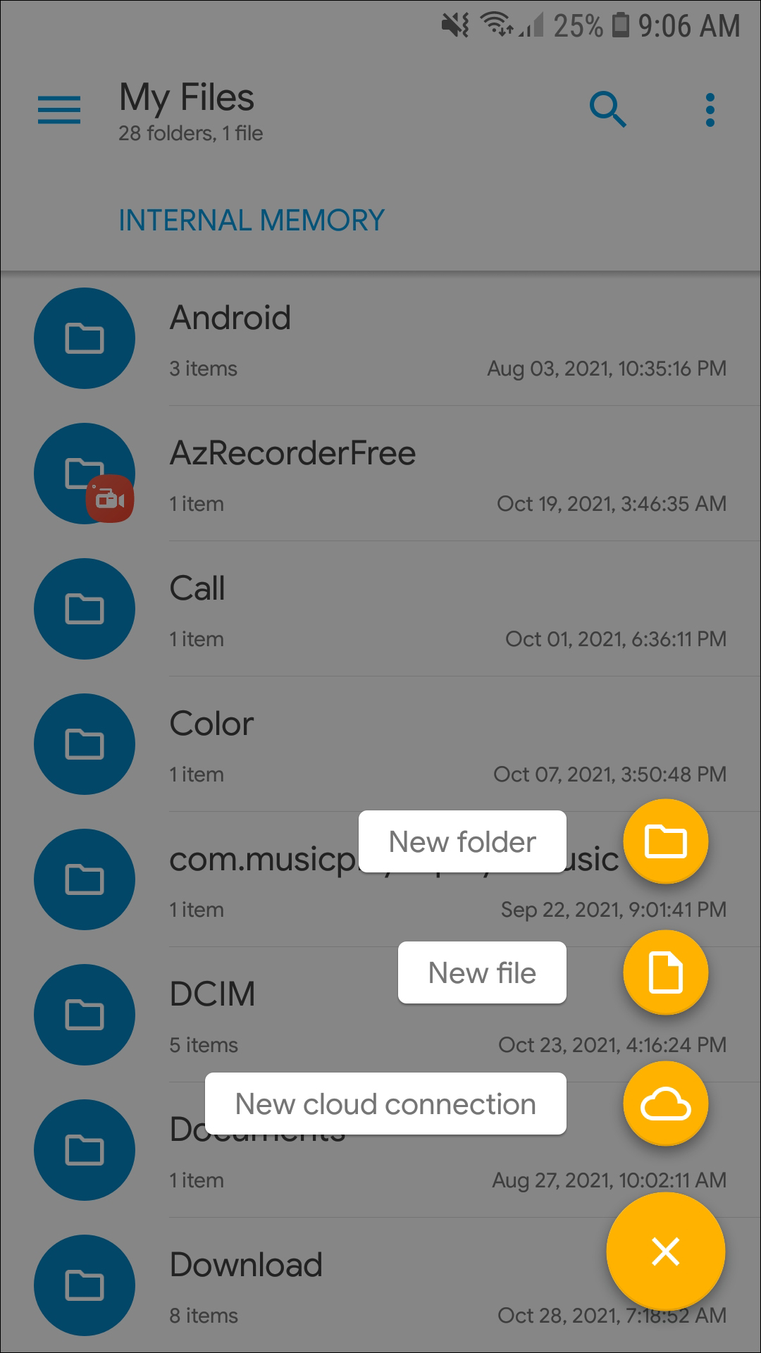
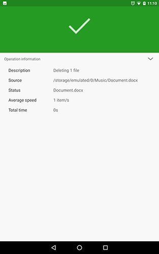
Long-tapping on a file gives you various options for moving and sharing a file: you can cut and copy the file, send it to the trash, share the file through an additional app, archive or encrypt the app, and even create a shortcut to that file. Cut, copy, and paste works well here, too, making it easy to move multiple files and folders around your device at once. Solid even gives you a progress bar for each data transfer. On tablets and larger-screened phones, Solid works better in landscape mode. By default, Solid allows you to have two separate panels in landscape, making multitasking a breeze. This is especially effective for phones and devices with both internal and SD card storage, making it easy to move videos, music, downloads, and other files between the two storage spaces.
Solid Explorer isn’t just a standard file browser app, though. Solid can also access your cloud storage apps from a dozen different cloud services, including but not limited to Google Drive, Dropbox, OneDrive, Box, and SugarSync. The app can even utilize LAN/SMB connections for accessing your home computer, and FTP, SFTP, and WebDav server connections for accessing server storage centers at your home or business. By implementing these cloud and network-based connections into Solid, moving files from your tablet or phone to your laptop or desktop, and vice versa, makes working on files on the go that much easier. And as if Solid decided it wasn’t enough to offer those services by default, you can download additional plugins for Solid from the Play Store, adding support for apps like Mega and even USB-based devices.
Solid isn’t a free app, but the trial does last 14 days before asking you to pay—and the unlock key only runs you $1.99. Some of the plugins downloaded from the Play Store are an additional cost, but at only $.99 per item, it’s a fair price for what is, hands down, the best file explorer app on Android. We don’t have a whole lot else here to recommend: ES File Explorer used to be our top free pick, but the app became run down with bloatware and adware throughout 2016. There are a few other choices on Google Play: Astro, ZenUI File Manager, and NextApp’s File Explorer app are all decently-reviewed applications, but none of them come close to touching the greatness offered with Solid Explorer. Definitely check this one out.
Compatible With
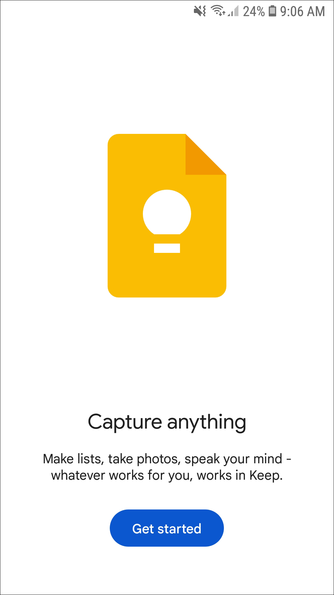
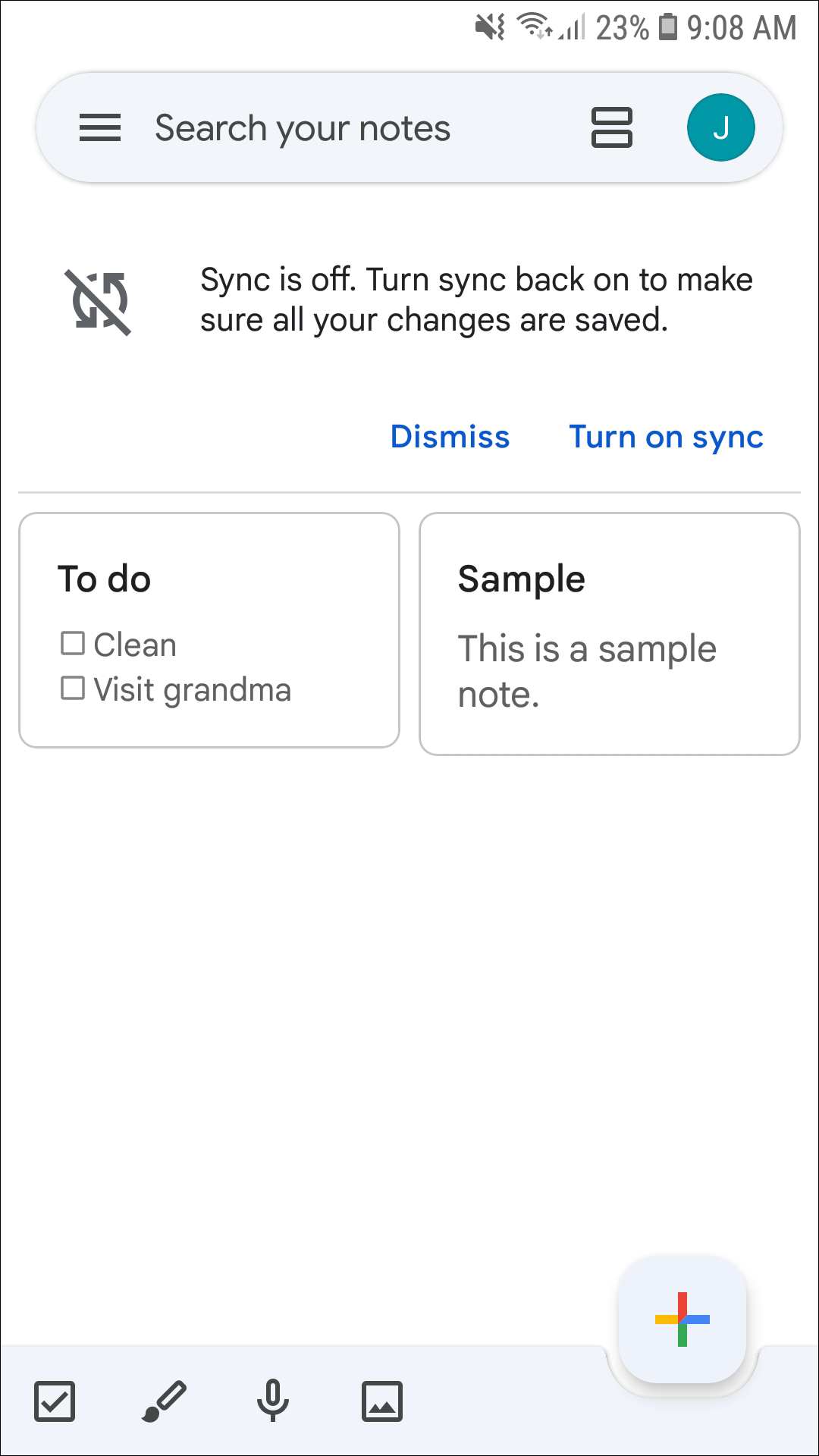
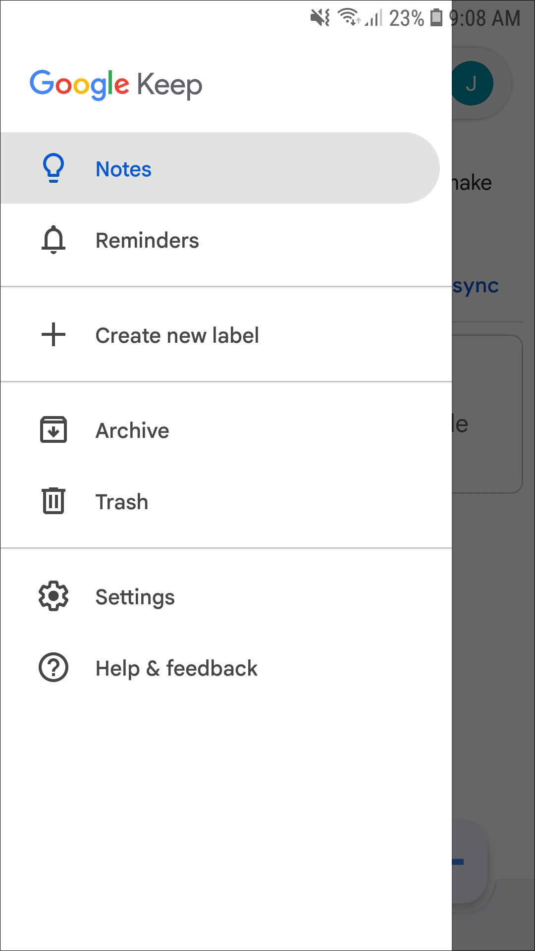
Google Keep is an odd little app from Google, designed to fit somewhere in your workflow between a full-fledged app like Google Docs and the voice reminders that can be set through Google Assistant on Android 7.0 devices. Keep functions as in all-in-one note, list, reminder, and to-do application, and while it might not be perfect in any of those categories, the “jack of all trades” approach makes it ideal for someone looking for a simple application that isn’t overloaded with too-much functionality for its own good.
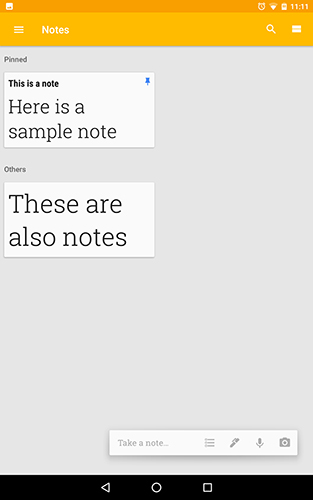
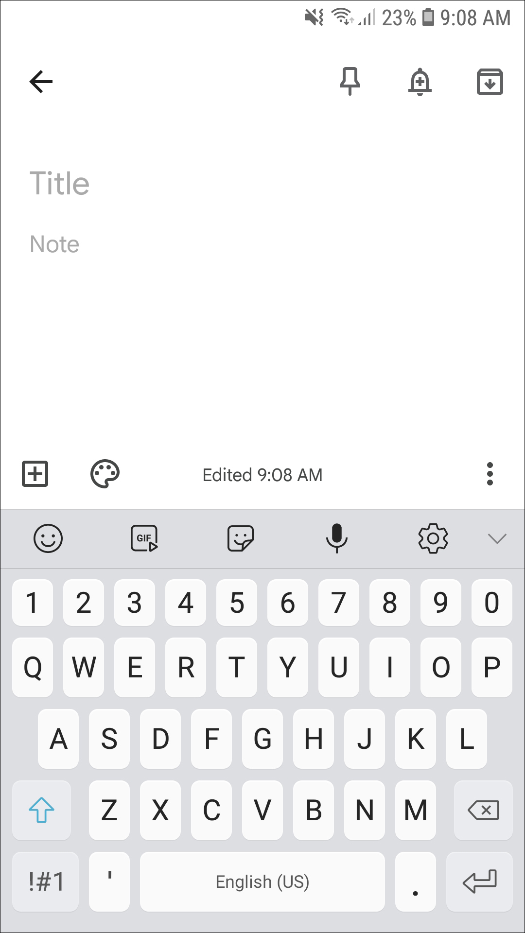
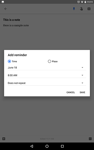
At first glance, Keep seems rather simple when compared to apps like Evernote or Any.do. The majority of the app display serves to show your notes in order, either in tile or list format, with a focus on color and organization. At the bottom of the app, you’ll find the note-taking interface, which has a few different options. The largest, labeled “Take a note…”, simply allows you to start typing a plain text note of any kind. When you leave the note interface, your note will be automatically saved to the app, and you can view and edit the note from any device your Google account is signed into. Each note has a few separate options, though, while you’re typing. You can add collaborators, similar to how Google Drive and Google Docs function, label each note with a specific tag or idea, make copies of individual notes, and even assign a note a themed color of your choosing. Individual notes also have the ability to add reminders, and be pinned to the top of your notes app, making it easy to see the important notes saved in your application.
However, if you head back to the main display of Keep, you’ll see a few other options available when starting a note. The first allows you to convert a note into checklist format, perfect for to-do, shopping, and packing lists. You can cross out your information as you finish the note, and the tab will fall to the bottom of your note, with a line running through the item. If you decide you have to replace the item in your note, just uncheck the box to the left of your information, and the note will be re-added to your Keep list. In our testing, it isn’t a perfect to-do app replacement—it’s just a bit too-simplistic for most users looking for a list-taking application—but for those who don’t require anything fancy in their lists, it’ll serve your purpose just fine. The second option opens a drawing interface that allows you to use markers, pens, and highlighters to create a drawing-based note. You can select your lines and information to move it around the interface, and even delete content. This all works especially well if you’re on a stylus-equipped device, like the Galaxy Note series of phones and tablets or the Nvidia Shield Tablet and Tablet K1.
Third, we find a voice memo option, and it’s one of our favorite options on the entire app. Using Google’s own voice recognition software, Keep pulls double-duty, transcribing and recording your voice actions as you speak. When you’ve finished recording your voice memo, Keep will display both your transcribed text and a recording of the line entry. In our testing, transcription worked just as well as other Google voice-enabled apps, and adding punctuation is as easy as speaking the punctuation out loud. The fourth and final method of note-taking utilizes your device’s camera, allowing you to take and attach a photo of something, and add it to a note. Under the photo, you can easily add text and reminders, and you can even use an already-existing image for your note.
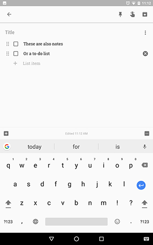
Google Keep isn’t quite as fully-featured as an app like Evernote or Any.do, but what it misses out on in features and additional functionality, it makes up for in a few key areas. First, the app is blazing fast compared to its competitors. While many appreciate the additional note-taking features in Evernote and reminder features in Any.do, for many users, those additions are not just unnecessary—they actively slow down usage of the app. Keep supplies users with exactly what most users will need when it comes to keeping notes, reminders, photos, and voice memos safe and ready to be viewed. By keeping the app from becoming too bloated with additional features, Google ensures a fast note-taking application on every device, regardless of the power limits of each phone or tablet. Second, by syncing through a Google account rather than an additional Any.do or Evernote account, it’s easy to access your notes on any device your Google account is signed into—and chances are, that’s every device you own. From the web client and application, to the Android and iOS app, Keep is everywhere you need it. And the addition of Google integration means Keep users can share and edit notes collaboratively.
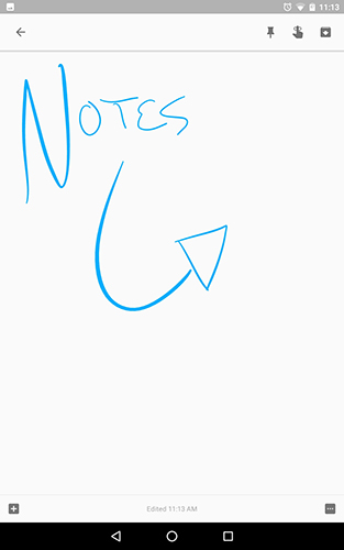
Keep isn’t an app designed for power users. You won’t find the massive note-taking options available in apps like Evernote on Keep, and for some users, that’s an absolute dealbreaker. But—and this is fundamentally important—most users are looking for a note-taking app that’s fast, simple, and free. Keep fits that better than any other note app on Android, all while offering cloud sync between devices and a ton of bonus features for those looking to add photos or voice memos to their to-do lists. In the case of Google Keep, simplicity is what makes the app work so well.
Compatible With
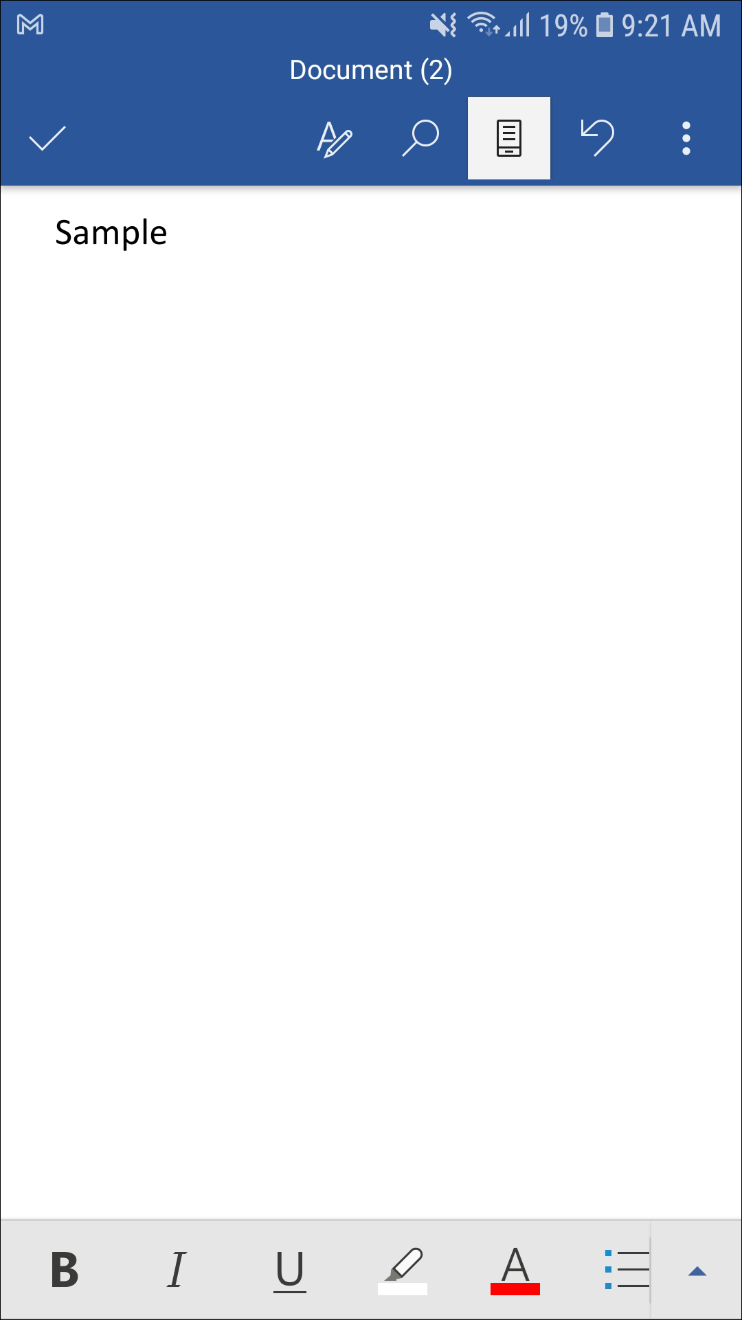
Unlike some of the apps on this list, you almost assuredly have some knowledge of Microsoft Word. Whether or not you’re a fan of Microsoft’s established word processor is a whole other conversation, but if you’re like most students or employees whose lives involve typing long documents, letter, forms, papers, or essay, you probably have to use Word in your life. Now the good news: Word has come a long way since the fairly-reviled 2007 version, and Word’s app on Android is actually pretty solid—especially on a tablet. It’s still not the fastest application in the world, but for a mobile application, Microsoft Word is nearly as feature-packed as its desktop brethren—especially if you’re willing to pay for an upgrade.
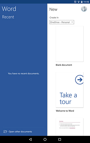
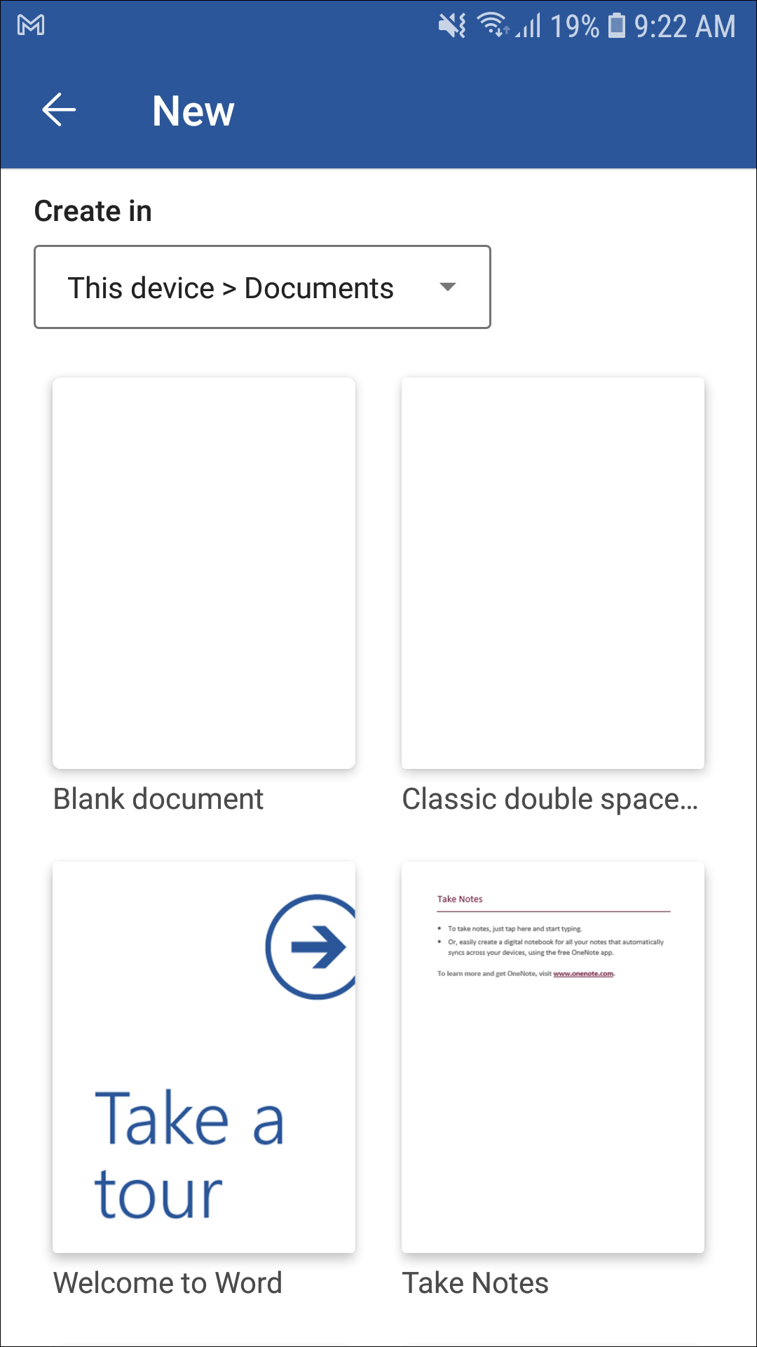
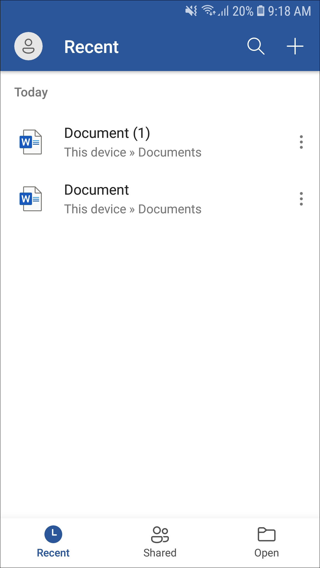
Let’s start with the basic application. Unsurprisingly, Word—like most Microsoft applications—requires you to either sign in with a pre-existing Microsoft account or be willing to sign up for one. As annoying as it is to sign in on Android with non-Google accounts, a lot of people have and use Microsoft accounts daily, so in our eyes, it isn’t the end of the world. Once you’re signed in, you’ll be brought to a display showing both your recent documents and a tab for creating new documents. You can choose from a blank document, as well as several templates like notes, lists, journal entries, outlines, and more. By default, Word creates and saves your document in Microsoft’s cloud system, OneDrive, but you can also choose to save the files locally in the “Documents” folder of your device, or an entirely different folder altogether.
Once your new document is created, you’ll be brought to a fairly-clean looking display, complete with a virtual keyboard for typing (which will be hidden if your phone or tablet is connected to a Bluetooth keyboard. You can even lock the on-screen keyboard in order to prevent it from showing up at inopportune times if you aren’t using it). It might seem strange at first—Word without a menu bar—but rest assured it’s there, hidden behind a drop-down menu, in order to keep Word looking as clean as possible. On a tablet, Word’s menu layout looks phenomenal. Seriously, it’s one of the only word processing tools we tested that doesn’t feel convoluted or difficult to navigate. It feels like a traditional desktop application, and that’s one of the things that makes Word so good. The same menu system used on newer versions of Word is on full display here, using tabs like “File,” “Home,” and “Layout” to navigate through controls and options. If you’re a daily user of Word, or a complete Word master, you’ll feel right at home here.
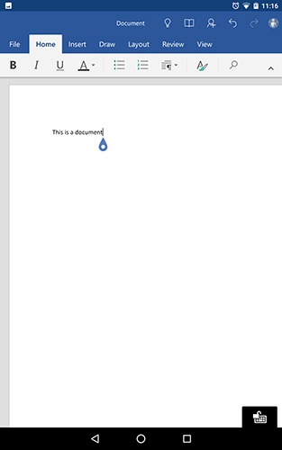
So, how well does the actual app function? Well, it’s actually pretty good. Even testing the tablet on a weaker platform with less RAM than most modern smartphones, the app’s interface was quick to load and to jump through tabs, allowing me to change settings quickly as I typed. Typing from the virtual keyboard appeared quickly and without hesitation, and typing from a Microsoft-branded Bluetooth keyboard was just as quick. There was an occasional hiccup or spike of lag on certain settings, but it seemed to spawn from the app downloading additional content and font, instead of the app experiencing actual technical difficulties. And as we mentioned above, Word on Android is a fully-featured port of the desktop version, even including tools important to students and employees like Track and Review Changes—if you’ve taken an English class, you know how important that can be in a college setting.
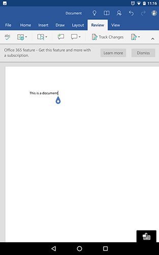
Unfortunately, pointing out a feature like Track Changes brings us to the part of the review every reader’s been dreading: to unlock every feature in Word for Android, you need to sign up and pay for an Office 365 subscription—a plan that, for most users, will run you about $69.99 per year (or $6.99 per month) for the Personal version. For that $70 annual purchase, you get every Office desktop application, 1 terabyte of cloud storage on OneDrive, an Office license for one PC or Mac, and the full-fledged mobile Office experience on one tablet and one phone (as well as 60 minutes of Skype minutes per month, for calling cell phones and landlines). Now, whether this is a good offer or not is really the kind of financial decision that will differ from person to person. For some, Office is a must-have, and paying annually for the newest software instead of repurchasing Microsoft Office every time a new version comes out will make some financial success. For others, though, it might be a better idea to stick with either the free version of Word available on the Play Store without an Office 365 subscription, or switching platforms to something like Google Docs. For students looking to use Word for the features it offers that aren’t included in something like Google Docs, there is good news: Office 365 for Education exists, and if you meet the eligibility requirements, you might be able to get Office for free.
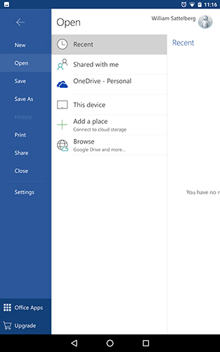
Here’s the bottom line: Evernote and Word are two of the most popular applications on Android and other platforms for taking notes and documents, syncing them to the cloud, and working on them collaboratively with others. They both will run you around $70 per year to use each application to its fullest potential, and for a lot of people—students especially—it’ll be a tough choice between the two. If you’re looking for a far more note-oriented application, Evernote’s platform is probably better, with its support for handwriting, photos, video and audio, and its robust search functionality. For those students—or writers, for that matter—it might be the better of the options. For most people though, Office 365 includes a number of applications that are irreplaceable in day-to-day use, and between the OneDrive storage, free Skype minutes, and both the desktop and mobile versions of Office included in your purchase, Office 365 offers more of what the average consumer looking for a productivity app wants.
Compatible With
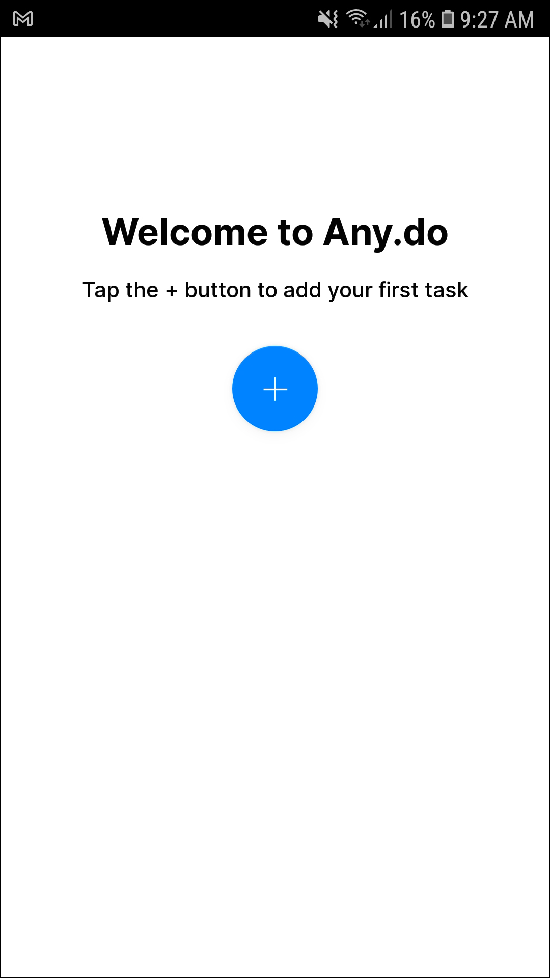
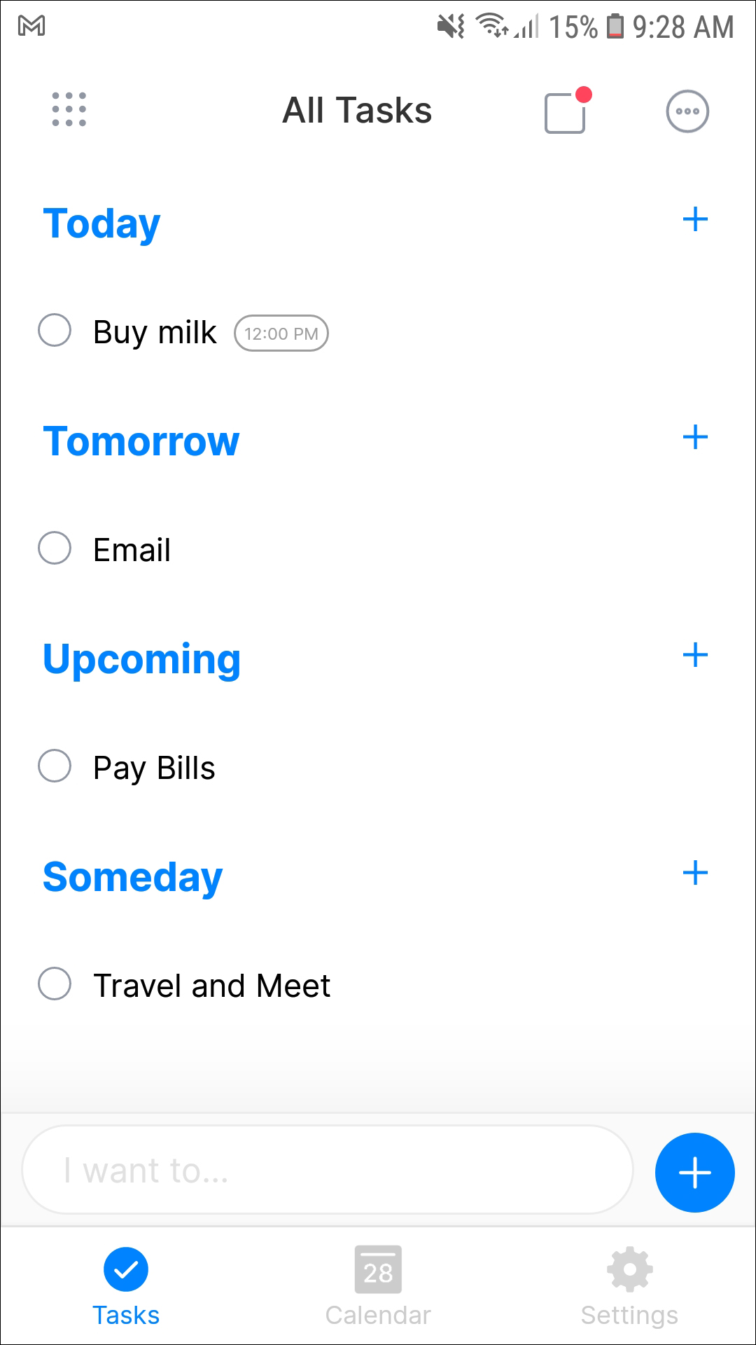
Choosing one to-do list application on Android for recommendation is difficult. There are more than a dozen good-to-great choices to choose from, including Todoist, Trello, Wunderlist (before it’s shut down by Microsoft and replaced), and even Google Keep and Evernote. But if you’re looking for a dedicated to-do list app to keep track of everything going on in your life, our favorite pick for full-fledge to-do list applications is Any.do, for its robust application features, wide variety of software platforms outside Android, and its gorgeous design.
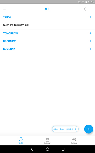
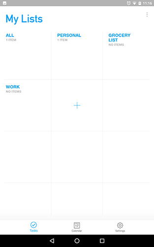
When you first launch Any.do, it can be a bit overwhelming—the tutorial offered is quick, and throws a lot of information at you all at once. The actual display of the app, however, is fairly easy to get used to and navigate around: your list is calendar-based, with a “Today,” “Tomorrow,” “Upcoming,” and “Someday” tab for you to input your projects and plans onto. The main display shows every single to-do list of yours combined into one list, but that doesn’t mean Any.do doesn’t offer categories and separate lists. Tapping the grid-based display brings you to your lists, the presets of which include “Work,” “Personal,” and “Grocery List.” From here, you can choose to go into a single list, or stick with the “All” display. The main display also includes icons for your notifications and a triple-dotted menu button that allows you to change the sorting order, clear your completed tasks, print or share a list, and activate “Any.do Moment,” which we’ll discuss more in a moment.
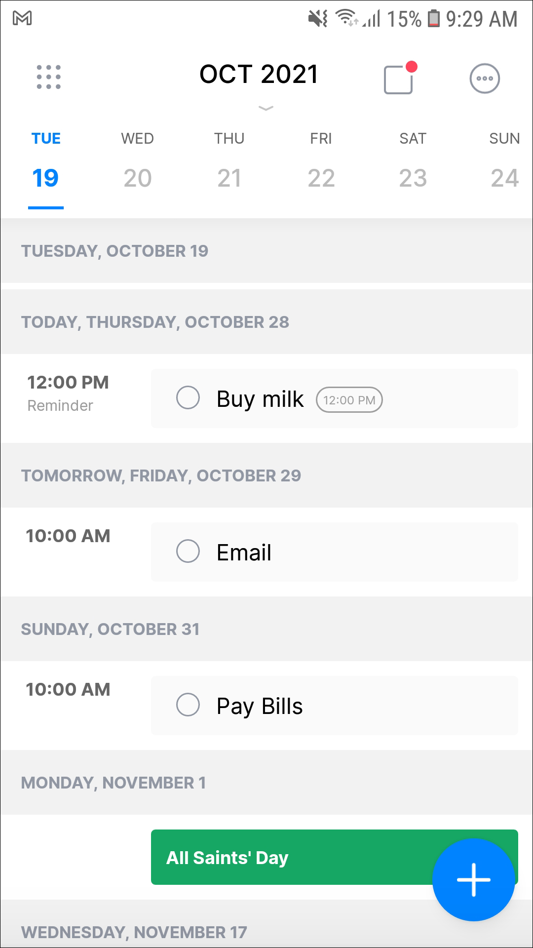
Along the bottom of the display, you’ll find three other views: Tasks, which is the default layout for Any.do, Calendar, and Settings. Calendar brings you to a display that allows you to add your device’s calendar to the application. From here, you can see you Google Calendar—or whatever other calendar app you use—plans and appointments mixed in with your Any.do tasks and to-do lists an interesting format that might help keep your dates and plans a bit more organized than just using Google Calendar or Any.do independently of each other. As far as settings go, you have some basic settings available, including a quick-add bar displayed in your notification tray (on by default, but if you like to keep your notification tray clean and clear, you’ll want to disable it), an option for what the “first” day of the week is (Monday, by default), an option to change the default list, as well as the sound options for your platform. You can even connect your Any.do account to an Amazon Echo through here, which, if you have an Echo and regularly use Alex, is a pretty neat feature.
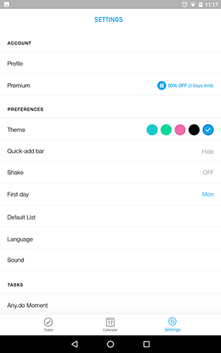
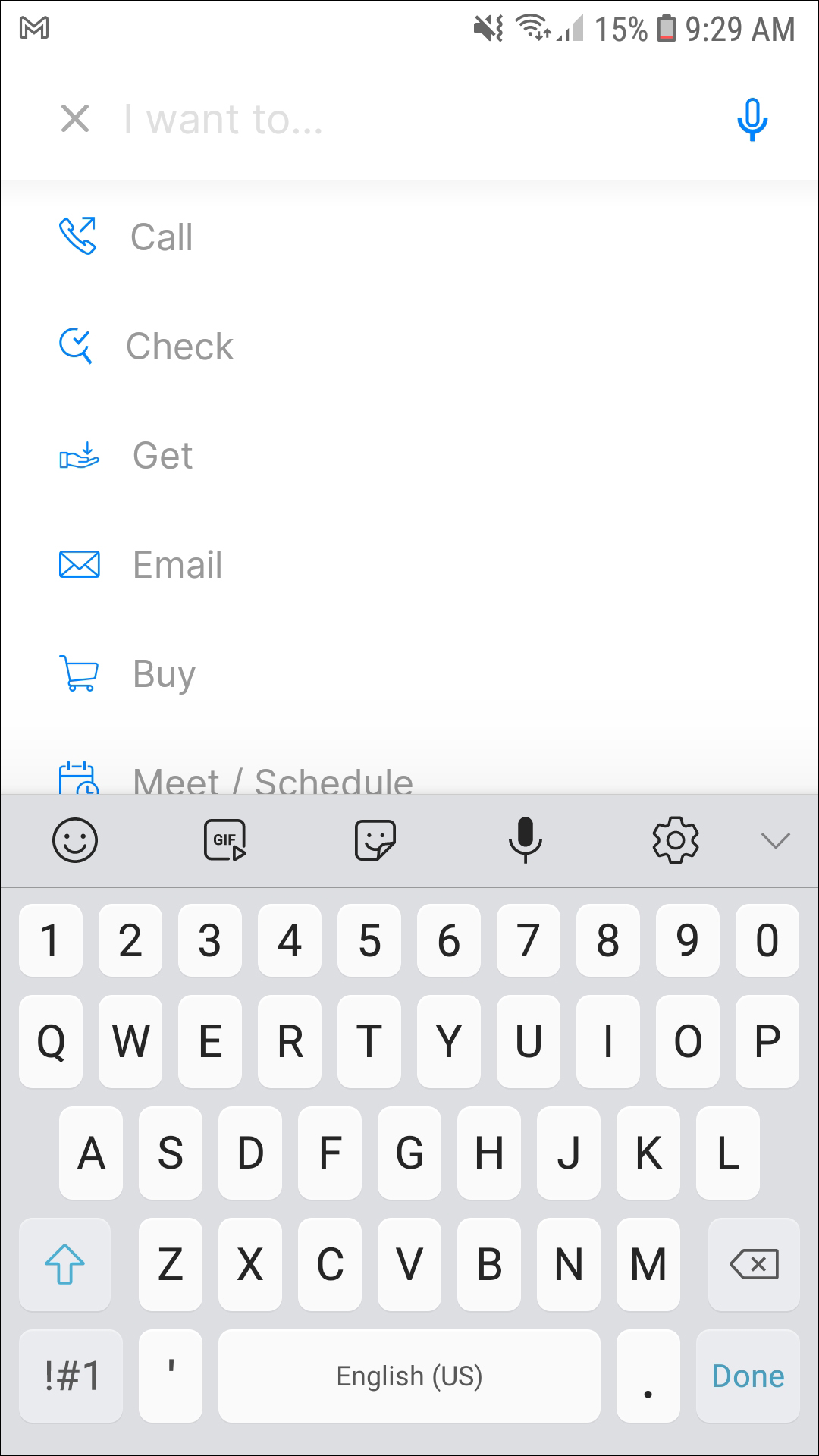
The app works well, though the white background can be a bit harsh on your eyes (more on theming in a moment). Adding tasks to your to-do lists is just as quick and easy as you’d expect: tap the blue add icon in the lower-right hand corner, and you’ll be brought to the “Add Task” display. Along the top of your device, you’ll see the input box, along with more than a dozen presets for tasks, like calling, checking, email, cleaning, purchasing, and studying. The presets are a neat feature, and can make adding tasks that much easier—especially since presets have their own suggestions, like “study for test” or “clean bathroom.” Sometimes, even the sub-suggestions have their own suggestions, making it easy to think of the things you need to do before you actually even think of them. The app is heavy on animation, some fast and some slow, so if you’re the kind of person who gets impatient when app animations run a bit too slow, you’ll have to test the app out to see if it hits your standards.
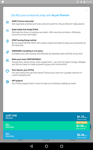
Just like Word and Evernote before it, Any.do has a pro plan that unlocks additional features and capabilities—though in fairness to Any.do, their plan is far more affordable than the plan from those two services. Any.do Pro lets you change the design and theme colors of each list, attach files and notes to to-do lists, adds a “habit-building” feature that supposedly helps you build up a habit through repetition of a specific thing, and allows you to make collaborative edits, allowing you to edit, change, and discuss to-do lists between other users. Finally, the pro version adds improved functionality to their marquee feature, “Any.do Moment,” which lets you plan and view your day without the clutter of your other lists and plans for the week. You can get reminders for all of these moments, or mark them as delayed or complete. Any.do Pro has three different plans: a single device plan for $21 annually, a multi-device plan for $23.04 annually, and a multi-device plan for $2.49 monthly ($29.88 annually, after all 12 payments). Whether or not these features are worth it to you is another conversation, but we appreciate seeing both the flexibility of annual and monthly plans, and relatively-affordable subscriptions when compared to the $70 plans from Microsoft and Evernote.
In our eyes, Any.do is a great app for syncing your to-do lists and your calendar together. The app features a great layout, even if the animations are, at times, a bit too-much for our tastes. The amount of features on the free tier makes it ideal for those looking for a simple to-do and task application, and the price of their premium plan is more affordable than the competition, even if it (obviously) can’t do quite as much as apps like Word and Evernote before it. We do wish theming was included in the free tier, even if only to eliminate the bright white backgrounds of the standard app. Regardless, Any.do is our pick for the best to-do list app out on Android—and the fact that it has a web client and an iOS app available for syncing accounts makes it that much better.
Compatible With
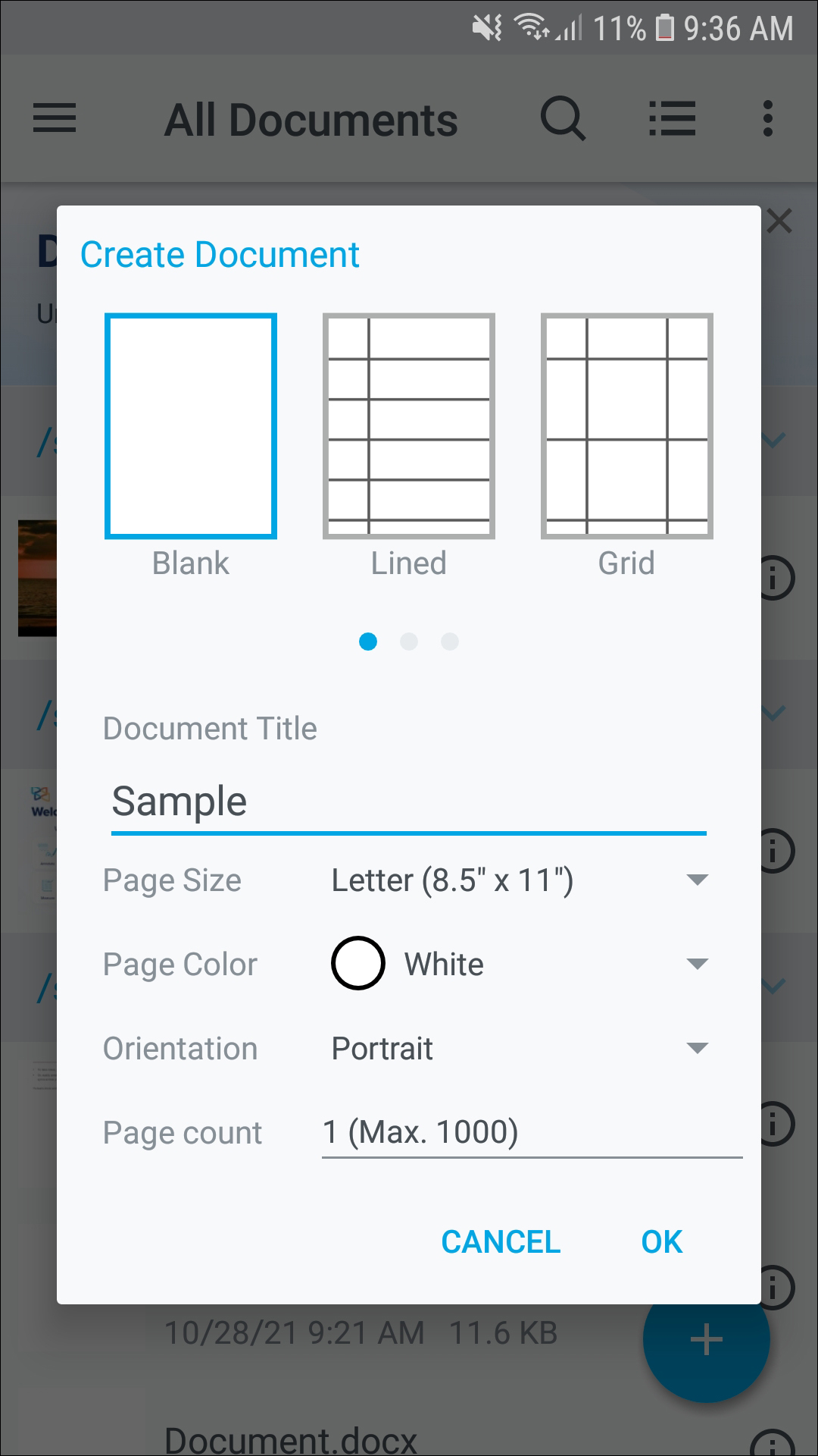
What list of productivity apps is complete without a powerful PDF reader? There are a ton of great selections for displaying, editing, and annotating PDFs available on the Play Store, but none of them offer the same level of features, functionality, and design—all without charging a dime. Xodo can do almost anything you need a PDF reader to handle: annotations, signatures, sharing, autosync, and so much more, packed into a single, very fast PDF app. If you’re looking for the best free PDF reader for Android, you can stop looking—it’s Xodo.
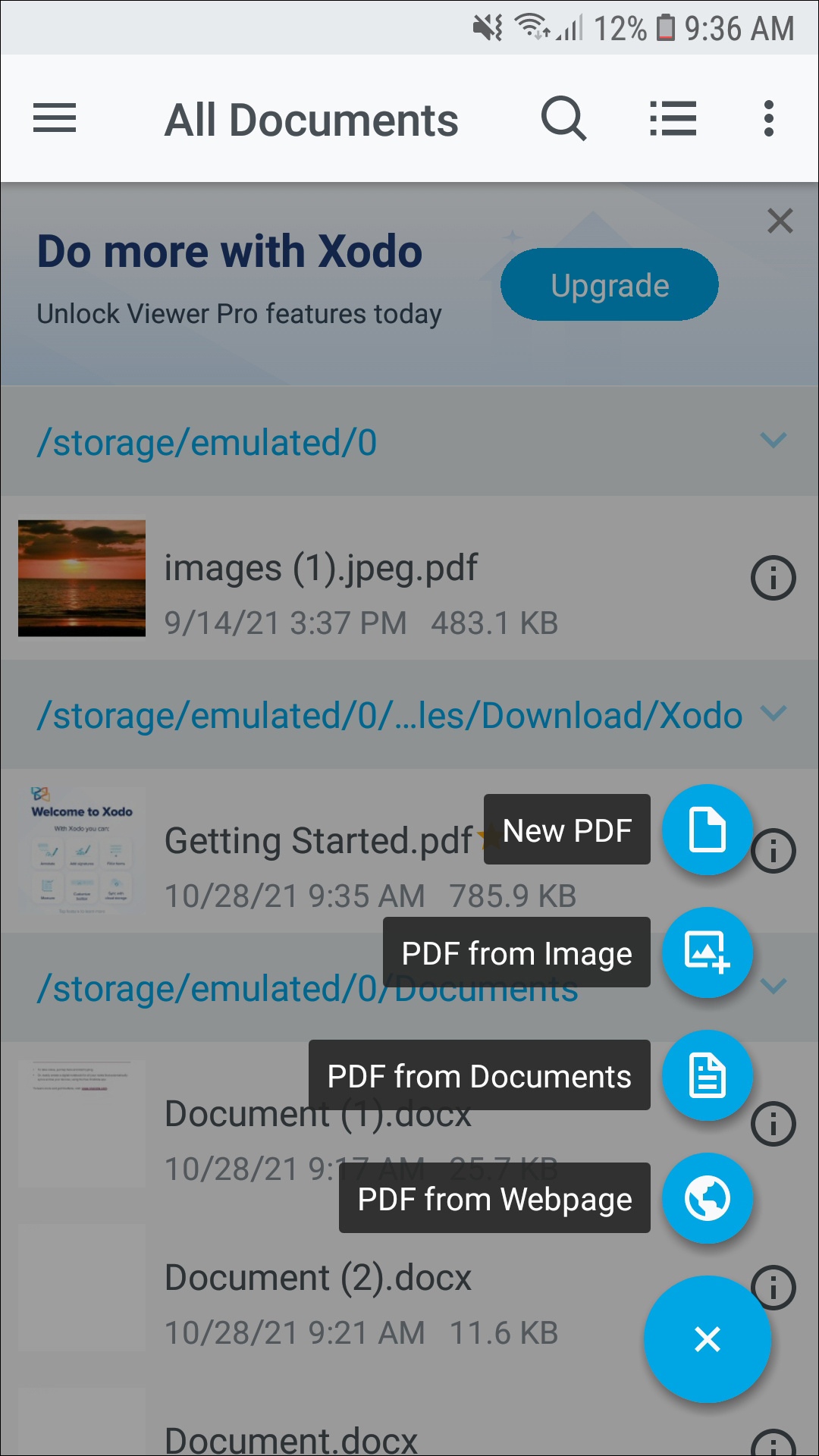
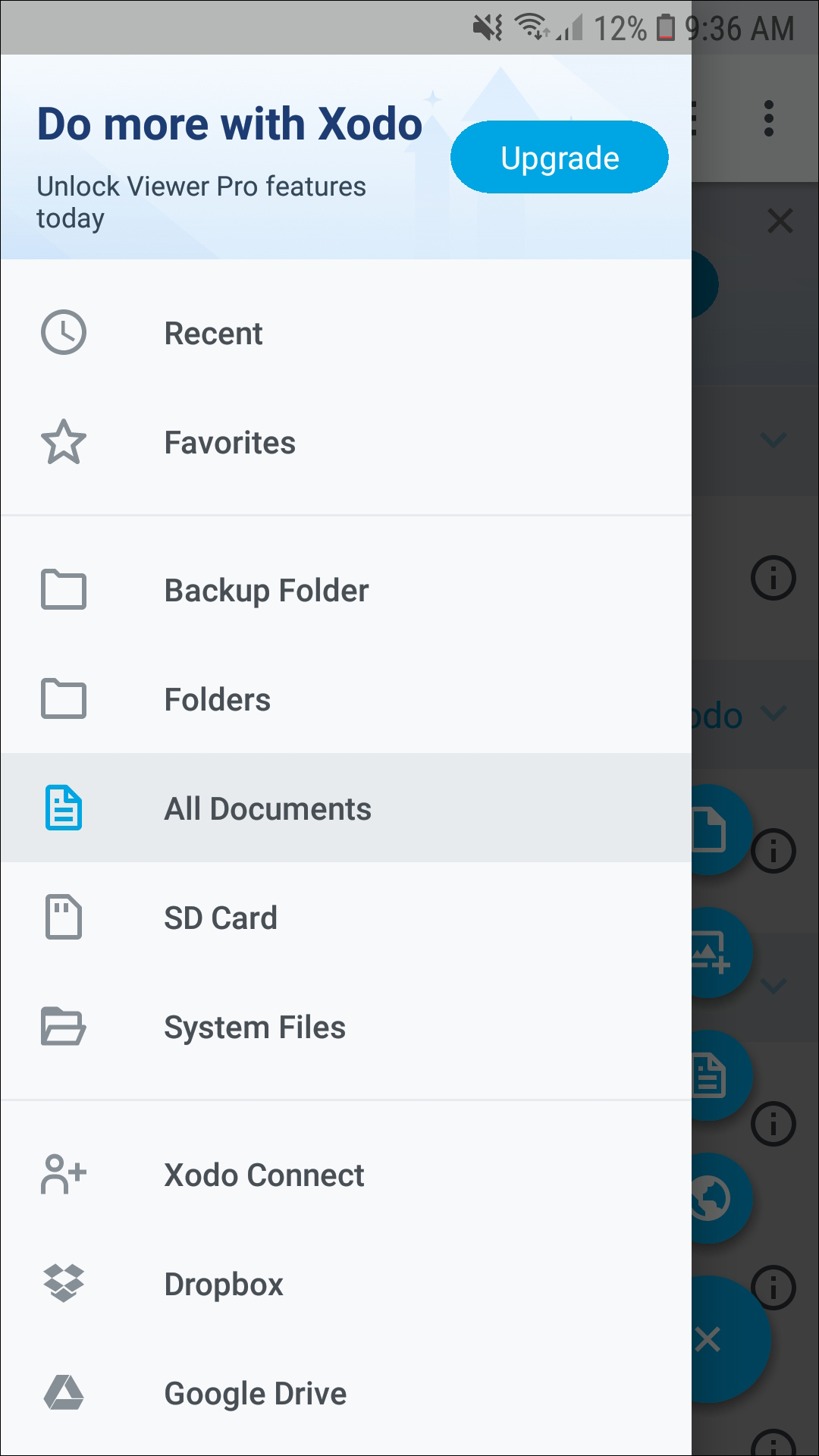
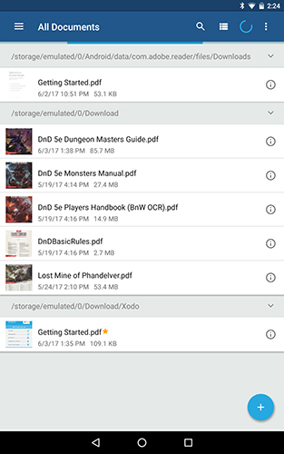
First, let’s discuss the basic layout and design of Xodo. Much like Solid Explorer, Xodo’s design is entirely based on standard material design guidelines, with a circular action button in the lower-right hand corner, a sliding menu hidden to the left of the display, and a triple-dotted menu button in the upper-left corner to be used to reformat and change the sorting order and filtering of your documents. If you’re an experienced Android user, everything will function and be displayed exactly where you expect, based on material design. Inside the sliding menu, you’ll find your document folders and synced cloud storage services (more on this in a moment). The settings menu contains a ton of options and settings to experiment and play around with, including page animations, image smoothing, a full screen mode enabled by default, and one of our favorite settings, stylus as pen, allowing Xodo to recognize a stylus and still use our fingers to move and change pages. Everything in Xodo is laid out clean and clear, with several different viewing modes. Moving and deleting documents is a breeze too—just like in Solid Explorer, a long press will bring up a menu bar along the top of the display, making it easy to change and modify the PDFs in your library.
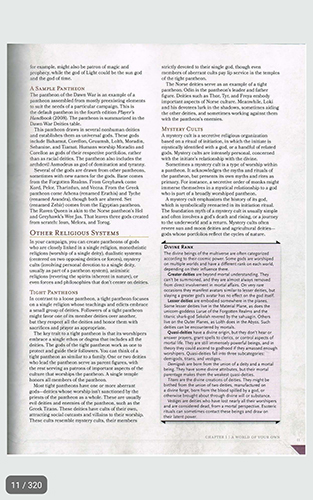
Even if you aren’t someone who feels the need to edit and annotate PDFs, Xodo is one of our favorite readers on the store. The amount of functionality built into reading PDFs on Xodo is astounding, and it really shows how much work the devs put into building this app. There are some standard PDF features built-in, like bookmarking specific pages for future reference and using a tab interface that makes it easy to switch between multiple PDFs at once. If a PDF allows for reformatting (read: it isn’t just a static image), reflow can help make your PDF fit in a readable display without requiring you to zoom in and out of a page as you read your documents. Xodo has some other neat reading tricks, too, like a night mode for reading in low-light situations without harming your eyes, and a vertical scrolling mode in single, double, or cover page modes. And yes, there are a ton of viewing modes, including the aforementioned versions, as well as a book-like mode that allows you to flip pages with an included animation. It makes reading PDFs feel that much more advanced than it actually is.
Of course, this is a list of productivity apps, and if you’re going to be productive, chances are you’ll be marking up, annotating, and editing the PDFs in your library. Luckily, Xodo has a ton of functionality here too, and it’s what truly pushes Xodo ahead of other readers like the built-in Google Drive reader and Adobe’s own Acrobat Reader. You can do the obvious, standard editing, like drawing and typing directly on top of a document, underlining and highlighting text, and adding circles, lines, and other graphics to your document. Of course, Xodo wouldn’t make this list if all it could offer were identical features to the other PDF readers out there. Xodo can also merge and split PDFs, making it easy to take pages from multiple PDFs and combine them into one document. You can change page orders, delete entire pages, and even search through your annotations to find specific notes.
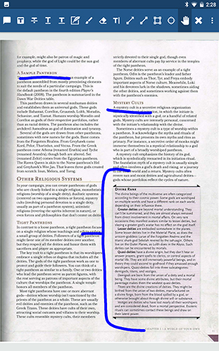
Overall, Xodo just takes the cake when it comes to reading and annotating the app. Some users might prefer to use Adobe’s Acrobat Reader, in conjunction with apps like Fill and Sign and the aforementioned Adobe Scan, but for most users, you just can’t beat the amount of features and functionality offered by Xodo for absolutely free, with no in-app purchases and no advertisements to speak of. Xodo is a robust, fully-featured PDF reader and editor on Android, and it’s one of our top choices for the platform. If you’re looking to manage your documents on the go, definitely seek this one out.
Compatible With
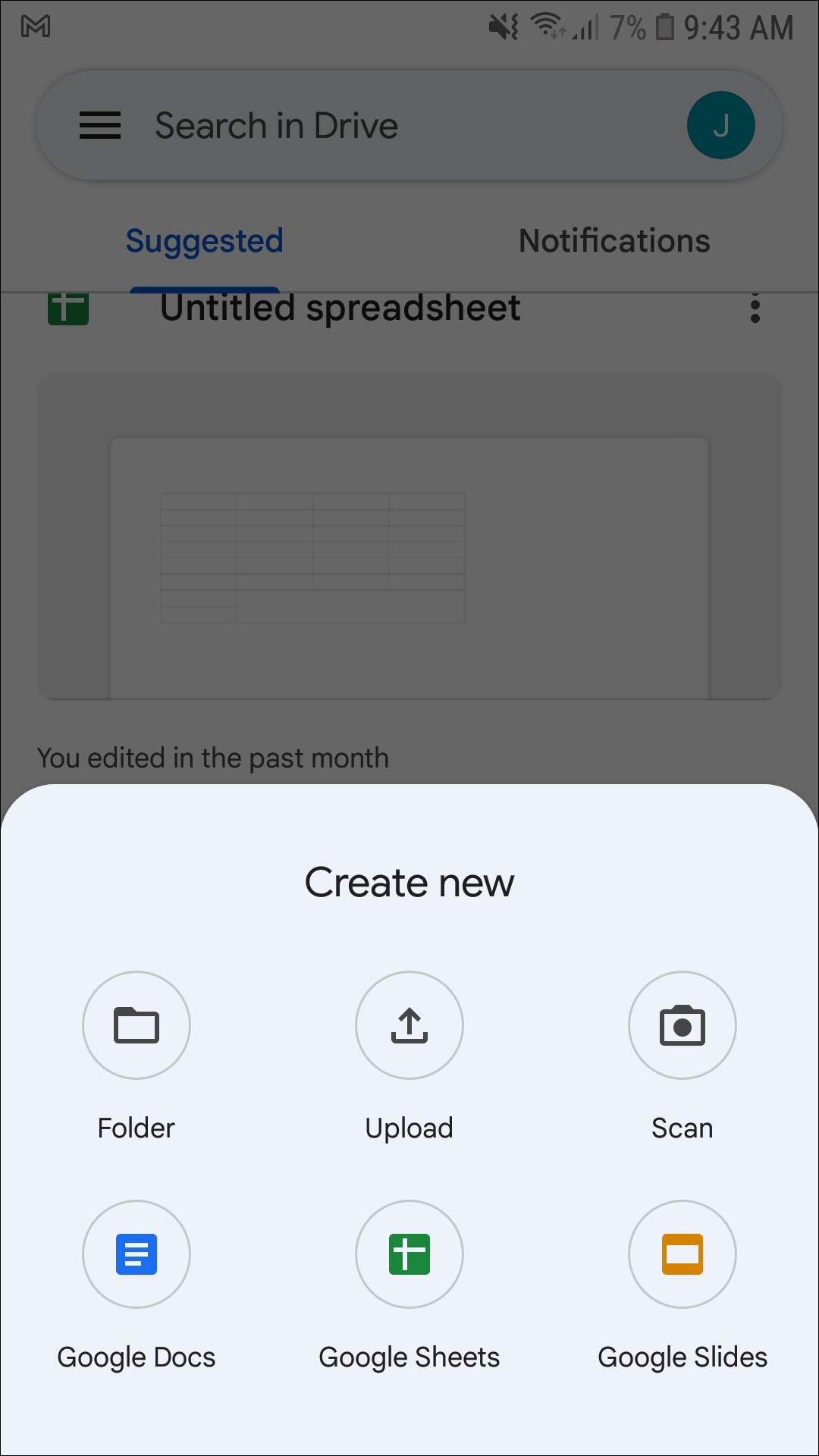
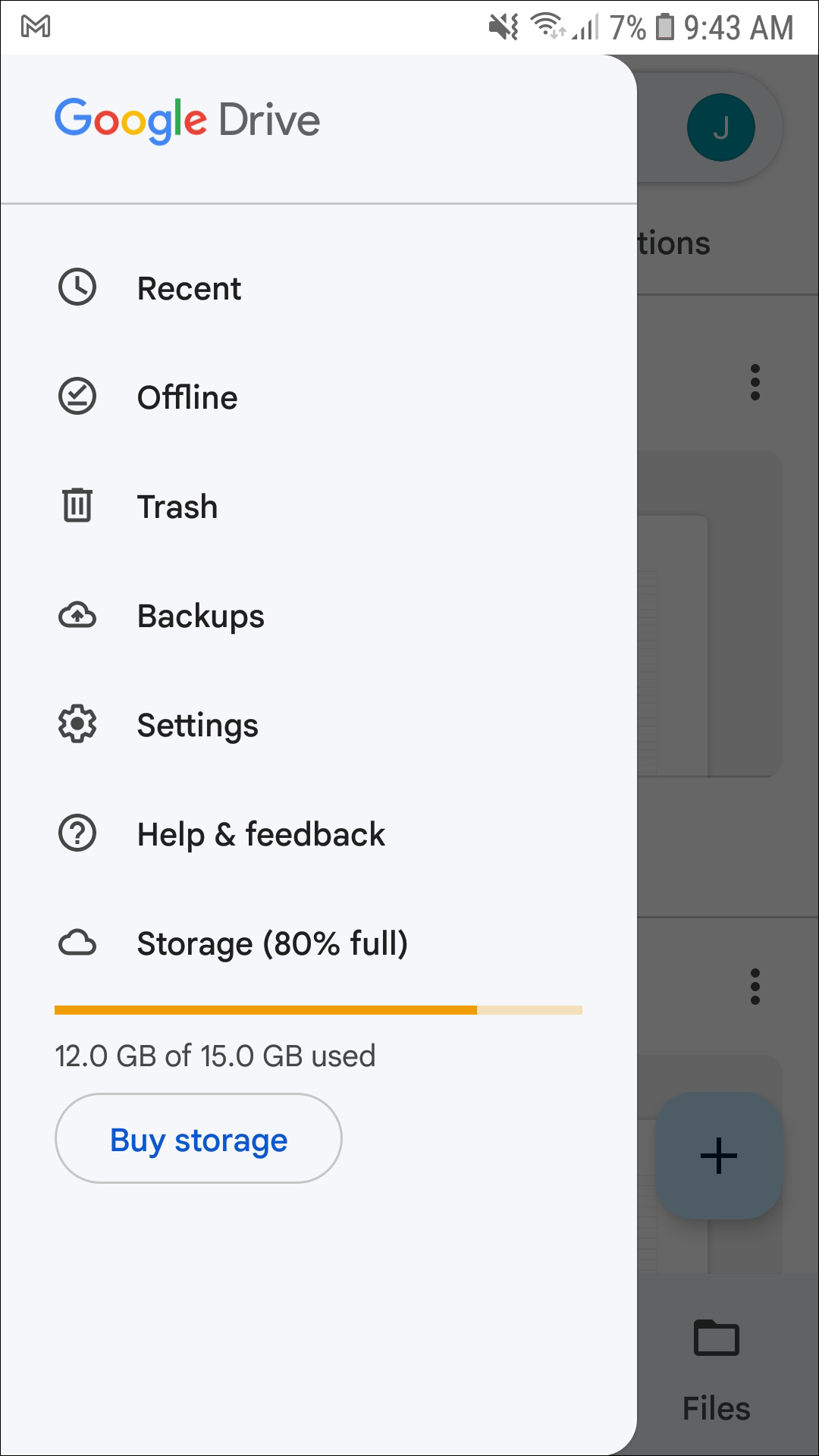
Yes, it might be a bit of a cop-out—after all, Google Drive is effectively spread over four separate apps—but when it comes to cloud storage, word processing, spreadsheet creation, slideshows and presentations, and collaborative work, there’s nothing better on Android than Google’s own Drive Suite. And even though you’ve probably used these apps before, it’s worth revisiting each aspect of Drive just to see the amount of features and functions hidden inside Google Drive. Let’s take a look, app-by-app.
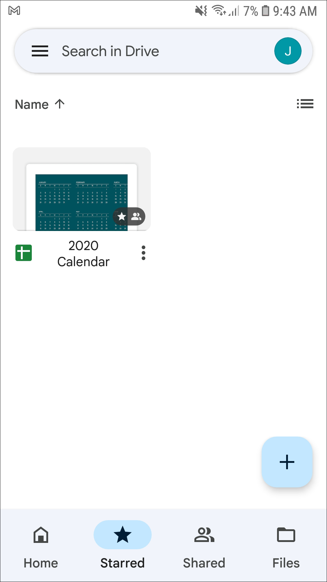
The main Google Drive app is one of our favorite cloud storage apps, syncing with your Google account on every device you sign into quickly and easily. The app comes with 15GB of free storage, and storage expansions are cheaper than the majority of other cloud-based competition out there right now. It’s also easy to find ways to add free storage into your Drive account: Chromebook users get additional storage, as do students. Sometimes, Google even gives away a few gigabytes of expansion for free, making it easy to build out your Drive library. Files are quick to upload, though as usual, true upload speeds will depend on the speed of your internet connection. Once your files have been uploaded, you can sort by name, type, date uploaded or accessed, and even create folders for additional sorting.
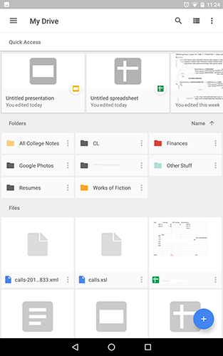
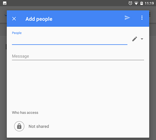
Drive also makes it easy to share your files and folders with others, making it the ideal cloud service for anyone looking to get work done with others around you. Because both files and folders can be shared independently, it makes it easy to collaborate on a project without sharing additional, unnecessary information. You can even view what and when your content was accessed by others, and set specific access levels for each collaborator independently of each other. Specific files and folders can be set for offline viewing easily, downloaded right to your devices storage. Drive also functions well with other Google apps, specifically Photos: any photos or videos you upload to Drive will also be organized and accessible right from your Photos app.
While Google’s Drive app might be great for accessing your files, the three additional Drive applications—Docs, Sheets, and Slides—all happen to have their own features and functionality, all while keeping tight integration with every Drive feature we mentioned above.
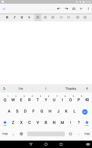
Docs is perhaps the best-known and most-used of the three. The app is necessary to open any of the Google doc files saved inside your Drive account that may have been created on your desktop or laptop computer, but the app also allows you to make and create new documents that are automatically backed up to Google Drive, so long as sync has been enabled on your tablet or phone. The app has plenty of features and functionality, including sorting options, viewing options, and more. Obviously, the marquee feature of Docs is editing your documents on the go, but the app can also be used to open other, non-Google Doc files, like those taken from Word or downloaded from an email. They’ll be converted to a Google Doc file, where you can continue to edit them. Docs saves everything as you type, so backing up and saving is never a worry when inside the app, and since Docs is a Google project, you can research your project online without even leaving the app. And while most students (or recent students, if you’ve graduated) will know this, but the collaborative features built right into Docs are absolute lifesavers when it comes to group projects, making it easy to brainstorm in and outside of the classroom.
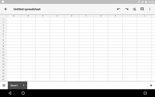
Sheets is probably used less often than other Drive apps, but it’s no less important. Documents are all well and good, but for finance students, people work hard in business sectors, or anyone just trying to keep track of financials and statistics in a well-organized manner, Sheets is irreplaceable. Just as Docs allows users to access their Google Doc files on their Android devices, Sheets is used to access any Sheets files created on desktops or laptops. Sheets uses the same sorting and categorizing and sorting methods that we’ve previously seen in Docs, and sharing also functions similarly. The main uses of the Sheets app come from the abilities and functions that spreadsheet users and creators love to see: cell formatting, chart and data viewing options, formulas, and insights on your data are all included here, as is the all-important find and replace function. And don’t worry—Sheets can open, view, edit, and save Excel files, so your data can carry over between applications and devices easily.
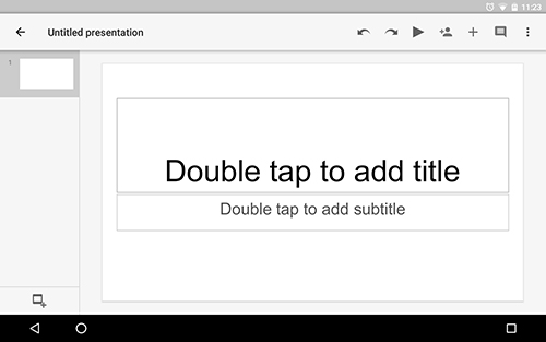
Slides is another app familiar to students, functioning largely as a free Powerpoint replacement. Though the app isn’t quite as powerful as what we’ve seen from Microsoft over the years, the ease-of-use here makes it ideal for a quick presentation maker. Just as with Sheets and Docs before it, Slides has a wide variety of viewing and sharing options for collaborating on slideshows with coworkers or fellow students. Slides can even add comments to slideshow presentations, making it easy to see the associated notes for each presentation. Obviously, Slides has a bit of an additional social aspect to it: unlike with Docs or Sheets, your slideshows will have to eventually be seen by an audience, whether it be a professor, a boss, or anyone else. In addition to editing and rearranging your presentation, Slides allows you to present right from your phone or tablet, both over projectors and, using Hangouts, video calls within scheduled meetings. And since Slides is designed to be used to present to an audience, the app comes with built-in Android Wear integration, allowing you to control your phone or tablet right from your wrist.
And of course, all three of these apps integrate right back into the standard Google Drive app. When you create a new document, slideshow, or spreadsheet, the app automatically saves the file right inside Drive. To open any of your files, it isn’t even necessary to open the corresponding app—everything can be opened right from Drive, so long as the associated application is preinstalled on your device. This ease of use, and the amount of features and functionality offered by these four apps, make it essential to anyone looking for the best productivity suite for their phone or tablet. It might be cheating, but Google’s entire library of Drive applications are the perfect Android apps: fast, fluid, and fully integrated with Google services. If you somehow have avoided making the switch from Office to Google Drive and Docs, and you don’t need any of the specific Office-only features provided by Microsoft, Drive is one of our favorite productivity experiences on Android.
If you don’t see an app that should be here, let us know what it is