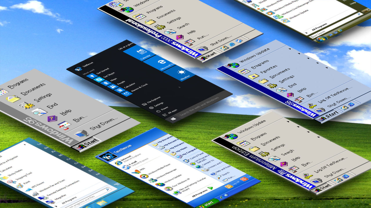
The Evolution of the Windows Start Menu: Windows 95 to Windows 10

Windows 10
Codename: Threshold
General Availability: July 29, 2015
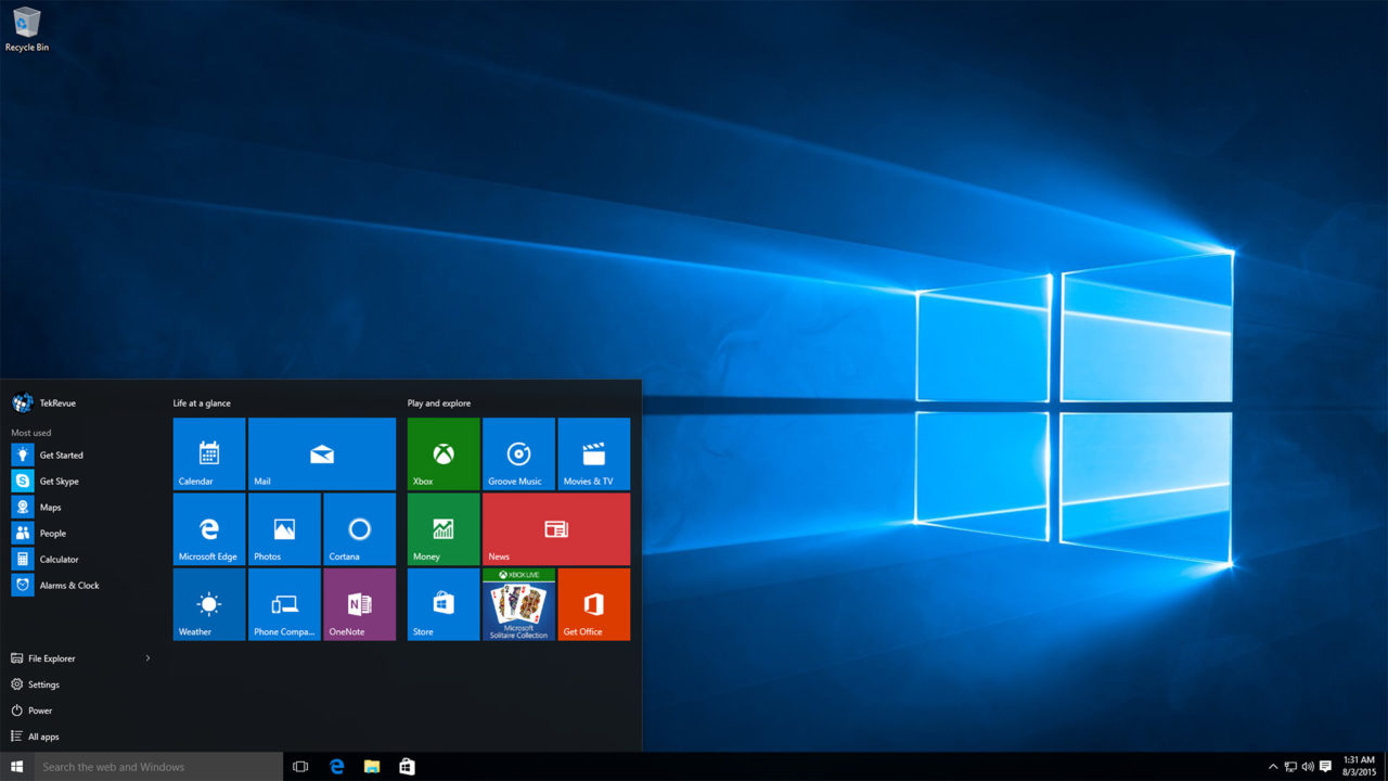
Following months of lackluster reviews and customer complaints over the significant UI departure in Windows 8, Microsoft relented and signaled in late 2013 that the Windows Start Menu would return in a future version of Windows. Initially planned as an update to Windows 8.1 (with the press referring to it unofficially as “Windows 8.2”), Microsoft decided in 2014 to make a clean break with Windows 8, both from a technical and branding standpoint. Windows 10 was born, and users started gearing up for the new Start Menu.
Not counting the switch to the Start Screen in Windows 8, the Windows 10 Start Menu is perhaps the largest departure from the original design in the feature’s history. Windows 8-style live tiles have returned, offering users quick access to their universal apps, and as a result the Start Menu is much wider than it’s ever been. Also new in Windows 10 is a user option to resize the Start Menu, or remove live tiles altogether, but even in its smallest configuration the Windows 10 Start Menu is quite different from the Windows Start Menus seen in Windows 7, Vista, or XP. Users can pin their most-used apps to the top of the menu (Windows will try to intelligently populate this list if you don’t override it), and common apps like File Explorer and Settings are within easy reach. Users can also browse all of their installed applications via a scrolling list within the confines of the Start Menu.
More interestingly, Windows 10 Search (or Cortana, if available and enabled), blends seamlessly in with the Start Menu. Although these are separate functions within Windows, users can activate the Start Menu with a tap of the Windows key, and instantly switch to a Windows or Cortana Search simply by starting to type. Overall, the Windows 10 Start Menu provides access to virtually everything offered by previous Windows Start Menus — either natively or via search — potentially making it a far less painful transition for longtime Windows users as opposed to Windows 8. Unless you make heavy use of Microsoft’s default Windows 10 apps, the live tiles will seem primarily wasteful and not worth the space they consume by default. For those who don’t elect to remove the tiles from their Start Menu, however, the situation should improve as more universal apps are released via the Windows Store, letting users get the most out of the relatively innovative live tile interface.
[one_half padding=”0 5px 20px 0″]
1. Introduction
2. Windows 95
3. Windows 98
4. Windows 2000 Professional
5. Windows ME
[/one_half]
[one_half_last padding=”0 0px 20px 5px”]
6. Windows XP
7. Windows Vista
8. Windows 7
9. Windows 8.1
10. Windows 10
[/one_half_last]








3 thoughts on “The Evolution of the Windows Start Menu: Windows 95 to Windows 10”
Krystle of
pirate bay