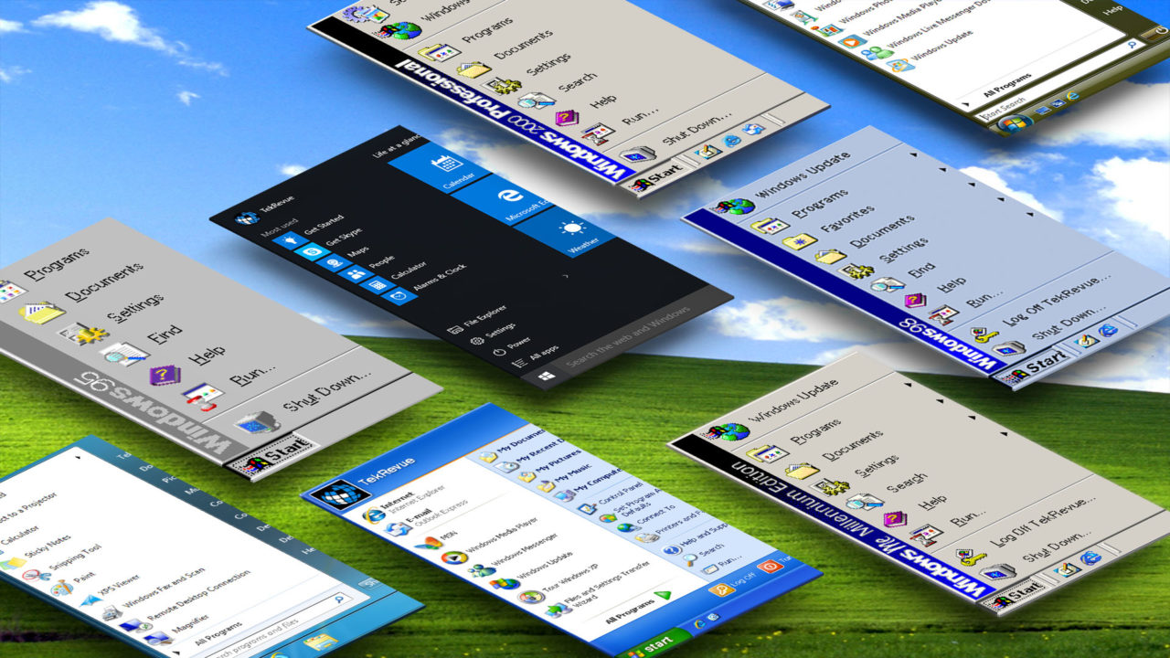
The Evolution of the Windows Start Menu: Windows 95 to Windows 10
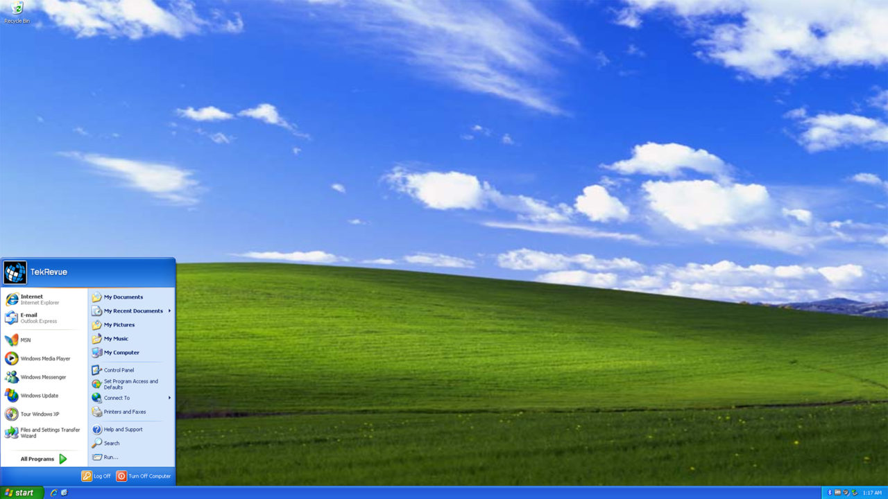
Windows XP
Codename: Whistler
General Availability: October 25, 2001
Arguably one of the most successful operating systems of all time, Windows XP was installed on well over a billion PCs and devices at its peak, and is still in use on millions of PCs nearly 14 years after its initial release, a fact that concerns both Microsoft and security experts now that Microsoft is no longer supporting the operating system.
So what made Windows XP so popular? The operating system retained the familiar basic layout of its predecessors, complete with Start Button, taskbar, user desktop, and Windows Explorer, but added a host of new features beneath a refreshed design. New graphics options allowed Windows itself to take advantage of visual effects like drop shadows and subpixel rendering, while technical improvements brought better support for advanced 3D gaming, Wi-Fi networking, high-speed USB, and fast home Internet connections provided by cable and DSL modems. A 2002 update to Windows XP also saw the release of Windows Media Center, the live TV and DVD playback and management suite that enjoyed a cult following but has unfortunately been discontinued completely with Windows 10.
As Windows XP was marketed to businesses in addition to consumers, productivity and management features were also introduced or improved, including Remote Assistance and Remote Desktop support, file encryption, and fast user switching.
The Windows XP Start Menu also saw a significant facelift. Now wider and more colorful, the Windows XP Start Menu was split down the middle into two categories: programs on the left (with frequently accessed programs available at the top level) and user folders and system settings on the right. New folders were added by default specifically for user media like pictures and music, and common configuration options, such as network and printer settings, were also given top billing. Users who found the new Windows XP Start Menu too colorful or unfamiliar also had the option to use a “classic” Start Menu with all items listed in a single column.
In the end, ass good as people thought Windows XP was, the delayed development cycle and relative failure of Windows XP’s successor, Windows Vista, resulted in hundreds of millions of consumers adopting, and sticking with, Windows XP far longer than Microsoft initially anticipated.
[one_half padding=”0 5px 20px 0″]
1. Introduction
2. Windows 95
3. Windows 98
4. Windows 2000 Professional
5. Windows ME
[/one_half]
[one_half_last padding=”0 0px 20px 5px”]
6. Windows XP
7. Windows Vista
8. Windows 7
9. Windows 8.1
10. Windows 10
[/one_half_last]








3 thoughts on “The Evolution of the Windows Start Menu: Windows 95 to Windows 10”
Krystle of
pirate bay