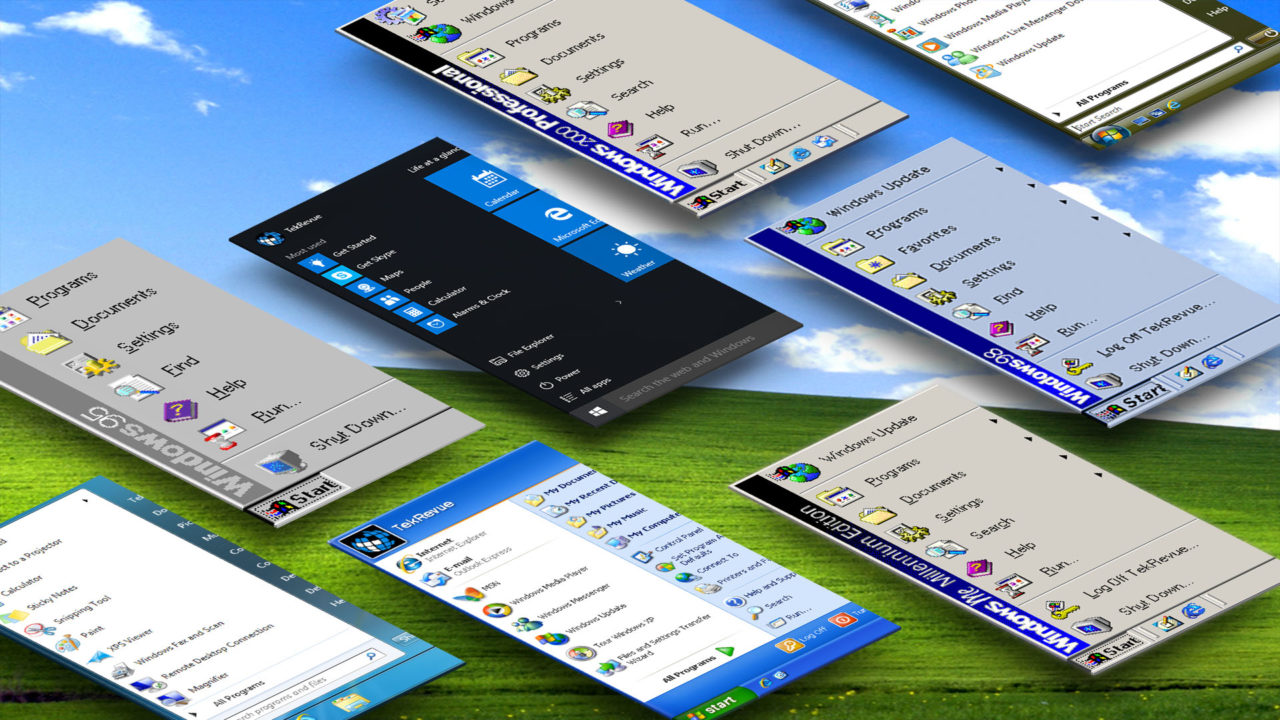
The Evolution of the Windows Start Menu: Windows 95 to Windows 10
Windows Vista
Codename: Longhorn
General Availability: January 30, 2007
Arriving five years after the launch of Windows XP, Windows Vista represented the longest span between public releases of Windows in Microsoft’s history. When it finally hit the market, Vista was a shell of what Microsoft had promised in the preceding years, and quickly gained a negative reputation for running poorly on low- and mid-range hardware. With sufficient hardware, and after a few early patches, however, Vista offered a number of interesting new features, including the effects-heavy and translucent-packed Windows Aero UI, an entirely new search and indexing feature with results as you typed, an optional sidebar with live gadgets, built-in anti-spyware protection, new backup features like Shadow Copy, and a suite of new consumer-targeted apps for email, calendar, photos, and movies.
On the business side, Vista brought improved fax and scanning support, application and desktop sharing, Windows Image Formatting for easier deployment, and new methods of encryption and protection with BitLocker.
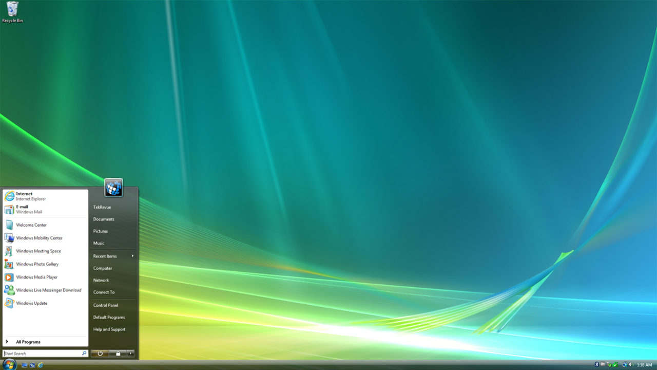
The Windows Vista Start Menu was similar to the default Start Menu in Windows XP, but user and system entries (i.e., those on the right side of the menu) lost their icons in the name of simplicity and space saving. The favorite programs located on the left side of the Start Menu kept their icon display, however. Vista is also notable as the first version of Windows without the literal “Start” button. The button that triggers the Start Menu, still called “Start” in the Windows documentation, is now just a circular Windows logo, although it functions exactly as expected.
One notable new addition to the Vista Start Menu is the live search box. Whereas users with previous versions of Windows needed to launch Windows Search manually in order to search their PC, the new search box leveraged the fast searching tech mentioned above, letting a user simply tap the Windows key on their keyboard (or click the Start Button), and start typing the name of a file, program, or setting they want to access. This method of searching Windows is now the standard in modern versions of operating system.
Overall, Vista was packed with features, but negative public perception of the operating system killed any chance at rapid adoption. Microsoft even ran a notable advertising campaign called the Mojave Experiment, in which consumers with a negative impression of Vista were shown a demo of what they were told was Microsoft’s “next major version of Windows.” The consumers generally liked the features in the demo, rating the supposed next generation operating system nearly twice as high as Vista, but were shocked to discover that the demo was actually Vista itself.
Despite these efforts, many critics and reviewers criticized Vista for being too bloated, too slow, too expensive, and too buggy, particularly when it came to support for legacy software. Even features that worked as intended, such as the new User Account Control (UAC) were lambasted for being too intrusive. While a relative failure compared to its predecessors, Vista is still notable for being the launching point of many of the Windows features that defined its successors, and that are still in use today.
[one_half padding=”0 5px 20px 0″]
1. Introduction
2. Windows 95
3. Windows 98
4. Windows 2000 Professional
5. Windows ME
[/one_half]
[one_half_last padding=”0 0px 20px 5px”]
6. Windows XP
7. Windows Vista
8. Windows 7
9. Windows 8.1
10. Windows 10
[/one_half_last]







3 thoughts on “The Evolution of the Windows Start Menu: Windows 95 to Windows 10”
Krystle of
pirate bay