
TechJunkie Expert Recommendations
When FaceTime was first announced alongside the iPhone 4 back in 2010, Steve Jobs described the platform as an “open standard,” meaning anyone who wanted to use the FaceTime technology for their own gain would be able to do so. At the time, it seemed obvious that a FaceTime client for desktop and alternative mobile platforms would eventually show up, allowing for Windows or Android users to call their iPhone-owning friends—so long as both parties were on a WiFi network, of course.
But while Apple did eventually manage to convince their carrier partners to allow Facetime to operate over mobile networks, FaceTime clients for operating systems not created in house by Apple never arrived. While it’s true that FaceTime is created on an open standard, its end-to-end encryption means developers looking to make a FaceTime client for non-Apple device would either have to break this encryption—a serious security flaw, in addition to a major legal risk—or wait for Apple to create a dedicated FaceTime app or kit outside of their own hardware. And while we wouldn’t rule out Apple eventually porting FaceTime to Android or other platforms, we also wouldn’t hold our breath for that app anytime soon.
Instead, it’s worth looking into the alternatives that exist for Android. Just because FaceTime doesn’t exist for Android doesn’t mean you can’t video chat from your mobile device; on the contrary, there are some great cross-platform apps on the Play Store that allow you to contact users on just about any device, including iPhones and iPads. If you’ve been holding out on video chatting and you’re ready to jump into the 21st century of communication, let us be your guide. These are the five best FaceTime alternatives for Android.
Compatible With

Android is home to a number of solid to great messaging and video calling applications built into the suite. The Play Store is filled with apps promising to bring your communities closer together and create the type of connections and communication that users on iOS achieve through iMessage. While this is an admirable goal, the truth is most messaging apps have a hard time getting real traction, especially here in the United States where iOS has a much higher percentage of use when compared to the rest of the world. While WhatsApp has picked up serious traction in Europe and WeChat has effectively become the de facto communication app in China, getting your friends to install a new communication app is a much harder task than most tech companies seem to understand.
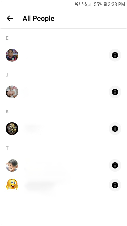
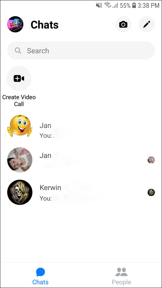
This is why Facebook Messenger (or just Messenger) is such a great pick for communication. Unlike nearly every other messaging app on Android and iOS, Messenger comes with a huge built-in audience—even if you don’t use Facebook regularly, you’re probably on the platform to some degree, making it an obvious choice for picking as a messaging app. Facebook makes it easy to find and add friends without needing their phone numbers, and every accepted friend request automatically opens a chat interface between you and your new friend on Facebook, making it easy to reach out to them and begin communication. Nearly every Facebook user—over two billion of them—have used Messenger to some extent, and since the platform supports iOS, Android, and web apps, the ability to use the service is always immediately accessible.
But just because the audience is there doesn’t mean Messenger is necessarily the best pick for video chatting. Let’s take a look at what makes Messenger so great—and what makes it the best alternative to Facetime for Android.
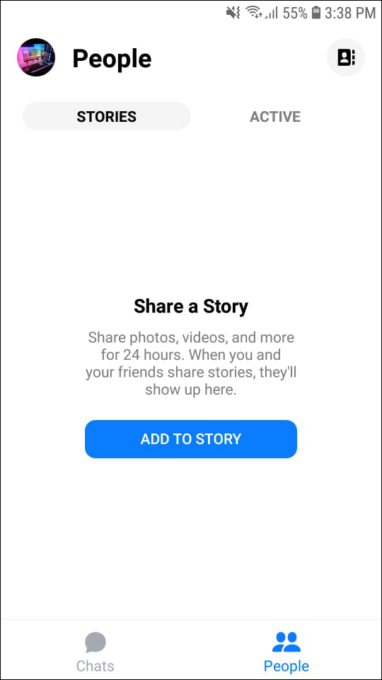
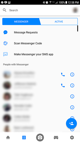
This might be the biggest issue with Messenger, because its interface has become overly complicated and busy in recent years. Though a recent update finally moved the “Facebook Messenger Day” feature from the top of the app to further down the chat screen, it’s still an eyesore—and overall, the app has become complicated and difficult to use, even for basic chatting. Upon open up the app on Android, you’re greeted with a relatively complicated messaging system that includes a search bar, a link to your messaging profile, your inbox, tabs for active users, groups, and calls, another list of active users, a taskbar at the bottom of the device, and a button to compose a new message. It’s a lot to look at, and all things considered, it’s not even a fraction of what’s included in this app. Messenger might not be confusing to navigate once you’ve grown used to the app, but it fails to ever feel natural in a way similar apps have succeeded.
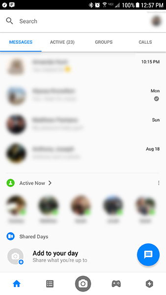
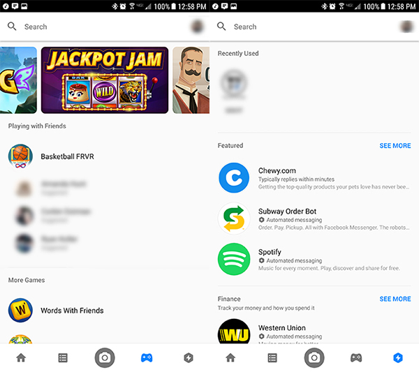
Take, for example, the taskbar along the bottom of the display, which hosts five different icons: Home, Contacts, Camera, Games, and Extensions. While the home display shows your inbox and active list, and contacts allows you to browse through your most-common connections on the app. The other three menus, however, range from redundant to worthless, depending on how you feel about their features. Extensions can be interesting, with these applications plugging into your messaging app to help you do things like find new music through Spotify, shop for deals on eBay, and order food from Subway. That said, it’s not a necessary function of the app, and often feels more like built-in advertisements than a real feature. Same goes for games, which allows you to play specific games right from within the app. You can challenge suggested friends and start a new game you haven’t played, but there’s nothing in here that’s groundbreaking—you’re better off downloading apps from the Play Store instead.
The camera button, meanwhile, represents the push Facebook has been trying to implement into every single app they own. It launches a custom camera interface incredibly similar to Snapchat’s own camera layout, complete with filters and AR effects that change the way your image looks. It’s meant to be sent as a direct message to other users, exactly as Snapchat and the Facebook-owned Instagram function as well. You can also post these images on your “Messenger Day,” a clone of Snapchat’s (and Instagram’s) own Stories feature. When this originally launched back in March, the feature had been pinned to the top of the screen. Though I can only comment on behalf of my own account, Facebook Messenger Day hasn’t been used by nearly anyone filling my Messenger feed, and it seems that spans true for most users, as the list has been moved towards the bottom of your inbox.
While the app itself is a bit of an unorganized, cluttered mess, the actual messaging interface is much cleaner. Conversations have a clean layout, with buttons and icons displayed around the app in a sensible arrangement around the conversation screen. At the top of the display is the name of your contact, their last active period, and options to both voice and video call, along with an icon to load more details about the contact. This details screen works as an extended menu of sorts, and it’s here where you can change the color of your conversation, the style of emoji, set nicknames for individual members in both single and group messages, start a “secret” conversation, request money orders, and more. Truth be told, it’s a lot to take in at once, but unlike the games and extensions in the rest of the app, having these features built into Messenger actually makes some amount of sense.

At the bottom of the screen is your taskbar for sending new messages. There’s plenty here as well, and again, it’s busy but functional. The actual text entry field takes up about half of the taskbar along the bottom of the screen, with dedicated buttons for the camera interface (again, the Facebook-branded Snapchat clone, not your own device’s camera viewfinder), a link to your gallery, a voice recording icon, and dedicated buttons to both emojis and Likes, which can vary in size depending on how long you hold the button down before releasing. It’s silly, but it’s a neat feature to keep in Messenger, especially since you can change what your Like button sends. There’s also a blue Plus button to the far left of the display, and… the less said about this the better. It offers the ability to add extensions directly to your messaging interface, but the overall app just doesn’t need the majority of these features.
All the bells and whistles in the world can’t make a poor video chat app good, and luckily for Facebook’s Messenger team, they’ve built a pretty solid application when it comes to voice and video communication. As mentioned above, each messaging thread has the ability to call your contact via either voice or video at the top of the screen, which makes it easy to contact the person you’re looking to call or video chat with.
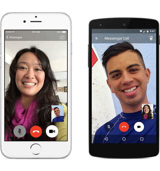
Tapping on the phone icon will begin a voice call with the user, which will ring their phone similar to how any other smartphone would ring. You’ll see a display highlight on your phone featuring the incoming call’s contact image and the receiving user can either begin or end the call from this display. There’s no voicemail feature, though you could always send a voice message in the actual chat thread. Voice quality sounded comparable to what we’ve come to expect to HD voice on modern smartphones. There wasn’t much distortion, though the quality of your call will presumably depend on the quality of your network. The call interface isn’t too bad, with a clean, white look that matches the rest of Facebook’s overall aesthetic. You can control all the typical call settings from within your display, including mute and speaker options, along with the option to transfer the call to a video display.
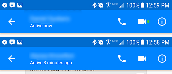
Video calls, meanwhile, are a little bit different. Though you can begin a call with anyone, you’ll want to first look to see if the user is active and ready to accept a video call on Facebook. This is relatively simple; you can either look for currently active users, or you can check to see if a green dot appears next to the video chat icon on your contact’s thread. When that green dot disappears, it doesn’t mean they won’t answer the video call, but it does mean they’re no longer actively using the app and may miss your call. You can also make a group video chat from your groups within the app the same way, with up to six users able to join the chat at once (and up to fifty with voice-only options).
The video call interface is well-designed, with a modern flat look that matches most other modern video call displays. Your own video feed is displayed in the corner of your screen, with your caller’s video displayed on the main portion of the screen. You can switch the display at any time by tapping on the postage stamp-sized video feed in the corner. Besides this display, three other icons make up the UI for Facebook’s video chat: a red end-call button, a transparent mute button, and a white camera icon that allows you to toggle your camera on and off (thus switching to a voice call). At the top of the display is a small icon used to switch between the front and rear-facing cameras, along with a banner that simply reads “Messenger Call.” Overall, it’s a clean look for an otherwise messy app. Video and voice quality were solid, though once more, network status will play a big role here.
Despite the shortcomings of Facebook Messenger, there’s no denying it’s a powerful communication app, built to rival even iMessage in terms of features and ability. While Google’s own communication strategy continues to flounder, it’s Facebook that has the community and audience to truly ship an app like Messenger that can compete with iMessage. And while Messenger lacks the most important part of iMessage—the ability to switch between SMS and iMessage without any effort by the user—it’s important to note that Messenger does support SMS messages, albeit in their own separate feeds.
Facebook’s Messenger app is no doubt a mess, but with two billion users worldwide and clients for Android, iOS, and the web, it’s probably the most powerful message app on the market right now. Because of Messenger’s easy cross-platform appeal, it’s the app to use in place of a FaceTime client on Android. While it doesn’t come standard on any iOS or Android device, you can nearly guarantee all of your iPhone-owning friends have this app installed on their devices. And if they don’t they’ll still get the notification sent to their Facebook profile. Now, of course, the major problem comes when you’re trying to reach a friend on iOS who doesn’t use Facebook, but despite the platform’s slightly-diminished popularity among younger audiences, you’ll still find these issues to be few and far between. And not having to deal with gathering a friend’s phone number is a huge benefit as well.
Overall, Messenger is the app to get when looking for a FaceTime alternative, so long as you’re willing to use the admittedly-bloated application. It’s the easiest way to connect with your friends on any platform, and the calls—both voice and video—are of high enough quality to forget you aren’t using FaceTime anyway.
Compatible With


In 2016, Google announced their newest messaging clients for Android in their never-ending quest to perfect mobile messaging through continued fragmentation. The two apps, Allo and Duo, were received with general criticism from Android fans upon their announcement, largely due to the limitations of both applications. Allo, Google’s messaging application, features Google Assistant built into the application, but messaging is limited to other Allo users, requiring a whole new app to be downloaded to both your phone and the phones of your friends and family members. This, combined with the lack of a web client until very recently, made the app relatively useless to even the most dedicated Android users. Though the app launched to some success on Google Play, the app quickly left the top 100 downloads on Android, and haven’t seen much success on iOS either.
Duo, however, is a far more interesting application. Whereas Google Allo works quite similarly to WhatsApp, Duo is Google’s take on a FaceTime-styled mobile video chat app. Unlike Google Hangouts, which felt more like a Skype clone, even on mobile devices, Duo was built from the ground up to support mobile devices; in fact, the app still doesn’t have a desktop-based version. But that’s okay, because while Google Duo doesn’t nearly have the same sort of audience that Facebook Messenger does, it’s also an app that features some great design choices and might just possibly be one of the best video chat apps we’ve tried. It isn’t perfect, and the struggle to build a dedicated audience is real and obvious, but so long as you can get your friends on the platform, you might find yourself loving Google Duo for what it is.
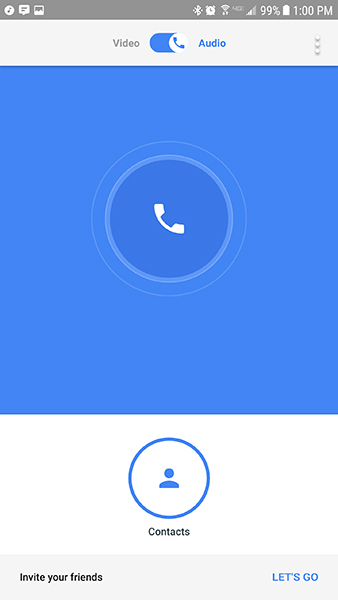
Unlike what we saw from Messenger, Google Duo’s interface is uncluttered and simple to use. This is mostly because the app does so much less than what Facebook Messenger does, but if you’re looking for an alternative to FaceTime for Android, this is more or less the ideal version of this. After setting up the app with your device’s phone number, Duo loads into its main display. This screen shows your camera, a list of contacts along the bottom of your device, and a video or audio option at the top of your screen. Duo uses your phone number to find and add contacts across the service, meaning there’s no friend requests or suggested contacts to add to your app. Instead, as long as your contact’s number is registered with Duo, they’ll appear in your device, ready to be called.
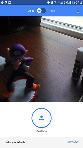
The contacts display is rather simple. Along the bottom of the screen, inside the large white box, will be a link to your contacts and any recent calls you’ve made from your device. Tapping on the contacts icon will open up a full list of the contacts stored on your phone. Everyone who has a Duo account will be bumped to the top and listed in alphabetical order, and all of your other numbers will be listed below this. Non-Duo numbers have an “Invite” link next to their, name, allowing you to send a text to that individual from your device with a URL that allows you to install the app. On Android, this link we’ll load directly to a Google Play Store install page; I wasn’t able to test the iOS version of the app, but presumably, it would load to the app’s iTunes listing.
Beyond the main display and your contacts list, there isn’t much else to Duo’s interface beyond a settings menu that allows you to tweak your app a bit. You can enable or disable vibration while ringing, set a mobile data usage limit, get alerts when a new contact joins Duo, turn on or off updates and suggestions for Duo usage, and block numbers within the app. You can also unregister your phone number if that ever changes, a necessary function since only one phone number can be registered to your Google account.
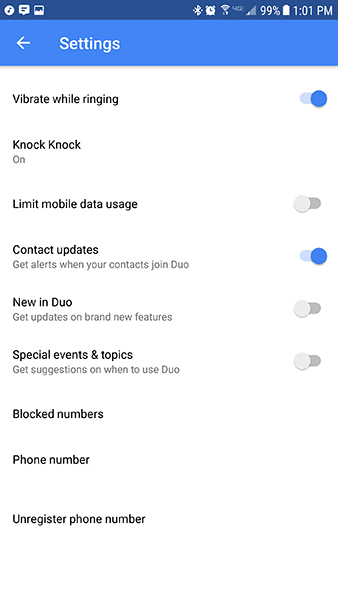
Duo’s also fairly light on features, with only two notable additions to the basic video-chatting service we’ve grown used to since FaceTime’s launch in 2011. First, Duo can integrate directly into Android’s call log, listing Duo calls right alongside your other calls to those contacts. This is a small-but-neat addition that makes it easy to view all your calls to a contact in one screen. The second feature is another small addition, but something that makes Duo feel a little bit more futuristic than its competitors. This feature, Knock Knock, previews your video for the other contact as you call. So when someone calls you on Duo, instead of seeing their contact image or name, you’ll see a live preview of their video feed. When the call is answered, the video automatically goes live, and you can jump into the conversation immediately. Again, Knock Knock is a small feature, but it’s something different in a sea of similar video chat apps. It does help to make the conversation feel a little more organic, instead of something that’s feeling forced or contrived. If you don’t like showing a live preview of your video when calling, you can disable it inside the settings menu.
Duo might be lacking in terms of features compared to Facebook Messenger, but when it comes to video and voice calls, it more than makes up for it. Because the app is dedicated to video and voice calls only, Google can focus on making sure this app is incredibly good at just those two things. And while some might feel the app is missing something because of this focus, for anyone looking for a FaceTime alternative for Android, it really makes this app feel like the best choice. Unlike in Facebook Messenger, where you have so many options to communicate, this app keeps it simple. By default, it’s a video chat application, but it can quickly become a way to call Duo contacts over WiFi as well.
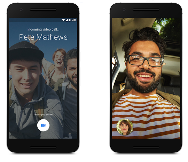
When you pick your video or voice call by switching between the tab at the top of the display, you’ll either see the live preview of your video or a glowing call icon. You then pick your contact from either your recents list, and a call begins. Assuming Knock Knock is still enabled on your device, your caller will be able to see your face as you call them, and when they jump into the conversation, your display will change from your preview to their video feed. The video interface looks relatively similar to what we saw on Facebook Messenger. Your video preview is minimized in the corner of the display, and you can switch back and forth between your feed and their feed at will. Unlike Messenger, your video call controls typically stay hidden on screen, maximizing the amount of space displaying your contacts’ face. You can tap on the screen to bring these controls in at any time though, and these controls include an icon to change your camera between the front and rear modules, a mute icon, and of course the end call icon.
Voice calls work nearly identical, with a clean look displaying your contact’s image and icons for mute, speaker, and end call, along with the runtime of the call. Once you’re inside a call, you can’t switch between video and audio, so it’s worth noting that you’ll want to make your decision on what type of call you’d like to make before placing it. It would be awesome to see this ability added in with a future update, but as of right now, no dice. Same goes for group calls—they aren’t here, despite their built-in support with Google Hangouts, Google’s other video chat service. Hopefully those will come down the line eventually, especially as Hangouts becomes more and more for business users only.
In terms of quality, both audio and video calls were solid. Video can be a bit stuttery depending on your connection, but it also appeared a bit sharper than what we saw with Messenger. The video feed pauses and fades to grey whenever the user leaves Duo, so while multitasking is possible inside a call, it will translate your video call to a voice call temporarily, albeit with limited options. When you reenter the Duo app, your video resumes. Video can also pause and fade to grey when the connection is unstable or poor, saving on data and helping restore a solid audio connection between two users. Speaking of which, audio quality was on par with Facebook Messenger and HD voice calls. You won’t have too much to complain about here in comparison to other calling services.
If this review series was based solely on the best video chat app regardless of outside circumstances, Google Duo would win in a landslide. It’s the perfect alternative to FaceTime, with the same simplicity seen in Apple’s own app without the limitations set by platform exclusivity. Calling a contact is as easy as hitting two buttons, and the simplicity of the app makes it easy to use right next to your standard IM and texting applications without feeling pressured into yet another messaging app. Knock Knock is a legitimately cool feature in a product area that typically doesn’t see too much innovation, and call quality is solid all around.

Unfortunately, Duo doesn’t exist in a bubble, and while the app has grown a fairly large audience of users, it’s nothing compared to the amount of users that have Facebook Messenger installed on their device. Though there are several contacts from my device on Duo, seven or eight out of nearly two hundred numbers isn’t a strong-enough ratio to use consistently as your main video call application. Messenger, meanwhile, has a monthly active user base of 1.2 billion people, as of April of this year, meaning the majority of your friends, no matter what phone they use, will be accessible with Facebook’s app.
That doesn’t mean Duo’s future is bleak, however. The app is now part of Google’s mandatory app installs for phones launched in 2017 and beyond, meaning the user base for Duo should increase as more and more people update and upgrade their phones, and the invite and sign up process is one of the easiest we’ve seen in a video chat application, making it easier than it otherwise would be to convince your friends to jump onto this new platform. Google secretly has a great application here, with a solid UI and some cool features, and there’s no doubt the monthly users of the app will grow overtime, assuming Google doesn’t just dump support for the app. Duo’s looking a lot healthier lately than Allo, its messaging sibling, which is a good sign for the future. With a steady stream of updates pushed out over the past year since the app launched, it’s a good sign that Duo isn’t going anywhere soon. Duo is, by far, the best one-to-one video chat service on the market today. The challenge comes from convincing your family and friends to adopt it as their video chat app of choice.
Compatible With
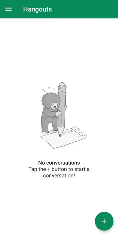
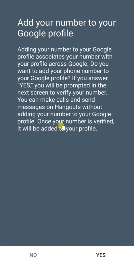
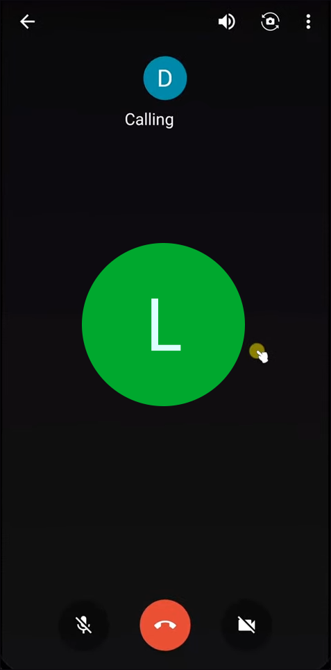
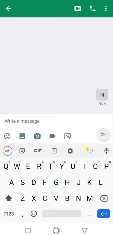
Google Hangouts makes the list largely for the same reason as Facebook Messenger: nearly everyone, especially Android device owners, have access to it. Hangouts is a preinstalled application on most Android phones shipped prior to 2017, which makes the install base larger than every app on this list outside of Messenger. The only requirement to use Hangouts is access to a Google account, something that’s already required to use Android devices anyway, making this app one of the easiest to setup and use for video calls.
Like most video chat applications outside of FaceTime and Duo, Hangouts also has its own built-in messaging service that allows you to instantly message any of your Google or Gmail contacts built into the device. Hangouts keeps its interface relatively simple, with a threaded interface displayed on the homepage of the app and recent messages and calls displayed within each thread. You can send other users images, emojis, stickers, and regular text messages, and set a status for other users to see if you’re actively online or offline. Google Voice and Project Fi users can use Hangouts as their SMS app, meshing their Hangouts and text conversations together, though other users will have to use a separate texting application to communicate with SMS users.
The biggest problem with Hangouts isn’t the app itself—it’s Google. With the introduction of Google Allo and Duo as their new messaging suite, plus the refocus of SMS and RCS messages with Android Messages, Hangouts has been left in a tough position, being forced into a corner by Duo’s video chat services, Allo’s instant messaging features, and the removal of SMS support from Hangouts when Android Messages was introduced. Though Google has sworn Hangouts won’t be retired anytime soon, the app is slowly being repositioned for business users. If Google’s opinion on the continued existence of Hangouts isn’t obvious enough, they removed the app from the required suite of Google apps to be installed on Android devices at the end of 2016, replacing the app’s place with Google Duo. Hangouts isn’t a bad application—with clients for Android, iOS, and the web, it can work on any platform available—but it’s one that’s slowly being replaced by Google’s newer suite of communication devices.
Compatible With
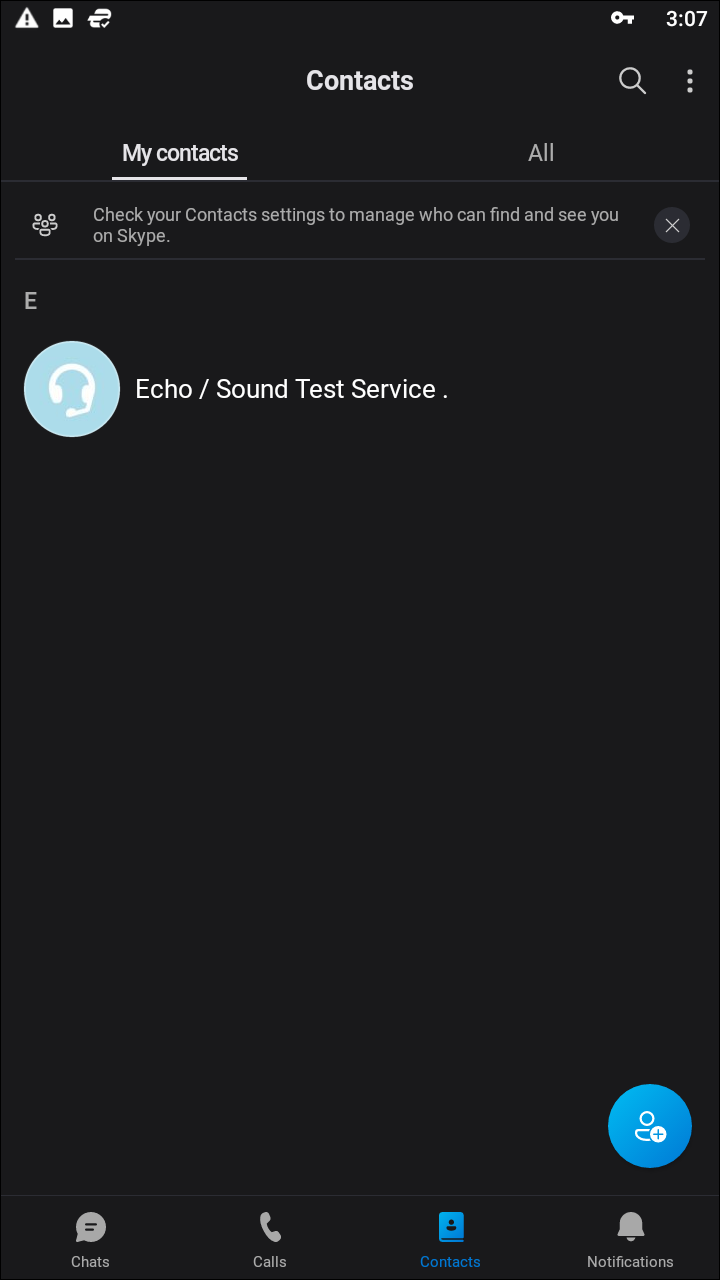
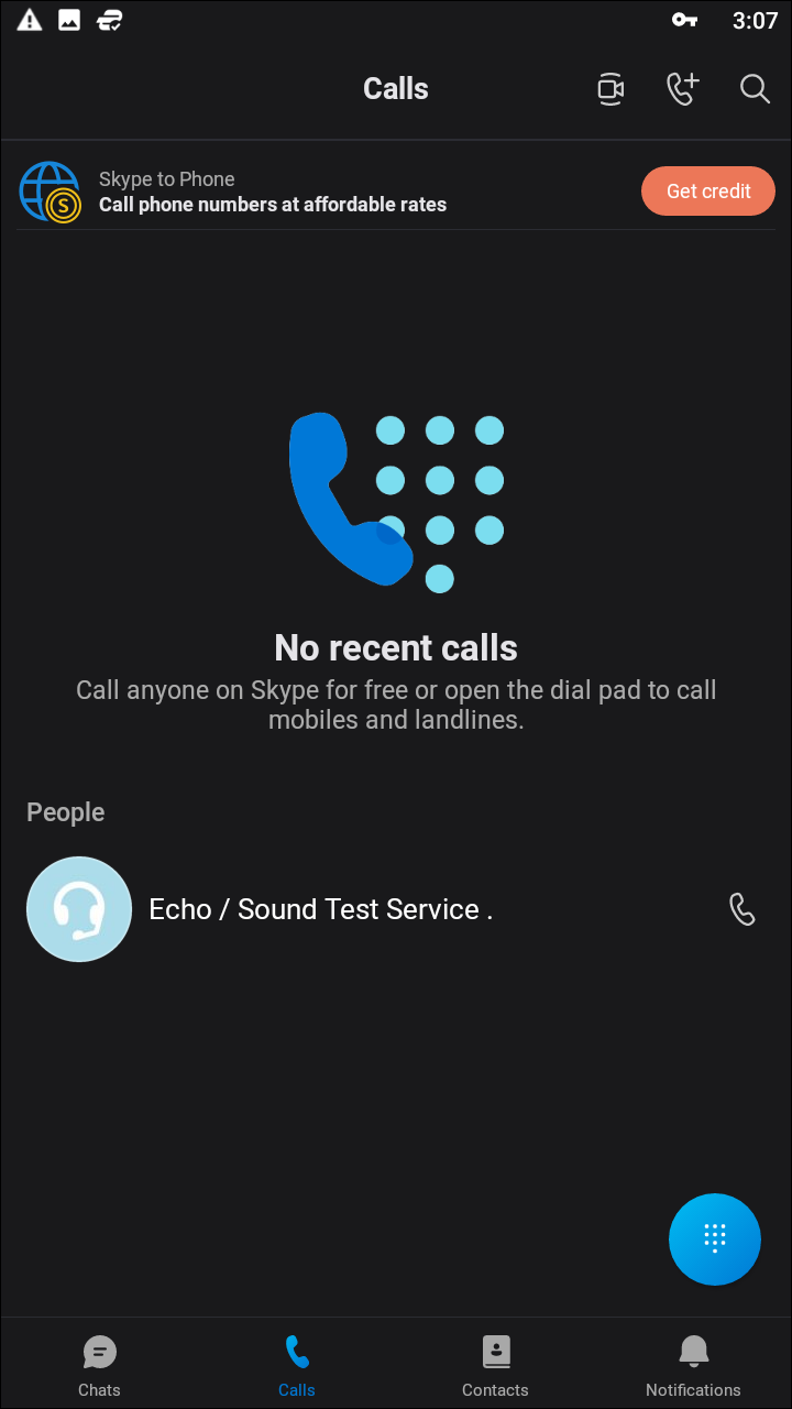
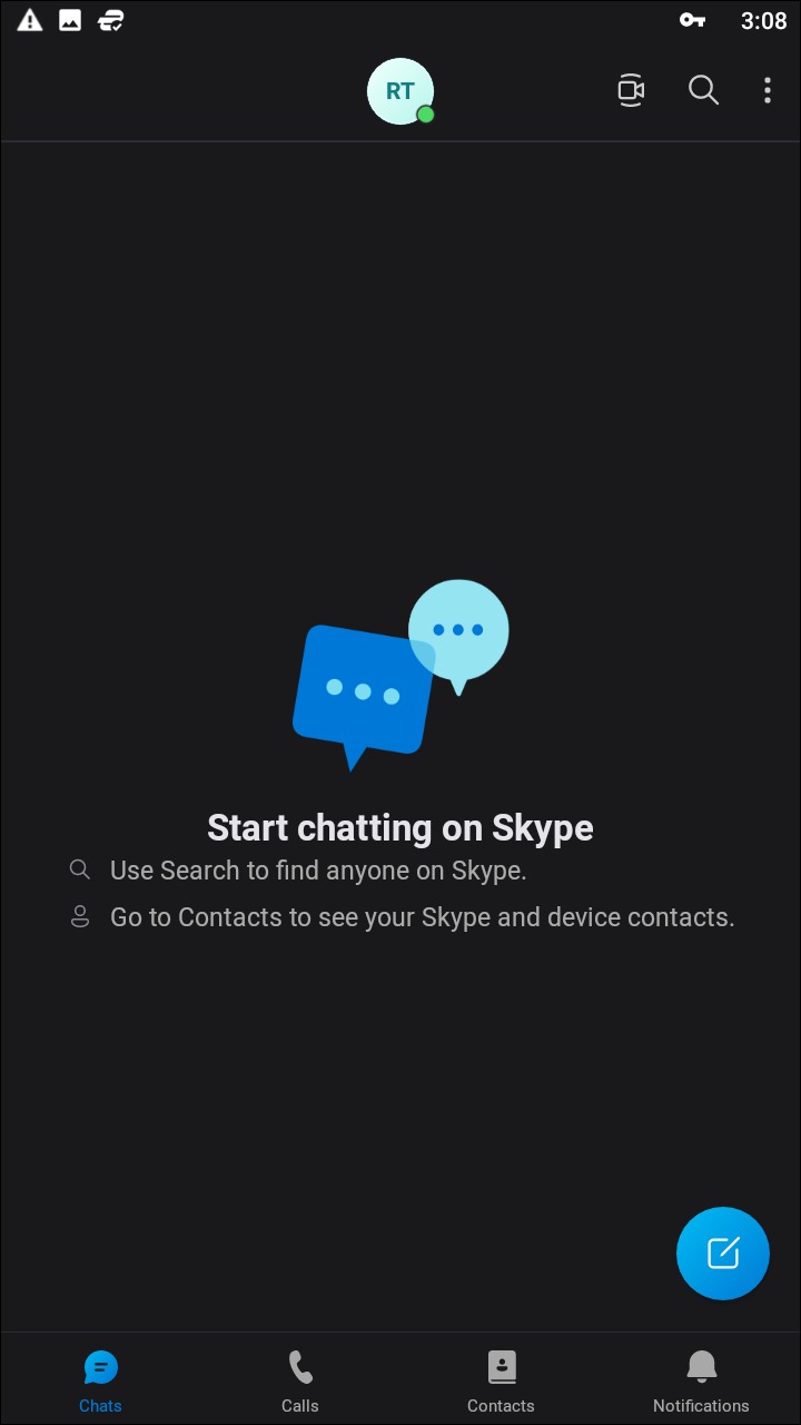
Skype’s been on the marketplace for nearly a full fifteen years, and for a time was the video chat application, much like how Kleenex is used in place of the word tissue. And though FaceTime—and other apps, to a lesser extent—have eroded away at some of the market domination held by Skype, many people still rely on the service for their video calling daily. Unfortunately, the app has received its fair amount of criticism over the years from users, typically due to connection problems, high CPU usage on desktop computers, and latency issues when using the application in the background. Microsoft’s purchase and subsequent funding of Skype in 2011 have helped alleviate some of these issues, but the app remains controversial in some corners of the internet.
The app was massively redesigned in 2017 to refocus Skype not as a video calling application, but as a messaging client that also supports video calls between users. While this in and of itself isn’t necessarily a bad thing, it does push video calling into the background of the application, which only manages to exacerbate the problems outlined above with Skype. The newer, flattened design of the application isn’t necessarily bad, though. It looks rather nice and bright, especially on devices with an AMOLED display (there’s a dark theme as well), and with support for “Add-Ins,” Skype can replicate some of the features supplied by both iMessage and Snapchat, including stickers, embedded YouTube videos, and forecasts right inside the app. The mobile app does support group calling, and the new Highlights feature replicates Snapchat’s Story feature to a T.
Overall, Skype is Skype, whether you’re using it on mobile or desktop. It’s been around for long enough that most smartphone owners have probably used the platform, building an extensive friend list over more than a decade of use. That said, whether or not your friends are still using Skype is another story, and if you can’t get other users to download the app onto the device, you can forget about using Skype to manage your friends’ video chats.
Compatible With

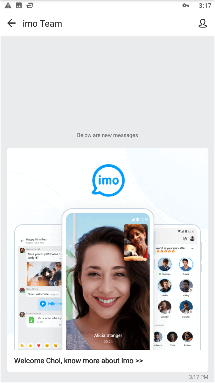
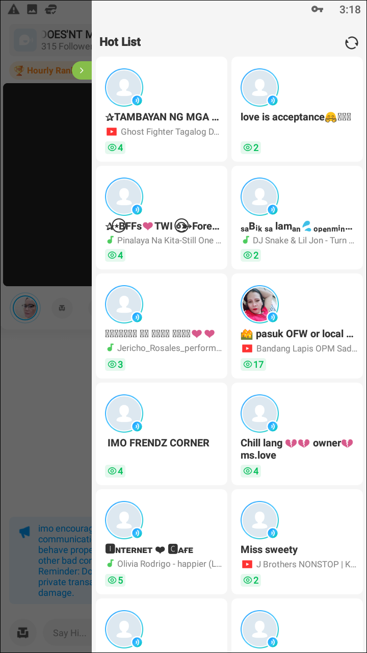
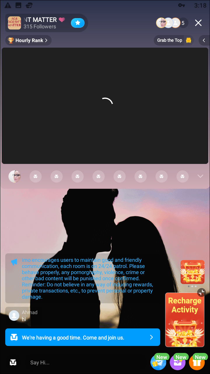
In terms of comparisons, imo is closest to Google Duo or FaceTime in terms of simplicity and features. With clients for Android and iOS, it’s a solid cross-platform offering for users looking for a basic yet powerful video calling app. Though the app does have a messaging interface for communicating with your friends over text, it’s obvious the app is designed to focus primarily on video chatting from the main display. imo is, in some ways, an overly simplistic app, with a tab-based layout that features your chats and your contacts in two separate displays. In the chats display, you can start a new group call or reply to an already existing thread. The app has taken some direct influence from Snapchat, with a shutter button at the bottom of the display that allows you to take photos or hold to record short videos to send to your contacts.
Inside the Contacts thread, you can start a new conversation with your already-existing friends on the service, or invite a recent contact to chat with you on the service. Tapping on the name of your contact will open a display that shows the message interface (allowing you to send photos, emojis, voice messages, and more), as well as a large banner to video call the user. You can also video call right from inside the Contacts tab by tapping the video camera icon on the right side of the display. Finally, if you know the phone number of the user you want to add and they don’t appear in your recent contacts, you can add them directly from the “Add Friends” option using their phone number.
Though imo’s video and voice quality was solid in testing, the biggest problem facing this app isn’t the interface or the features—it’s the user base. Only one contact on our test device appeared within the app, out of the 200-plus contacts saved on the phone. Even with its 100 million downloads on Android, imo has, by far, the lowest user base out of all five apps we tested. This makes it difficult to recommend on the same level as applications that come with preinstalled users, including Google Duo and Facebook Messenger, and even Hangouts and Skype. This isn’t to say imo is a bad app, of course, but that it will be difficult getting your friends and family members to adopt a new platform they’re largely unfamiliar with. Still, if you can get past that hurdle, imo is a solid app in the spirit of FaceTime or Google Duo, with some extra messaging features built in for good measure. Even if this app never hits the heights of Messenger or Skype, it’s not a terrible idea to keep imo on your device for when the occasion calls for it.
If you don’t see an app that should be here, let us know what it is