Google News vs. Yahoo! News vs. Bing News
News web sites are nothing new and have been around a very long time. People like them a lot because they do genuinely deliver the news we want to read be it for world, national or local information.
The formula for a news site really hasn’t changed all that much over the years, with the exception that there’s now more social integration. Google in particular really wants you to use social media with the recent introduction of their News For You feature on Google News.
A small note before continuing: Every single major portal news site completely missed the mark pertaining to social media and news sites. Why? Because they’re finally getting around to it now, whereas they should have integrated more social digs into news sites way back in 2007. If there’s anything that people would want to share and share often, it’s news stories. Duh.
Google News
Site: http://news.google.com
Prediction: The News For You feature is going to fall flat on its face because it requires watching an instructional video just to figure out how to use it, and it messes around with the interface in such a way where it breaks familiarity. People do not like it when you switch things around like that.
In addition, News For You by default is shoved below the Top Stories. If News For You was such a big deal, why not put it at the top? The Goog is weird like that, I guess.
Aside from the News For You feature, here’s a basic overview of Google News.
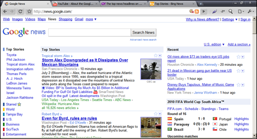 Interface
I’m bothered by the fact that the links you most want to get to (as in the colored blocks) on the left have now been shoved down because of Top Stories. You cannot collapse Top Stories at all as it’s static text. Top Stories is also listed twice. Once on the left column, second in the middle column. That’s redundancy for the sake of redundancy and doesn’t serve any advantage to you, the reader.
I do appreciate the fact the news search box at top is large. The font used within the box is also large to suit.
I also appreciate the fact that setting favorites is really easy. Each article has a star icon next to it. To favorite/bookmark the article, click the star. It does require a Google account to save the information, but that’s par for the course.
The colored blocks on the left sidebar are your best friend in Google News, because that’s how you switch from World to National to Business and so on. On top right you can select your country of choice to see news for that specific nation.
Getting local is where Google News fails. While there is a local link (mine is “Tampa Bay”), this is literally guessed by Google as my locale based on my IP address. However there is nowhere where I can input a ZIP code to change that locale. What if I’m in a different state and don’t want to read the local news there? How would I reset it to be local to somewhere else? The answer, unfortunately, is you’re forced to use a Google account to get very specific with your locale. That’s a flaw. There should be no requirement to have a specific account just to get local information on a very specific area.
Informative?
Google News as far as being informative is fair at best because the way it categorizes things is improperly done. In fact, when reading the Google News main home page there are basically no categories at all for listed stories. You’ll see the category topic, but not which main category it falls under.
For example, one of the main stories has the topic listed as Tropical storm Alex. Okay, what category is this in? World, U.S., regional, local? You don’t know. Every single news story on Google News’ home page is like this, and I wish it wasn’t.
Yahoo! News
Site: http://news.yahoo.com
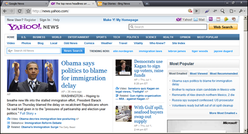 Interface
Y! News smartly looks similar to an actual newspaper. For lack of a better description, it looks “newsy”, and that’s not a bad thing at all.
What I’m bothered by immediately with this interface is the fact there are two search boxes, with the one you want to use, news search, being much less prominent than the other, web search. The web search function should be completely removed from Y! News, because when you’re here, you don’t want to search the web, you want to search news.
Font consistency is all screwed up on Y! News. There’s your big-ass title text, the super-tiny and almost unreadable date text right below the title (which I guarantee you didn’t see until I pointed it out to you), and the box sizes are a bit off the mark. At first glance, Y! News appears to be a three-column layout. It isn’t as there are only two. As you scroll down the page you’ll find this to be true.
Y! News’ interface is functional, but a bit on the clunky side. Even though that’s true, it does in fact look a whole lot better than Google News does, and in fact is easier to find stuff on it – particularly for video content which makes Y! News both a newspaper and news-television style site.
The best part of Y! News is the top blue bar and the accompanying sub-menu white bar directly underneath it (this is a pseudo tab-like interface). You can easily get to whatever you want very quickly.
Getting local is stupidly easy. You can click Local in the top white bar when on Home in the blue, and you can change your location to whatever you want via the Change Location link from there. If you want the site to set a cookie so it “remembers” your location, be sure to check the box Make this my default Yahoo location. This is nice because it does not require you to login with a Y! account to use the local feature.
Informative?
I score this one as good. The way in which Y! News delivers information is spot-on because it gives you a very wide selection of what to read or watch without having to hunt and peck around. It is genuinely informative each time you load the site. As you scroll down the main home page, you’ll see everything is categorized properly and you never have to guess what category a particular news story falls under. In addition, each category has subcategories so you can choose the news source easily, sometimes as many as eight!
Bing News
Site: http://www.bing.com/news
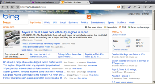
Quick question 1: Did you know Bing had a news site? I’m guessing the answer is no.
Quick question 2: Did you know MSN had a news site? I’m guessing the answer is yes, because of course you’ve heard about MSNBC, right? Right.
Bing News literally does not need to exist, because MSNBC beats the ever-lovin’ crap out of it. Microsoft literally has two major news portal sites for no reason at all. MSNBC is a million times better in every way, shape and form compared to Bing News – yet they are from the same company. As far as I’m concerned, Microsoft needs to dump Bing News entirely and just use MSNBC exclusively, because it is, said very honestly, one of the best news sites on the internet. I do score MSNBC as an “excellent”. Right layout, right information, right everything. When you want a news site that has it all, MSNBC nails it.
Even though that’s the case, let’s concentrate on the there-for-no-reason Bing News.
The first thing you’re treated to with Bing News is a bevy of text. Lots of text. It’s a design you’d expect to see from a web site made 10 years ago. If you click on any of the “tabs” under the big search box (which by the way is a legit news search and not web search), the right sidebar disappears on the next page. Hey! Where did it go? Well, it’s gone.
In the plus department, it is nice that stories are categorized similar to Y! News, however there is no way to select the news source. You have to take what Bing gives you.
A very strange maneuver is that the “top news videos” are at the very bottom of the main home page for Bing News. Why? Shouldn’t that be up a little bit? Way more up, actually? Granted, there is a “See news videos” link at the top of the page, but the video bar at the bottom has thumbnails which makes it more interesting and informative!
I will give credit to Bing that there is an RSS link directly on the main page and marked as such. Many people who read news like RSS, and it’s nice Bing has that in there. There is also a prominent “News Alerts” link as well, and that’s something people like to use also.
Informative?
Only in a cursory sense. Bing News is like a bad copy of Y! News. I give Bing News a score of below average. Both Goog and Y! beat the snot out of Bing News, however, MSNBC beats the snot out of both them easily.
It’s like I said, Bing News should be dumped right now for MSNBC and stay that way. Microsoft can call it “Bing on MSNBC” or whatever they want, but they seriously need to do it.
What Internet news source do you prefer?
Google, Yahoo!, Bing, MSNBC, or maybe something I didn’t mention?
Let us know by writing a comment or two.








One thought on “Google News vs. Yahoo! News vs. Bing News”