How To Get Back The Old Internet Explorer 8 Logo In IE9
From IE8 to IE9, the browser changed logos.
Here’s are the logos side by side, with 8 on the left and 9 on the right:

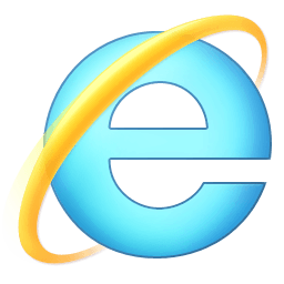
If you recently upgraded to IE9 but hate-hate-hate the new “e” logo, here’s how to get the old logo back.
Step 1. Download this ie8.ico file which contains the old logo (note: you may have to right-click/Save As) to download the file outside the browser.
Step 2. Place the ie8.ico file in your Documents folder.
Step 3. Click the Windows logo and search for Internet:

Step 4. From the search results, right-click Internet Explorer then select Properties:

Important note: If you’re using 64-bit Windows, you will have to change the icon for both the 32 and 64-bit version of IE9. For this example I’ll just be modifying the 32-bit version.
Step 5. From the Properties window, click the Change Icon button:

Step 6. Click the Browse button:
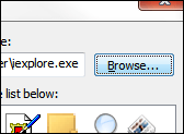
Step 7. Navigate to your Documents folder and select the ie8.ico file (which may simply show as ie8 without the file extension):
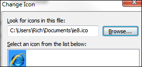
Step 8. OK, Apply, OK.
Whenever you launch IE9 from this point, the old IE8 icon will appear (the highlighted IE below shows the 8 icon, the other which is unchanged shows the 9 icon):
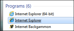
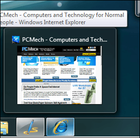
It will also reflect as such in the taskbar:
Final notes
Didn’t work? This was probably because IE was pinned to your taskbar. Unpin it (right-click IE on taskbar, select ‘Unpin this program from taskbar’), perform the steps again to change the icon, re-launch IE and it should work.
If you want to change the IE logo back to the new 9, you will need to use IE’s executable to retrieve its icon file. This is easy to do.
Right-click the IE you changed from a search in the Start menu and select Properties:

Highlight and copy the target path from the Shortcut tab:
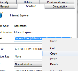
Click Change Icon:

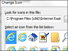
Right click and paste the path in the ‘Look for icons’ field:

Click OK, then select the first icon:
IE9 will then use its original icon.















4 thoughts on “How To Get Back The Old Internet Explorer 8 Logo In IE9”
Same program, same logo, different colours. Whoop-dee-doo!
Same country, same flag, different colors. No one will notice, right? Whoop-dee-doo!
The point is that this article is obsolete; a lot of very detailed steps for a medeocre and useless task.
You’re talented at explainations, and especially at writing guides, thus this article makes me a little sad that you’d spend it on something like this. Makes me wonder what actually paying you gets me…
What program uses the pen icon to the left of IE on the taskbar?
Google Chrome is about to change their logo as well and pretty much follows what Microsoft did to theirs. Brighter, lighter, ‘flatter’ (less 3D, more 2D), no dark outlines.