Inbox Alternatives (by Google) for Android and iOS
For several years now, Google has maintained and updated two separate email apps for mobile and web platforms. Gmail has been around since 2004 and happens to hold the trophy as one of Google’s most successful products to date, with over 1.4 billion users around the globe. Gmail accounts basically run the entire backend of Google, and are occasionally even required to use other Google products like Android. The Gmail app on Android and iOS had a reputation for being pretty good, but in 2014, Google announced an all-new email application to use with your existing Gmail account: Inbox. Originally available by invitation only, Inbox was off to a rocky start in the first couple months of its existence. Some accounts (especially business and school accounts) didn’t sync with the application, leaving some users without their entire email service on their phone.
Still, for many, Inbox felt like a revelation, a complete reinvention of some of the tropes and recurring features we’d come to expect in mobile and desktop email applications. Suddenly, Google made it easy to balance your multitude of emails, sorting them into categories that made it simple to minimize or archive them with just one or two clicks at a time. Even better was Inbox’s ability to show you your trip reservations on one page, open your reminders, and so much more right within the desktop or mobile app. And with other third-party email applications like Astro drying up at a similar rate, it’s become seemingly impossible to recommend new apps and services to replace Inbox on your phone and desktop.
So, with Inbox limited to about five more months of life, we saw it time to take a look at the market for email apps, to decide the best replacements for email on your phone, tablet, and desktop computer. While the market has continued to be increasingly limited, we select four apps that may be able to replace Inbox by March of 2019. Here are the best options to replace Inbox on your iPhone, iPad, or Android device.
Our Recommendation
TypeApp
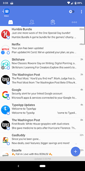
There’s a lot to love about TypeApp, from the (blue, like Inbox) visual design to the ability to focus on specific conversations in one option within the application. Though the app’s visual design isn’t as clean as Inbox’s, there’s still a lot going on here that makes it an obvious choice. The app’s tab-based layout and options page makes it easy to quickly select a different inbox view, and quick options for both your calendar and your tasks (more on that in a moment) make it a solid choice for not just organizing your email, but for working towards organizing your entire workflow.
Let’s start with the basics: TypeApp allows you to select from multiple views of your inbox, regardless of mail provider. Your entire inbox is here, as is a contacts panel (where you can view your recently contacted senders and receivers) and a full task list. This makes it easy to organize your inbox by sender, receiver, and tasks, which is ideal for coming from Inbox to a new email application. Tasks is a strange feature in TypeApp, because it doesn’t work the same as what you might expect from an app like Inbox. Basically, TypeApp’s tasks is a combination of snoozed email in Inbox and a full to-do list app. By either marking emails as “done” or “snoozed,” you can review messages based on what’s upcoming or completed. Already sent your boss that report he asked for? Mark the email as done and it’ll appear as a completed task. Still waiting on those reports from your coworker? Snooze the email for a few hours or until tomorrow to wait for the answer to come back.
The calendar function in TypeApp requires full access to your calendar and contacts, but with that implemented, you can view a full list of your upcoming events and appointments from your synced calendar. Overall, TypeApp does a good job of recreating plenty of the options we had in Inbox, especially with the ability to snooze and mark emails as done, while also implementing its own spin on the basic idea of an email application. It’s not perfect, but if you’re looking for a good email application that’s more outside the box than Gmail or Outlook, this might be the one for you.
Runner Up

Blue Mail
Blue Mail is by no means a perfect replacement for Inbox, but if you’re absolutely against switching back to Gmail and you’re looking for a third-party service, Blue Mail is the one for you. The app might not stick to the general Android aesthetic we know and love, but there’s plenty to like once it’s installed on your phone. Blue Mail focuses on trying to be the best mail application for universal access on Android, and it does a good job in managing this. It’s feature-packed, features a clean design with a color scheme reminiscent of Inbox (unsurprisingly, from an app with the name Blue Mail), and comes with a full focus on both speed and productivity. Blue Mail might not be a perfect email application for everyone, but some—especially non-Gmail users—will find its features hard to ignore.
Once you’ve synced your email account(s) into Blue Mail, there’s a bit of a learning curve to getting used to the app. While most modern email apps have effectively repurposed Gmail’s own sliding layout, BlueMail has an entire top panel of options and settings above your email. Below the blue bar is a list of all your linked email accounts, each of them labeled with a custom identity. This makes it relatively easy to switch between different email accounts at will, viewing them one at a time. Alternately, Blue Mail’s default setting is the ability to view your unified inbox, similar to Gmail, making it easy to see all of your emails coming to your account at once. One of the coolest display settings in your inbox is Blue Mail’s People Switch, which allows you to only display mail from friends, family members, clients, and other real-world individuals.
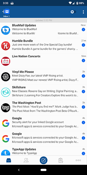
Beyond that, Blue Mail is also simply a great client. Sending and forwarding emails worked well, and the compose display looks nice, even if it’s a bit too much like the iOS mail app in its iconography. Blue Mail features reminders, a built-in calendar, email aliases, push notifications, a dark theme, and plenty of other features to keep users satisfied. It’s an incredibly powerful app, and though that learning curve does exist while using the service, the power behind this application doesn’t go unnoticed. What’s more, Blue Mail is an entirely free application, without ads or in-app purchases. If you’re the owner of multiple email addresses for work, school, and more, you’ll definitely want to check out Blue Mail.
Everyone Else
Outlook
Microsoft’s powerful email application Outlook won’t heal the Inbox-filled hole in your heart, but it might provide a salve to help you from feeling terrible about the loss of your favorite email app. Outlook is Microsoft’s own email service, but the application works with all email services, including Gmail, which means you can sync your account with Outlook to help gain access to some of the features you might miss in Inbox. Outlook isn’t a perfect replacement for Inbox, but it’ll do the job and get you through the day without making your email feel like it’s a complete mess.
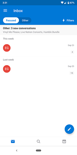
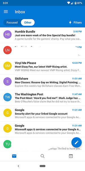
One of the biggest features that seems to be inspired by Inbox is the ability to toggle between a focused inbox and your full inbox. Focused provides you with a limited amount of options, giving you only the stuff you want to see and not much else. In our inbox, it delivered on the two email threads that had been active in the past week; everything else, from promotional emails to social network content to everything related to banking and financial information was filtered out, limiting the noise in the inbox that typically would fill up with clutter from all sorts of sources. It goes without saying that this feature is incredibly appealing to ex-Inbox users, and should please most users looking for that style of sorting. Likewise, notifications are only enabled on your focused inbox by default, which makes Outlook operate far closer to Inbox than traditional Gmail.
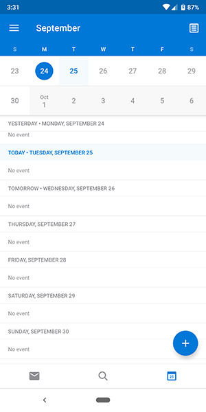
Since Outlook is not just an email client but an entire desktop suite of software on Windows, it makes sense that the app includes a calendar alongside the other offerings. In some ways, this should appeal to plenty of users looking to sync their content between their calendar and their phone, and being able to see your calendar inside of the application makes it easy to check up on appointments and upcoming reminders. That said, it’s not nearly as solid as the reminders sync with Inbox, so while it could be seen as a replacement for that, it’s just not the same. Like with Gmail, the ability to ask Assistant to make a reminder, and to see that reminder appear with your emails, is so convenient that, until we see a real replacement inside Gmail for it, it’s simply going to go unanswered for the time being.
Outlook isn’t the perfect replacement for Inbox, but it’s a solid offering. If there’s one complaint we have about the app, it’s one that simply can’t be avoided: Outlook is best used with Microsoft’s own services, but if you’re coming from Inbox, you’re probably a diehard Google supporter. That doesn’t mean you can’t make the switch, of course, and indeed, the included calendar and especially the focused Inbox make for some great additions and extras when you’re using your email app. Just keep in mind that the application works best with Microsoft’s own services, not Google’s.
Gmail
Of course Gmail would be our first recommendation when looking to switch away from Inbox, because Inbox users were already Gmail users to begin with. Switching back to the Gmail app after (presumably) years of using Inbox might seem like a bummer, but for better or worse, it’s really your only choice when it comes to switching apps and staying in Google’s wheelhouse. Here’s the good news: Gmail has become a lot more powerful since you last revisited the app years ago (again, assuming you switched to Inbox not long after the change), which means you might be surprised to learn that the app’s interface and design is pretty solid. Let’s take a look at what you get to keep from Inbox—and what you’ll lose.
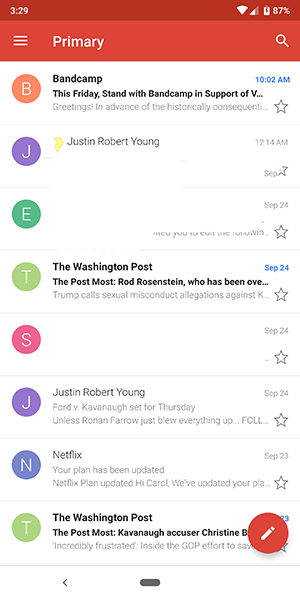
The basic red and white design of the app is solid, though in some ways, the app feels dated compared to some of its counterparts on Android. Gmail does its best to thread your unread messages together into different categories, including social, promotions, and updates, although it isn’t quite as powerful as the solution Inbox uses. The app feels fast and fluid on even lower-end modern phones, and with the ability to display a unified inbox, you can sync all of your email addresses together to create a cohesive display of your work and personal emails. Switching between accounts is easy too; as with most other Google services, you can change your account by simply sliding the left hamburger menu out and selecting your desired login. And of course, as with all other Google products, search has never worked better than it does in the Gmail application.
Here’s something that Gmail has in common with Inbox: labels are here, pre-sorting your mail into different categories to make it easier to make sure you can find the information you’re looking for. Unfortunately, Gmail doesn’t offer nearly as many premade labels and sorting as we’ve seen from Inbox, with the only real sync options coming from social messages and promotions. There’s no real sense of bundling here, either; everything pours into your primary inbox on Gmail, which can make it difficult to parse your new emails from your old ones and the content you’ve already seen days earlier to the emails received most recently. Still, this is all stuff you can learn to live with, which makes it easy in the long run to get by with Gmail over Inbox.
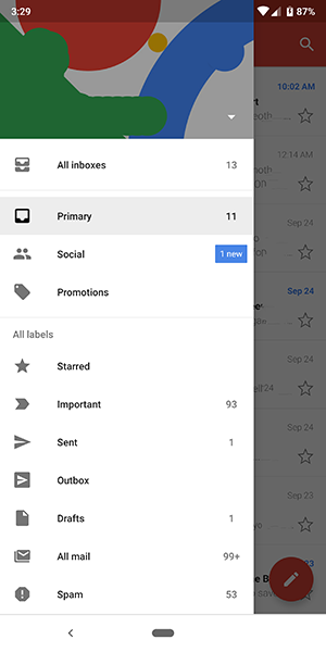
If there’s one major feature missing from Gmail that was present in Inbox, it’s the synchronization of reminders into the application. The ability to ask your Google Assistant or Google Home to make a reminder, and to see those reminders appear as messages in Inbox alongside your emails, made it easy and simple to check your reminders on one screen. It’s totally possible to use IfThisThanThat (IFTTT) to set up synchronization between your Google reminders and your Gmail inbox, but frankly, the amount of time and effort you have to put into doing that is ludicrous and simply not worth it.
This might all sound like Gmail is a poor replacement for Inbox overall, but the reason it tops this list is, frankly, because of a simple reason: hope. The Inbox team wasn’t fired or laid off from Google; rather, they were reintegrated back into the Gmail team and are now working side by side to improve Gmail and to make it the best email app it can be. This means that some of the best features in Inbox, from bundling to reminders, might come back to Gmail in the near-future—perhaps even before Inbox shuts the lights off for good in March. It’s not guaranteed, but the fact that Gmail may soon include some of the best of Inbox in the standard Gmail design makes us hopeful for the future.
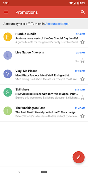
As we said, Gmail isn’t perfect. Non-Gmail users might not get the most out of this app, missing out on being able to use labels, archives, and more. Gmail often feels like a mobile port of the desktop version of the web app, for better and for worse. If you’re a Gmail die-hard, you’ll feel right at home while using the app, but users of outside email services might be disappointed in the design of the application. Gmail is a free application pre-included on your phone though, and for some people, not having to download or purchase a new device is one of the best features you can ask for. If you’re looking for a free application to help manage your emails with a unified inbox to replace the dying Inbox, you can’t beat Gmail.








2 thoughts on “Inbox Alternatives (by Google) for Android and iOS”