Make iDevice Navigation Easier By Enabling iOS Button Shapes

Starting with iOS 7, and continuing in iOS 8, Apple switched to a flat and simple user interface for the company’s mobile operating system. Part of this switch was the introduction of “buttonless” buttons: traditional buttons replaced with borderless text. This produced a cleaner and more modern look, but some users found it difficult to clearly distinguish between interactive buttons and plain old text. Thankfully, those who miss the traditional button look can switch back via an iOS Settings option. Here’s where to find it.
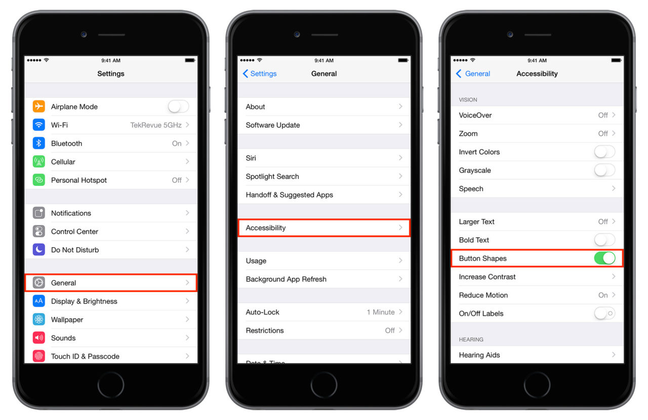
To display “button shapes,” as Apple calls them, first make sure that you’re running iOS 7.1 or higher. Then head to Settings > General > Accessibility. Find the option labeled Button Shapes and toggle it to On. You’ll immediately notice that interactive buttons are now highlighted with an appropriate shape depending on their function. As an example, check out the screenshot below, which shows the iOS Calendar app with Button Shapes disabled on the left and enabled on the right:
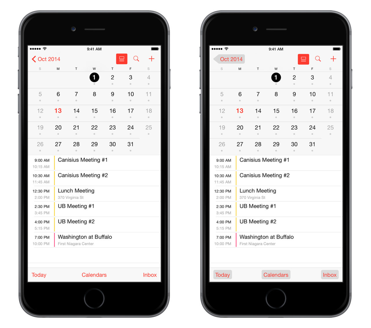
Those who have grown accustomed to the new modern look in iOS may not find the button shapes’ gray color aesthetically pleasing, but if it helps you better navigate iOS, it’s probably worth it in a “form vs. function” analysis. If you don’t like the button shapes, just hop back to the Accessibility menu in Settings and switch Button Shapes back to its default Off position.


