It’s Not Too Late: Apple Needs to Redesign Newsstand for iOS 7
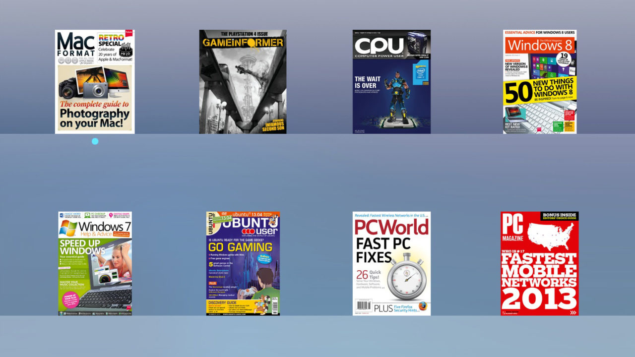
iOS 7’s arrival is fast approaching, but there’s still time for Apple to correct a glaring design problem: Newsstand. To be clear, Apple has made some great changes to Newsstand in iOS 7, such as the ability to hide it in a folder and the replacement of its live icon with a static one (so that those who don’t use it won’t have an “empty” icon on their iDevice screen). But the basic design of the application remains the same, and when juxtaposed with the drastic changes brought by iOS 7 to the rest of the operating system, Newsstand looks very much out of place.
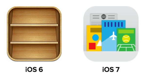
Apple launched Newsstand in September 2011 as part of iOS 5. The “app,” although we use that term loosely as Newsstand is truly just a specialized iOS folder with background update support, gives users a convenient way to gather, organize, and view their digital content applications, such as magazines and newspapers.
Although plagued by early issues related to background updates, the service has caught on with many iDevice users, especially those using iPads. Users now have the option to download and subscribe to thousands of publications in hundreds of languages.
From a design perspective, Newsstand was created during the heyday of Apple’s skeuomorphic phase, championed by now departed executives like Steve Jobs and Scott Forstall. The app looks like its real-world newsstand counterpart: a wooden rack or shelf lined with magazines and newspapers.
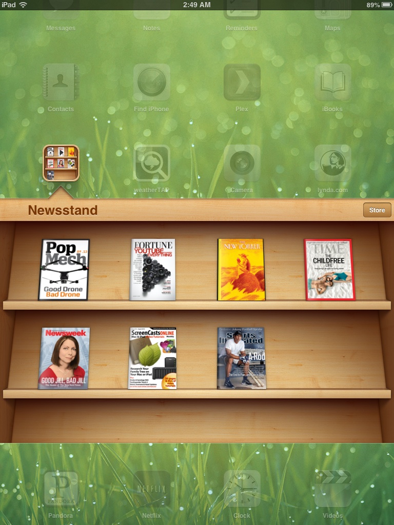
Regardless of your feelings on skeuomorphism, the design “fit.” In other words, the Newsstand app was clearly designed to mimic a real newsstand, and real newsstands display their publications in a similar manner. With iOS 7, however, skeuomorphism goes out the window in favor of a much more modern and streamlined look, yet Newsstand remains very much the same.
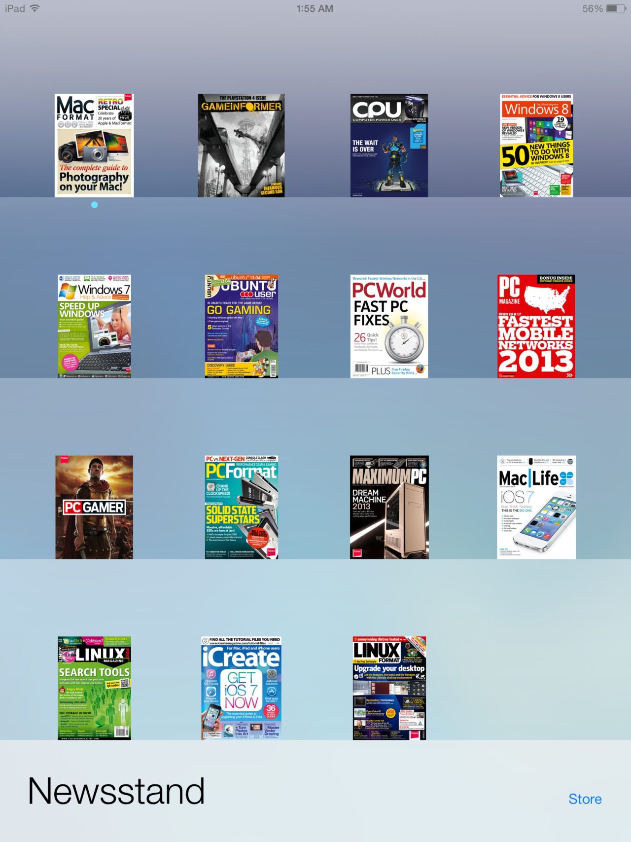
Sure, the wood is gone, but in its place is a bland set of frosted glass style rows that change color to match the user’s home screen wallpaper. With four publications per row, and four rows per page, the icons representing each magazine and newspaper’s front page are small and difficult to read, even at Retina resolutions. There’s also a ton of wasted space with no interesting visual elements to compensate. In short, the current Newsstand design in iOS 7 keeps all of the negative aspects of the former design while failing to add any positive ones. Isn’t it time for a change?
The good news is that Apple already has a perfect model for a redesigned Newsstand: Cover Flow.

Just about everyone who used an iDevice or iTunes in the past 7 years or so knows about Cover Flow. The beautiful interface, the design of which Apple acquired in 2006, was used to showcase album covers in iTunes and, later, on iDevices. It’s a safe bet that new Apple users during this period were introduced to Apple products, in part at least, by a friend’s Cover Flow demonstration.
Unfortunately, Apple killed the feature with introduction of iTunes 11 last fall and, with the iOS 7 update, it looks like the company will remove it from iDevices, too. But it doesn’t have to be this way; Cover Flow would be a great interface choice for Newsstand.
Instead of tiny icons, imagine an attractive layout that let users literally thumb through their digital magazine and newspaper collections. Covers would be nearly full-screen in size, allowing each publication’s cover design to be easily read and appreciated. Plus, the odd dichotomy of Newsstand’s current uninspired design compared to the more fluid look of iOS 7 would be solved.
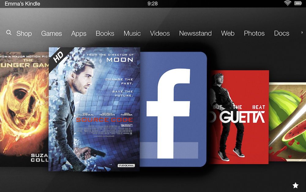
Amazon uses a similar design to display all types of content on its Kindle Fire tablet. While it could get tedious to thumb through pages and pages of apps using this method, a Cover Flow-like interface for magazines, newspapers, and books (we have yet to see Apple’s iOS 7 design for iBooks) is an attractive and, more importantly, easy to use option.
Don’t let Cover Flow die, Apple. The interface may not fit your plans for music browsing, but your neglected magazines and books are begging for a change! So now we turn to the readers. What are your thoughts on Apple’s Newsstand design in iOS 7?





2 thoughts on “It’s Not Too Late: Apple Needs to Redesign Newsstand for iOS 7”
However, also count me among those who think switching to Cover Flow would be a big mistake. What’s so great now about Newsstand on both the iPhone and iPad (mini and big guy) is that you can see how mags you have, identify which ones they are, and, on the bigger screen, even see some of the stories or cover photos.
Having to swipe through gobs of covers to get to what you want is inefficient and it hides what you have! It’s a design fail, but appreciate the thoughtfulness in the column and it’ll be interesting to see which of us gets flamed more–or, better, politely disagreed with!