Nova Launcher vs. Samsung One UI – Which is Better?
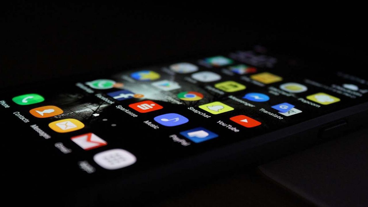
Having a responsive launcher is very important. Right now, there’s probably nothing as heated as the Nova Launcher vs. Samsung One UI debate. As far as Android phones are concerned, these two are the leading contenders for the top spot.
Let’s see if we can shed some light on why that is, while also helping you arrive at your conclusion.
Home Screen Comparison
To start things off, let’s compare the Home screen. Both launchers do an excellent job of granting users a wide range of customization options. You will be able to customize your dock, modify the search bar, change the icon layout, and the grid layout.
You will also be able to remove or hide apps as well as display badge numbers for icons (on the One UI launcher). That said, Nova Launcher is more convenient to use.
The significant advantage it has over the Samsung One UI is that it allows Home screen importing. Therefore, you can use your existing layout without having to make any changes.
Although customization options are nice to have, not everyone needs that. And, if you’re the type of user that already spent days customizing your Home, then doing it from again from scratch on the One UI may not be ideal.
Power Saving Through Dark Mode
As expected, both launchers allow you to use a dark theme. It’s a handy option for both relaxing your eyes and preserving some battery life. Phones with AMOLED displays will benefit from this feature the most.
But how does it work, and how can you enable it? Well, with the Nova launcher, you can customize your Dark Mode. You can play around with variations of a classic dark theme and even opt for dark grey instead of black.
When Night Mode is enabled, it changes the appearance of the dock, app drawer, and folders.
The Samsung One UI offers this feature under the Settings menu. Once enabled, the dark mode theme will apply to messages, all built-in Samsung apps, Bixby pages, contacts, and so on. But what’s convenient here is that you can set a timer for your dark theme.
Therefore, you can set it to turn on at night. By the time you wake up the next day, the day or white theme will be back on. So, although One UI offers less customization, the dark mode timing option makes it the more convenient launcher.
Feeds Interfaces
One UI hits the ball out of the park in this category. The launcher offers the Bixby Home feed interface, which you can also access via its dedicated button on some Samsung phones.
The interface offers standard date, time, news stories, weather, and other information. It also has customization options for widgets, support for third-party apps, and much more.
The only real issue with the One UI feed is that it’s not super responsive. Sometimes it may take longer to refresh, or to even show up after swiping it to open the feed.
In Nova’s case, the latest updates brought Google Now integration. Although this will provide you with the Google Feed style interface and many Google features, it’s not ready to use out of the box.
To make use of Google Now, you will need an additional app. It’s called the Nova Google Companion app, and you can find it on APKMirror. Without the companion app, you won’t be able to use the Google Feed page.
App Drawer Differences
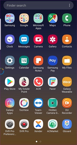
The app drawer is one of the most important aspects of any good launcher. The Samsung One UI is a bit limited in this area. It offers minimal options and meager customization possibilities.
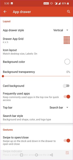
It allows app hiding, alphabetical categorizing, standard horizontal menus, and not a lot more. If your app drawer is essential to you, then you might like the Nova Launcher more, especially after the newer updates.
First of all, it won’t force you to use horizontal swipe menus. They’re outdated anyway. Secondly, customization is the name of its game.
Nova allows users to add pictures, the dark theme, apply transparency, add colors, and much more.
It’s All About Customization
Functionality and performance-wise, the Nova Launcher and Samsung One UI are not too different. There aren’t many noticeable low-performance spikes to speak of, concerning either of the two launchers.
But, in terms of customization, the Nova Launcher has more to offer.
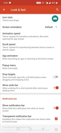
In a way, this makes perfect sense too. Since the Samsung One UI is the standard launcher, it would make sense for a third party launcher to fill in the blanks and add missing features.
Therefore, Nova comes with better folder exploration, more gesture customization, app animations, notifications, and more. On the other side, Samsung One UI still has its theme store, which allows for fast theme swapping.
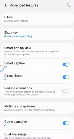
It also has the preset Gaming mode available as well as all the essential UI sections within reach. But since Nova enables users to use all built-in Samsung UI customization features too, it’s a no-contest between the two.
Final Verdict
Update after update, the Nova Launcher just got better and better. Besides its native Samsung One UI support and integration, it offers so much more in terms of personalization, customization, and folder exploration and file searches.
It’s a more resource-draining launcher, but it can help you do a lot more, a lot faster. What are your thoughts one the Nova Launcher vs. Samsung One UI debate? Are you a Nova user or a One UI purist?







3 thoughts on “Nova Launcher vs. Samsung One UI – Which is Better?”
I have been using it since 2014.