Make OS X Yosemite Look Better on Non-Retina Displays by Disabling LCD Font Smoothing

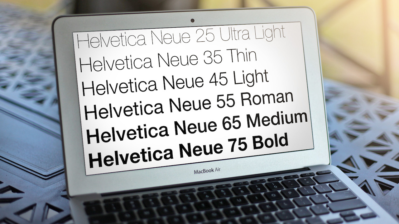
Apple introduced a new system font in OS X Yosemite, moving from the traditional Lucida Grande to the more modern Helvetica Neue. The change definitely gives the operating system a fresh feel, but it can also be more difficult to read, especially on non-Retina displays. While there are some unofficial hacks that can restore Lucida Grande as a system font, most Yosemite users without Retina displays may want to try disabling OS X’s font smoothing feature before taking more drastic steps.
OS X ships by default with LCD font smoothing — a sub-pixel rendering technology that aims to make fonts on traditional displays look less jagged and pixellated — enabled. This worked well for Lucida Grande in previous versions of OS X, but many users report Yosemite’s Helvetica Neue looks a bit “fuzzy” or “blurry” with LCD font smoothing enabled, and have reported that disabling the feature cleans things up a bit.
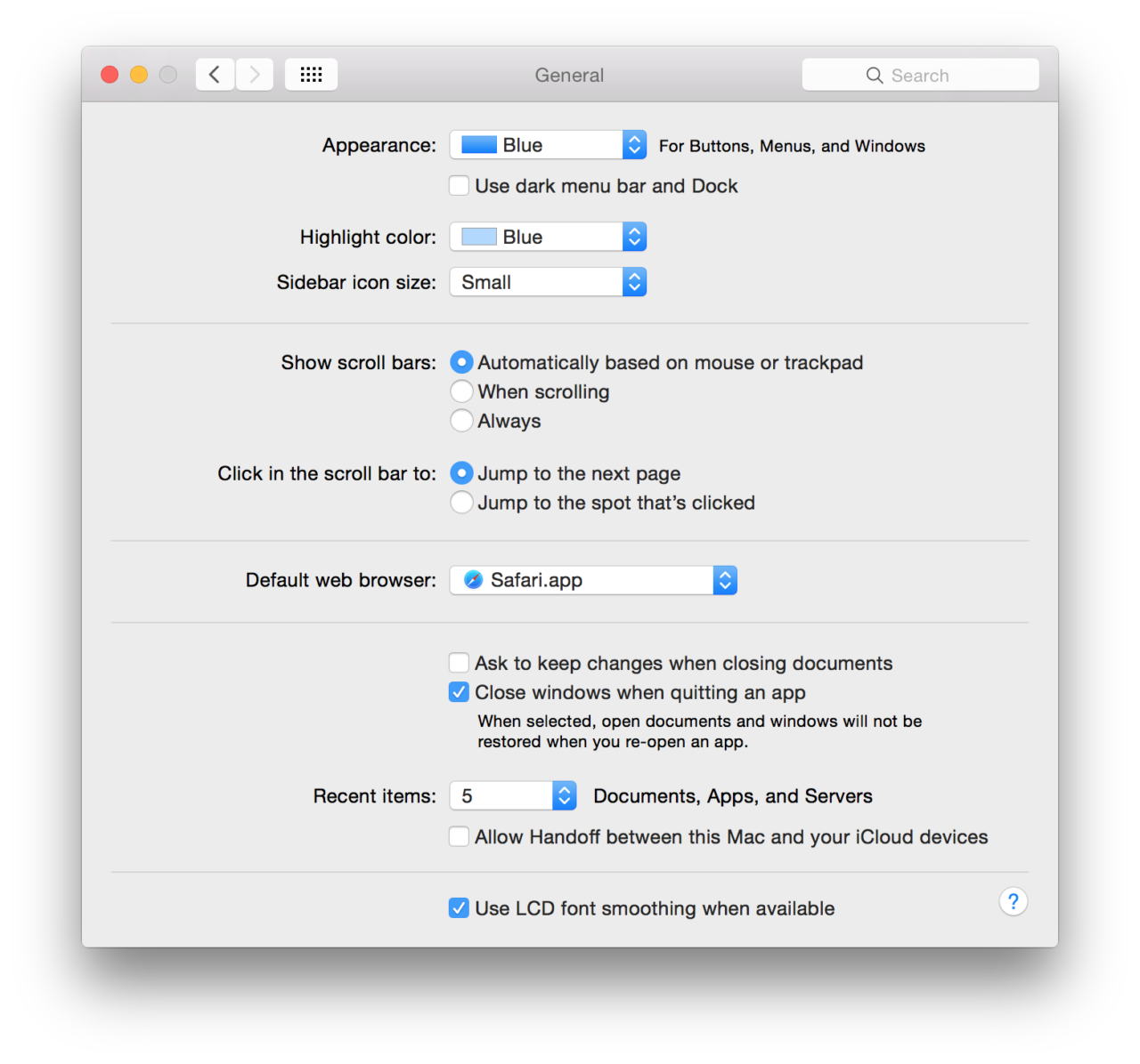
To disable LCD font smoothing, head to System Preferences > General. There, you’ll find a checkbox labeled Use LCD font smoothing when available at the bottom of the window. Uncheck it to disable LCD font smoothing and then log out and back in to OS X to make the change applicable to the entire operating system (some menus and items will change as soon as you check the box, but a full log-out is required to change all areas of OS X).

The change is quite subtle, but you can see the difference in the image above (LCD font smoothing is enabled by default, and disabled on cursor rollover). With LCD font smoothing disabled, the fonts in OS X do look a bit more jagged, but they’re also clearer, losing that “fuzzy” effect found with the option enabled. It’s entirely a matter of personal taste, but many users have found that disabling LCD font smoothing makes fonts look better in Yosemite on standard resolution, non-Retina displays.


3 thoughts on “Make OS X Yosemite Look Better on Non-Retina Displays by Disabling LCD Font Smoothing”