Test Your Website’s Mobile Layout With Safari Responsive Design Mode

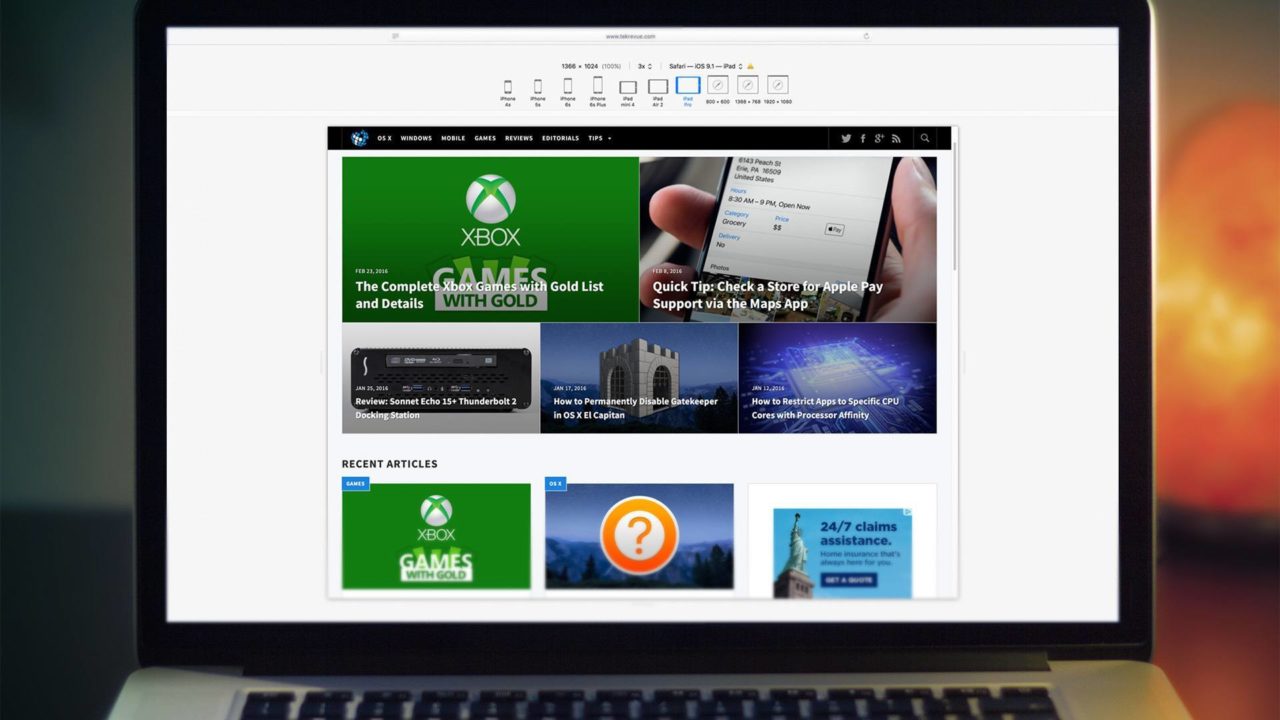
Mobile devices already comprise a huge chunk, if not the majority, of online readership for many websites, so making sure that your site will look and function properly on an iPhone or tablet is crucial. There are many services that offer mobile layout previews for a given URL, but Apple made testing websites for mobile readiness much easier with Safari 9 in OS X El Capitan. A new feature called Responsive Design Mode can quickly preview what a website looks like on a variety of Apple devices as well as common mobile screen resolutions. Here’s how it works.
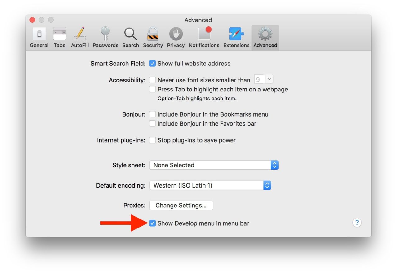
It’s important to reiterate that Responsive Design Mode is a new feature that is exclusive to Safari 9 in OS X El Capitan, so you’ll need to be running at least these versions of browser and operating system to access it. If your Mac meets this requirement, you’ll need to first enable Safari’s Developer Mode. To do so, launch Safari and click Safari in the Menu Bar. Then select Preferences > Advanced.

In the Advanced tab of Safari’s Preferences window, check the box labeled “Show Develop Menu in Menu Bar.” As the name of the option implies, you’ll see a new “Develop” menu appear in the Safari Menu bar to the right of “Bookmarks.”
Next, close the Safari Preferences window and navigate to a website you’d like to test in Responsive Design Mode. Once the website is fully loaded in your browser, use the keyboard shortcut Command-Option-R and you’ll see the browser window convert into a preview of one of several mobile device resolutions (you can also access Responsive Design Mode by clicking Develop in the Safari Menu Bar and selecting Enter Responsive Design Mode).
Safari Responsive Design Mode lets you preview how a website looks on all of Apple’s mobile device resolutions, from the 3.5-inch iPhone 4S to the 12.9-inch iPad Pro. Users also have the option of selecting a 1x, 2x, or 3x “Retina” resolution and changing the browser agent to mimic the behavior of most popular browsers such as Chrome, Firefox, and Edge.
For each device and screen size, users can click on the device icon to change between portrait and landscape orientation or, for devices like the iPad Air and iPad Pro which support split view, you can click to rotate between various split view layouts.
While Safari Responsive Design Mode lacks some of the options of similar preexisting tools, having it built directly into Safari can be a huge time saver for web designers, and a great learning and testing tool for website owners who want to make sure that their mobile visitors are getting the best experience regardless of screen resolution or size.
Once you’re done testing, you can leave Responsive Design Mode by either closing the browser window or tab, or pressing the shortcut Command-Option-R again.


5 thoughts on “Test Your Website’s Mobile Layout With Safari Responsive Design Mode”
I was wondering, Do freelance Web designers/developers tend to set their clients up with shared or dedicated hosting plans?
I want to make sure their website is fast. Any insight would be greatly appreciated!