The 2 Things Apple Got Wrong with the iPhone 6 Plus

When Apple introduced new iPhones last year, the company made a splash by releasing two flagship models simultaneously: the 4.7-inch iPhone 6 and the 5.5-inch iPhone 6 Plus. Although differing in size, the two phones share the same proportional design. Now that I’ve owned and used an iPhone 6 Plus for just over five months, however, it’s clear that Apple made two notable and, for me, frustrating mistakes with the design of its larger phone. While one of these mistakes will require a hardware refresh to rectify, at least one of them can be addressed via a software update.
Mistake 1: Lock Button Directly Opposite the Volume Buttons
Both new iPhones are larger than their predecessors, too big to keep the lock button (a.k.a. on/off or sleep/wake button) in its traditional location on the top edge of the device. Leaving it there would make it nearly impossible for most users to reach it while holding the phone with one hand, especially those using the iPhone 6 Plus. Therefore, Apple decided to move the lock button to the right side of the phone.
I don’t take issue with Apple’s decision to move the lock button to the side of the iPhone, but I’m now convinced that the company moved it to the absolutely worst position they could have chosen. As it stands, the lock button sits perfectly opposite the ‘volume up’ button located on the left side of the phone. This creates a nice visual design that I’m sure Jony Ive is proud of, but it makes for terrible usability.
As is obvious, when you want to press a button on one side of your iPhone, you need to provide opposing force of some kind on the other side of the phone. With the lock button’s current location, the most natural place to provide that counteracting force is the volume button area. The result? More than half of the times I attempt to lock my iPhone, I get inadvertent volume changes. It works the other way, too, with attempts to raise the volume far too frequently resulting in unintentional triggering of the lock or sleep function.
This issue was identified by many users in the early days of the iPhone 6’s availability, but the consensus was that we’d all get used to the new button locations and learn over time to move our hands and fingers into the correct positions so as to avoid inadvertent button presses. It’s true that you can contort your hand to apply counteracting force below the volume or lock buttons, but I, and many others I’ve spoken to, find such hand positions to be uncomfortable.
Things are a lot easier with the 4.7-inch iPhone 6 thanks to the device’s overall smaller form factor, but the positioning still isn’t ideal. Historically, the anticipated “iPhone 6s” will feature the same basic design as its predecessor, but here’s hoping Apple can make some tweaks to the location of the iPhone 6 lock button, preferably by moving it more to the center of the iPhone’s right side (roughly where the SIM slot is currently located), allowing for a user to apply opposing force without fear of hitting the wrong button.
Continued on Page 2


30 thoughts on “The 2 Things Apple Got Wrong with the iPhone 6 Plus”
OFF TOPIC SIDE NOTE: I can honestly say I’m glad it’s too big for my one hand because even though I am very against texting and driving, there have been a couple times when picked up my phone to read a text in an urgent situation while behind the wheel. And I can honestly say how ashamed I am for just those couple times because every text CAN wait. So now, it’s impossible for me to unlock my phone without having to look away from the road so my phone stays in the middle compartment where it belongs now lol.
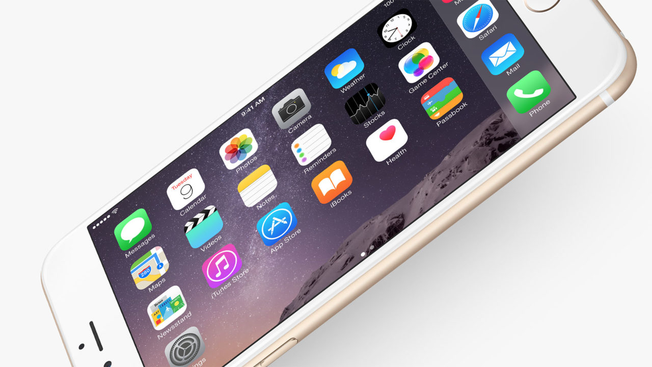
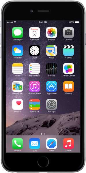
Also I hate that I can’t disable auto-rotation of the home screen on iPhone 6 Plus! As someone else mentioned in comments, it is very difficult to memorize two different icon layouts especially if most of the time you see them in portrait orientation. Luckily this point can be fixed with a software update and hopefully enough people complain to Apple to force them to implement disabling of auto-rotation of the home screen.
As for being able to independently lock the Home Screen, that’s an excellent idea. It, unfortunately, goes against Apple’s stand in the last decade to try to limit as much as possible the power people can exert over their devices, something that the Apple Watch project seems to be largely ignoring, to the benefit of usability and expandability. We can only hope that Apple will continue to chip away at this unfortunate stand.
This makes for perfect left-handed use for the middle finger, allowing both the thumb and index finger to stabilize the phone when you press the power/lock.
If you ever walk into any Microsoft store or Target, try it. You’ll think the volume rocker being on the right side weird, but you get used to it using the left middle finger.
I did struggle for a while getting used to the lock on the side after years of being used to pressing on the top of iPhones, but now when I do sometimes still use my 5s, I keep reaching for the side instead.
The home screen rotation though, I completely agree with. It’s a pointless and annoying ‘feature’. However, I’d add my 2nd issue as being the different keyboard added when rotated to landscape – sure the many extra buttons and features seem like a good idea, but the actual letters become smaller and my big clunky thumbs are left trying to type on much more awkward tiny keys. Ok, I can install a custom keyboard at least now and pick one which doesn’t have this problem, but then I haven’t yet found one which doesn’t have its own problems in other ways.
Try it and see! On the positive side, unlike all other sites I’ve ever visited it loads more than1 page!