TechJunkie is a BOX20 Media Company

Home PC Windows The 2 Things Apple Got Wrong with the iPhone 6 Plus
The 2 Things Apple Got Wrong with the iPhone 6 Plus

The 2 Things Apple Got Wrong with the iPhone 6 Plus

Mistake 2: No Independent Rotation Lock for iPhone 6 Plus Home Screen

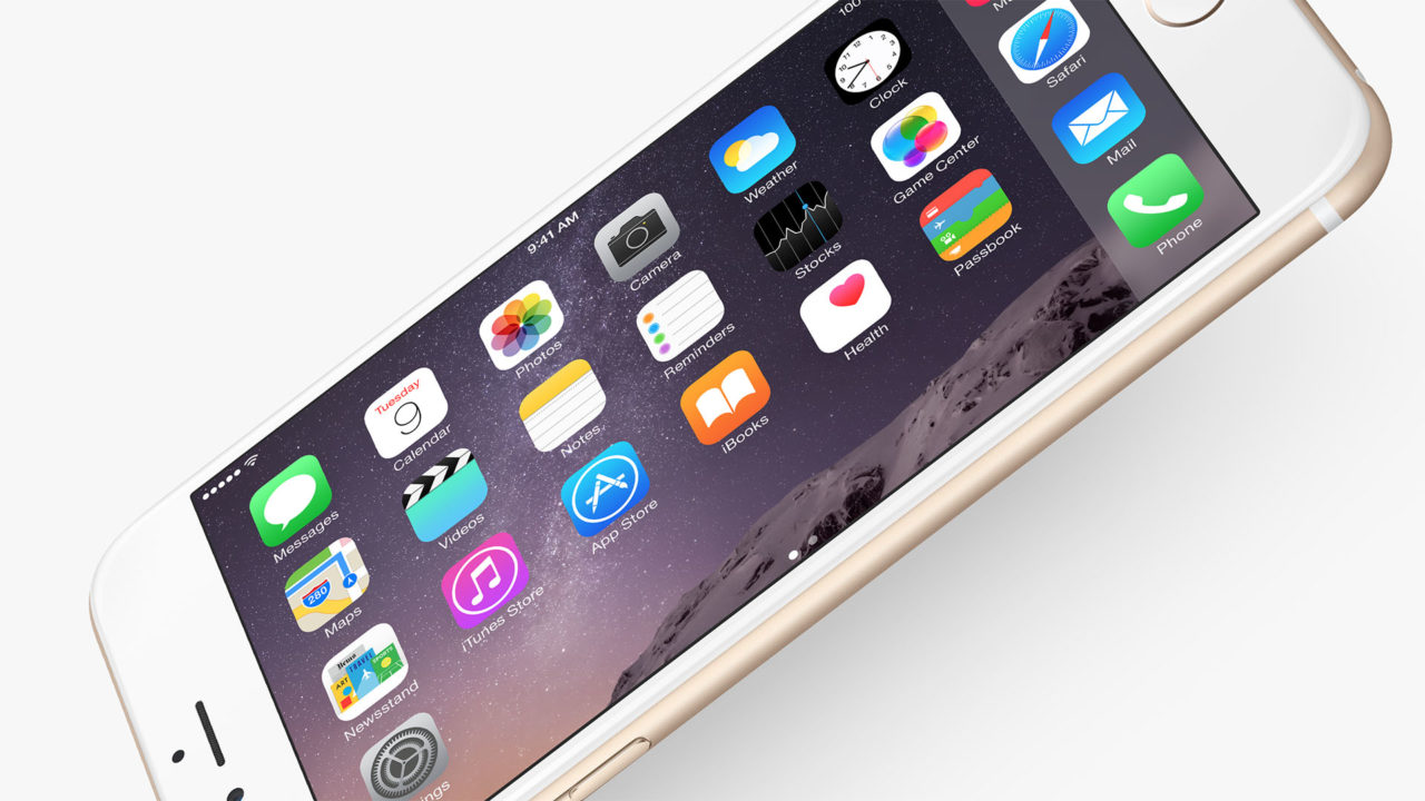
One of the few differences between the iPhone 6 and iPhone 6 Plus is that the home screen of the latter device can rotate into a landscape orientation. Some users may prefer the look of this mode, and there are some unique features associated with it, but there’s no way to lock or disable home screen rotation on its own. You’re only able to lock screen rotation system-wide, or not at all.


To be fair, it’s not entirely the hardware design’s fault; the annoyance factor here is exacerbated by the fact that iOS 8 still has rotation bugs, causing noticeable and frustrating delays when trying to rotate apps or the home screen. I prefer to interact with my iPhone in portrait orientation, and only ever want to go into landscape mode when an app requires it, such as watching movies with Plex or playing a side-scrolling game. But if I try to use my iPhone 6 Plus in a non-traditional position — such as lying in bed, or leaning over on the couch or in a chair — the home screen will frequently rotate into landscape mode.

This wouldn’t be so bad if the rotation effect was instant, but iOS 8 still has many bugs to work out in this regard, meaning that way too often these unintentional rotations take several seconds of animated twisting and wrist-flicking to rectify. I could turn on the rotation lock feature in the iOS Control Center but, as I said, that locks everything from rotation, including some apps that work best in landscape orientation.

These are ‘first world problems,’ sure, I get it. But they add up over the months into a frustrating experience. Both problems could be almost solved by simply moving to the 4.7-inch iPhone 6 (the smaller iPhone doesn’t have the home screen rotation feature), but I really like larger size and optical image stabilization features of the iPhone 6 Plus.

One thing is clear after five months of really getting to know my iPhone 6 Plus: Apple created a great phone, but they didn’t create a perfect phone. I can only hope that the company moves quickly to address the lock switch positioning with the next hardware update, and I don’t see any reason why they can’t address the Home Screen rotation situation with a simple software update.

How To Fix Camera Failed Problem On Samsung Galaxy S5

Read Next 

30 thoughts on “The 2 Things Apple Got Wrong with the iPhone 6 Plus”

Rob says:
Apple doesn’t care what works for their customers … their product people never come out of the ivory tower long enough to perform legit user testing. They are too busy “knowing” what customers really want instead of finding out what really works for them. #Apple_Fail
vladimir azarov says:
The story still continue with iPhone7.
avTronic says:
EXACTLY! I mean why do companies not learn from other’s mistakes?? There has been countless other devices that had this same issue and repositioning was accomplished to much success and praise. In apple defense I can see how grabbing the phone actually puts your thumb on the power and your poster and middle finger actually line up on the other side below the volume buttons. I think the problem is that people with weak hands need to place the opposite fingers even with the power button. Also, people that have a case (like myself) have even harder time pressing those buttons and that is why I find myself doing this same thing since my otter is case buttons at so hard to press. Well
Foster149 says:
I’m glad somebody pointed out the physics-challenged design of the i6 volume/power buttons. Newton’s Third Law doesn’t seem to apply at Foxconn.
Hans Thoma says:
You really think the iPhone 5’s sleep button was better? IMO it’s too stiff, and its location forces you to stretch your finger all the way up there while tightly gripping the phone to apply counterforce. It’s about time Apple joined the real world and abandoned that stupid design.
royalspirit says:
I agree with this post..the new location of the power button in iPhone 6s is really non-ergonomic. I really hate it. Very inconvenient.
paul_krupa says:
I wholeheartedly agree on both counts.
ncaldwell says:
I’m not a big fan of writing negative reviews but the power button on the 6s could not be in a worse place! It drives me batty! Did anyone do any functionality testing?
Robert says:
They purposely had to have problems so hence iPhone 7. We already have the 7 designed
Cody Flynn says:
Completely agree. Power button position is awkward. Considering learning to use the phone landscape mode primarily so the power button will feel like it’s on top again.
deucebaseman says:
I’m glad I read this article. These are the EXACT 2 things that have been bothering me with my new phone. So stupid.
Kenrick V says:
Iphone 6s home screen can be disable by this function setting > Display & Brightness > view > highlight zoom > set. It worked for me, I hope you enjoy your Iphone like me :)
Niina Helena says:
I am completely stunned as to why the top lock button was deemed unfit for one-handed use. I have the same problem with pushing the damn volume buttons when trying to lock my 6s Plus. However, when holding it in either my left or right hand, I could EASILY push the lock button if it were in its original top position. The most natural and comfortable ways to push the lock button on my 6s+ in either hand will always result in pressing one or both of the volume buttons. And I’ve noticed that the main thing I actually do with one hand on my phone now IS lock it! LOL. I don’t know how anyone can really use this phone with one hand due to its large size. Even though I’m female, I have medium-sized hands and there’s very little I can do without both hands on my new phone.

OFF TOPIC SIDE NOTE: I can honestly say I’m glad it’s too big for my one hand because even though I am very against texting and driving, there have been a couple times when picked up my phone to read a text in an urgent situation while behind the wheel. And I can honestly say how ashamed I am for just those couple times because every text CAN wait. So now, it’s impossible for me to unlock my phone without having to look away from the road so my phone stays in the middle compartment where it belongs now lol.

heitman says:
Sorry but I hate where the power button is located. When I hand my phone to people to watch a video they always push the power button and I find myself doing it all the time as well. I liked it much better when the power button was at the top of the phone.
Adrian says:
For me, I hate big changes with iphones, I just upgraded and got a new iphone 6.. The sleep/wake button is on the right side…. TERRIBLE place to put it! It’s MUCH better at the top! Know how many messages and calls I have not responded to in time because I inadvertently turned down/off the volume over time when I attempt to lock the phone? It’s not good. :(
Laura James says:
Was wondering where the assistive touch home button went when I set up my iphone 6. After finding and setting it up I started playing with it and you can use that home button to lock your screen so you don’t have to squeeze the phone’s side button to lock the screen and turn the phone off. Some may not like that little phantom button on their home screen but I’ve enjoyed having it there and on the iphone 6 it solves some problems with lock screen, taking screen shots, rotation and more that you can do using the assistive touch home button. Settings>General>Accessibility>Assistive touch-turn on. It’s worth a try particularly when the phone is in a cradle or dock and you can’t get a firm hold on it to push the side button.
Wedja Pires says:
I just got the Iphone 6, and after 2 days thinking that I had some coordination problem, I googled Iphone 6 on/off button. Happy to see that I’m not alone, and frustated that I will turn off my phone every time I try to get a print screen
Chuck Plock says:
Lock button: I definitely find the new lock button very awkward and unnatural now. And when my iPhone 6 is docked – trying to lock screen is a comedy – usually the phone tries to rock off the dock unless I try to use my ring finger like an opposable thumb. Until we evolve a better ‘gripping hand’ like Moties (Niven/Pournelle), maybe a good workaround would be to add a lock gesture or icon at least … a software change instead of a ‘hardware refresh’.
Serious says:
You can prevent the home screen rotation by increasing the icons size in the zoom menu.
Raphael Pungin says:
I agree that Apple made a mistake placing the power button on a side. I think having it on top is still a perfect solution. It is quite easy to just slide the phone down in your wrist and reach the power button on top.

Also I hate that I can’t disable auto-rotation of the home screen on iPhone 6 Plus! As someone else mentioned in comments, it is very difficult to memorize two different icon layouts especially if most of the time you see them in portrait orientation. Luckily this point can be fixed with a software update and hopefully enough people complain to Apple to force them to implement disabling of auto-rotation of the home screen.

Bruce "Tog" Tognazzini says:
Re: The Home Screen rotation: My biggest issue with the 6 Plus is the same as my issue with the iPad: The two different orientations require the user to memorize two different sets of icon locations. What Apple should do, when the user rotates the device from vertical to horizontal, is to leave the matrix exactly as it was but move the bottom row(s) that would become hidden, placing them vertically on the left side of the screen. This would give people a simple rule for where to look for their icons after a screen rotation. The rule could be made visible by animating the move.

As for being able to independently lock the Home Screen, that’s an excellent idea. It, unfortunately, goes against Apple’s stand in the last decade to try to limit as much as possible the power people can exert over their devices, something that the Apple Watch project seems to be largely ignoring, to the benefit of usability and expandability. We can only hope that Apple will continue to chip away at this unfortunate stand.

petrolly says:
Thank you for this article. I think Apple stubbornly didn’t want to copy Nokia/Microsoft on the lock/power button placement. Nokia has always placed its power/lock button just slightly above center on the right side of the phone.

This makes for perfect left-handed use for the middle finger, allowing both the thumb and index finger to stabilize the phone when you press the power/lock.

If you ever walk into any Microsoft store or Target, try it. You’ll think the volume rocker being on the right side weird, but you get used to it using the left middle finger.

Karen Kurzbuch says:
Thank you!!!! I’ve had the smaller 6 for 6 months now and I can’t STAND where the power button is located…most of the time I have inadvertently turned the volume down all the way and can’t hear any of my calls or texts. My hands have NOT learned to contort in a way to avoid this new flaw and I don’t think they will. BAD design….what was Apple thinking???
gez taylor says:
3rd bad point, it bends to easily, I am shocked this made it past apples stringent q&a.
Peter Davies says:
On the ‘plus’ side, the brand name means they retain their value in the second hand sales market
Gabriel Moraes says:
Personally, I like the LG’s button placement, on the phone rear. It makes screenshooting as easy as pressing with one finger, controlling the volume with the phone on your pocket easily, and no problems to turn screen on or off, independent of hand size.
Jacob Smith says:
I think if they were to move the power button back to the top for the supposed 6s, it’d be a decent idea. I picked up an HTC Desire 510 for cheap a week or so ago, just for rooting/modding, and its 4.7″ screen seems to be a good size for the top-place button. Although the screen is smaller than my Nexus 5, the 510’s form factor is larger. That’s off topic. But the power/lock button back up top might not be a bad idea.
buzzzqwert says:
Agree completely with #1. Also tough making a screen print with the button on the side and the volume opposite.
Nick Sharratt says:
I completely disagree with this point. With how I hold and use the 6+, moving the lock/power button to a central location would be putting it in exactly the worst position. I use my thumb to press the lock button leaving my fingers well clear of the volume buttons, and I can easily use 1st and 2nd fingers for the volume buttons without using my thumb at all as the body of he phone sits against the pad of my thumb. So hands off any idea of changing this. :)

I did struggle for a while getting used to the lock on the side after years of being used to pressing on the top of iPhones, but now when I do sometimes still use my 5s, I keep reaching for the side instead.

The home screen rotation though, I completely agree with. It’s a pointless and annoying ‘feature’. However, I’d add my 2nd issue as being the different keyboard added when rotated to landscape – sure the many extra buttons and features seem like a good idea, but the actual letters become smaller and my big clunky thumbs are left trying to type on much more awkward tiny keys. Ok, I can install a custom keyboard at least now and pick one which doesn’t have this problem, but then I haven’t yet found one which doesn’t have its own problems in other ways.

royalspirit says:
Your usability adaptation is strange, you must be an alien.
Brain says:
Your obviously a lefty duh. 2018 still not used to it and I hate it when my girl walks up and I can’t close my phone fast enough. I actually threw it at the wall a minute ago. Good case I guess, it’s fine.
Starman_Andromeda says:
Nice insights! Oddly, in Reader in Safari, your article repeats the write-up of blurb #2!

Try it and see! On the positive side, unlike all other sites I’ve ever visited it loads more than1 page!

Leave a Reply

Your email address will not be published. Required fields are marked *


Jim Tanous

Feb 23, 2015

676 Articles Published

More